
This is the second in a series of posts encouraging you to be different, quilt different, quilt bravely. To bend or even break some rules while pumping up your creative voice. You have the creative confidence, I’m just here to remind you of it.
Most of the first few quilts I ever made - some 2 decades ago - were pretty colours with a white background. For those first few years I couldn’t imagine how I would make a quilt any other way because it just looked so perfect to me. Well, I’m not sure what changed, but it’s been at least a decade since I made a quilt with a plain white background!
To be clear, I was almost never using plain white, a solid. No, I was using that lovely stuff called White on White, or what we used to refer to as WOW prints. A pretty shiny white ink on white fabric. Now, of course, the whites were never all the same and this row of fabrics in any quilt store will read from bright white to eggshell to cream.
Side note: if you ever find that white ink to be too bright, use the wrong side of the fabric. You get the idea of the print without the glaring brightness of the ink.
Then I discovered low volume prints. There weren’t as many then as there are now, but they definitely existed. More often than not that can still be located in the black and white section of the fabric store. Only now you can get a lot more choices of coloured ink.
I do find that people are afraid to use prints in a background, worried that they will overwhelm the design. Or, they are used and the design disappears. Here are two fundamental lessons to making sure neither thing happen.
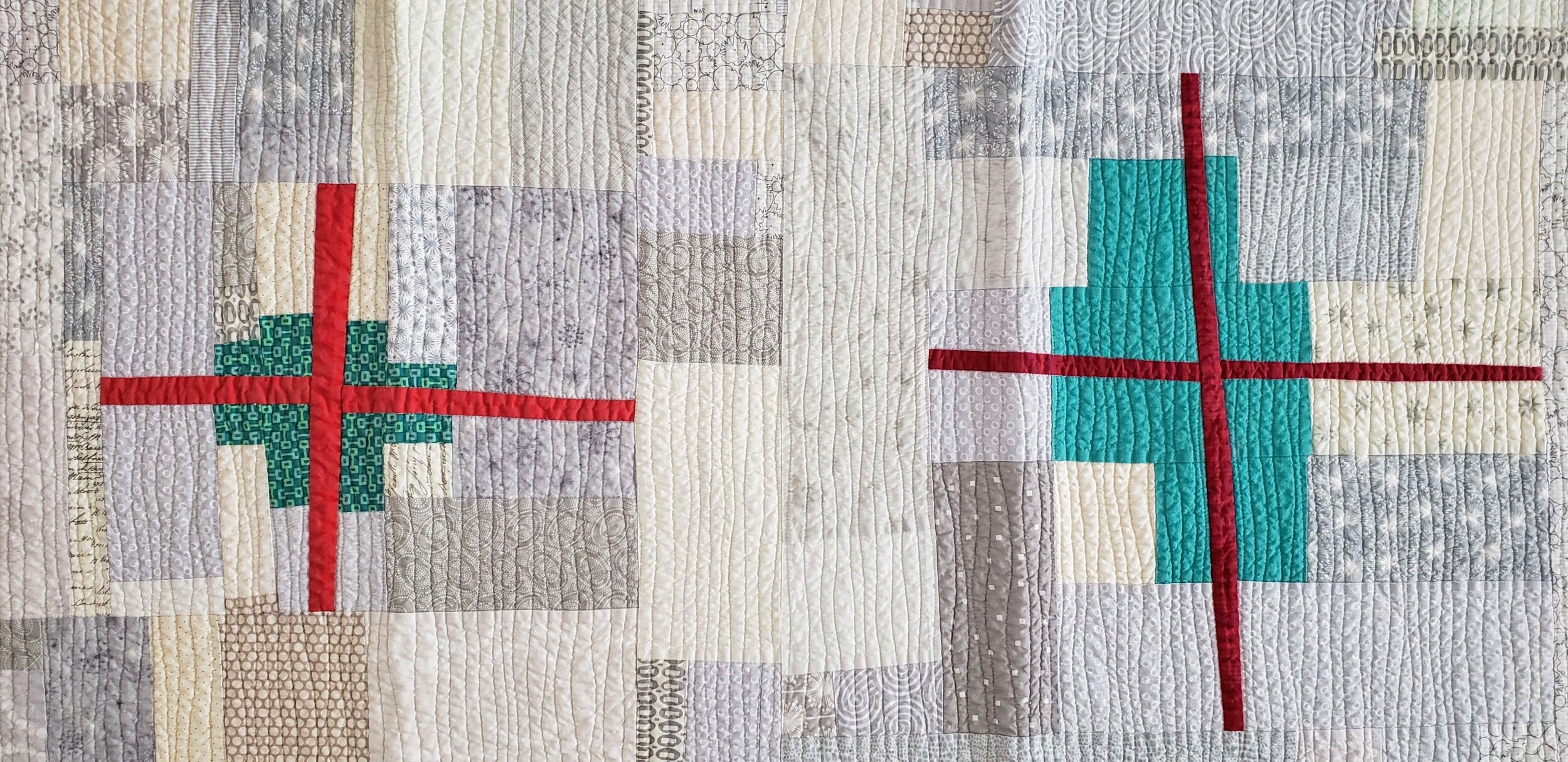
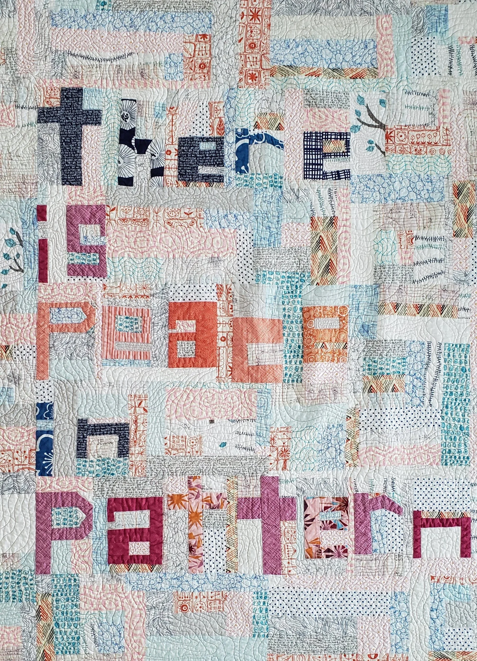
Mod Tree Quilt, pattern in Modern Patchwork
Value Matters
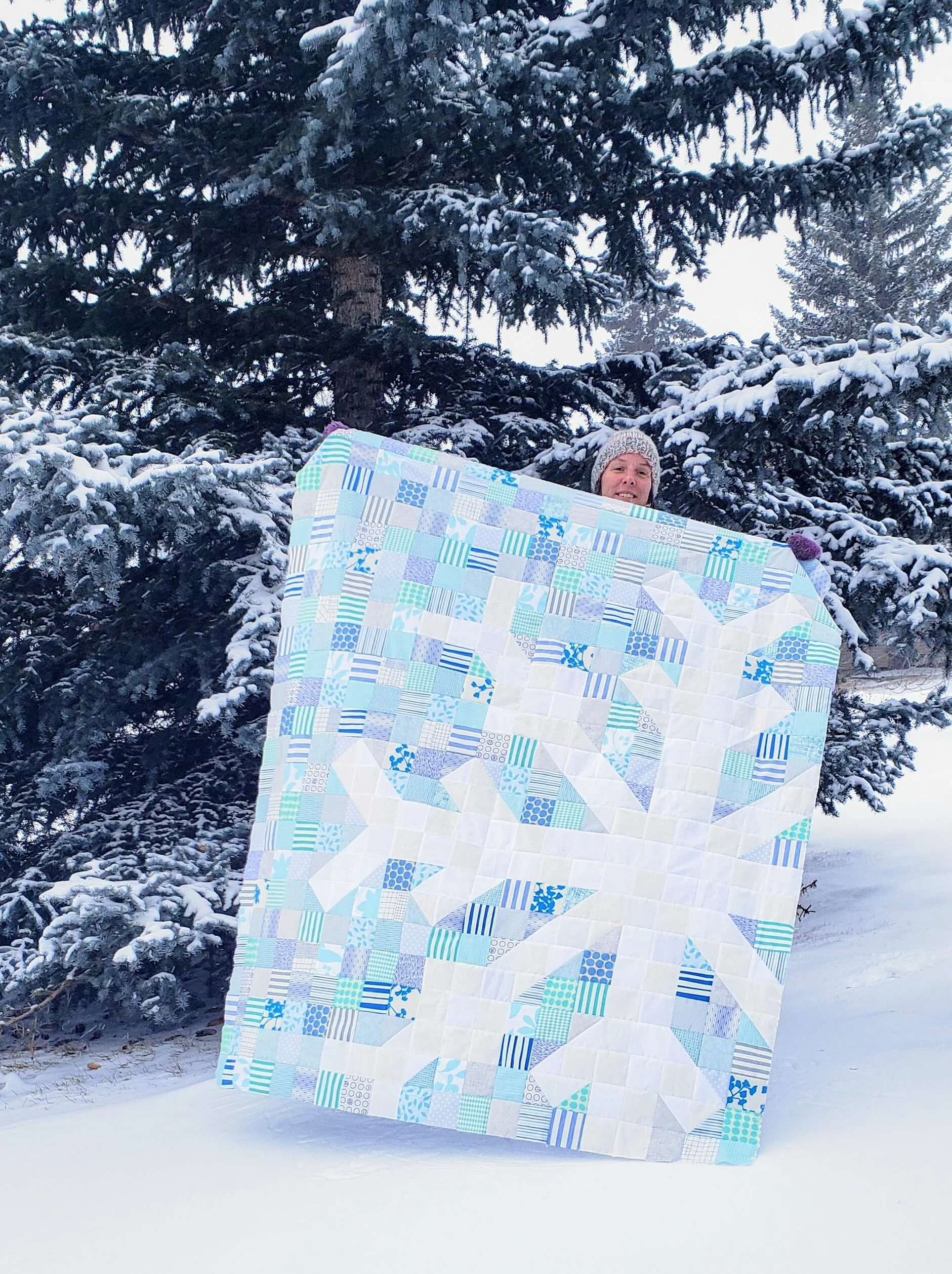
Value is the relative light and dark of a fabric. The key word being relative. It is about what the fabrics look like next to each other. If you want your design to stand out, then you need good contrast between the main design components and the background. This matters especially so when all the fabrics are prints. It isn’t enough to just have colour contrast, or maybe you want a monochromatic look. Either way, making sure the value of the background prints contrast with the design elements is important.
You also want to make sure that your background prints are all of similar values. They don’t have to be match match perfect, but aim for similar. This leads to the next key lesson.
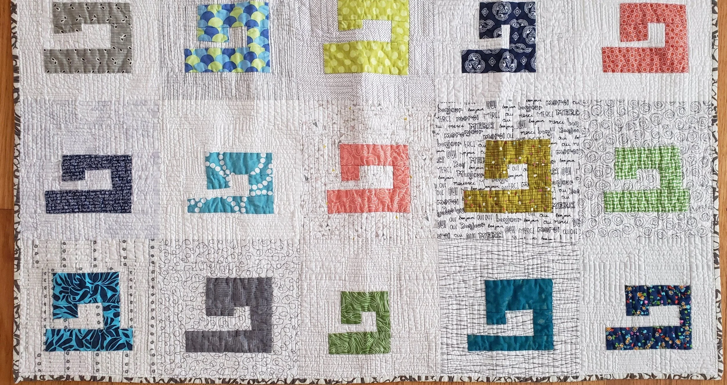
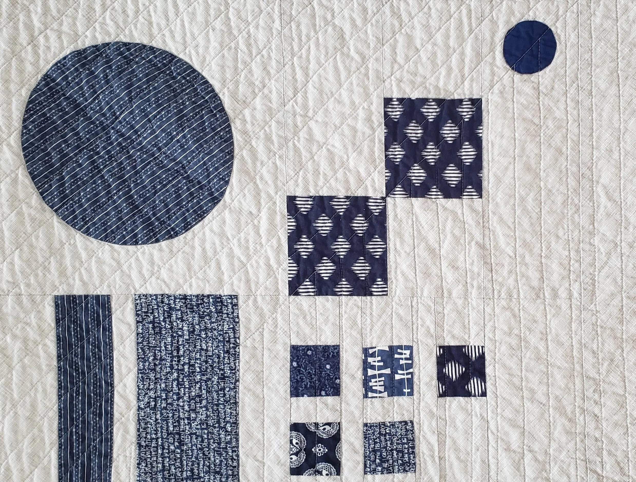
Sewing Machine Quilt, check out Pattern Drop
Texture Matters
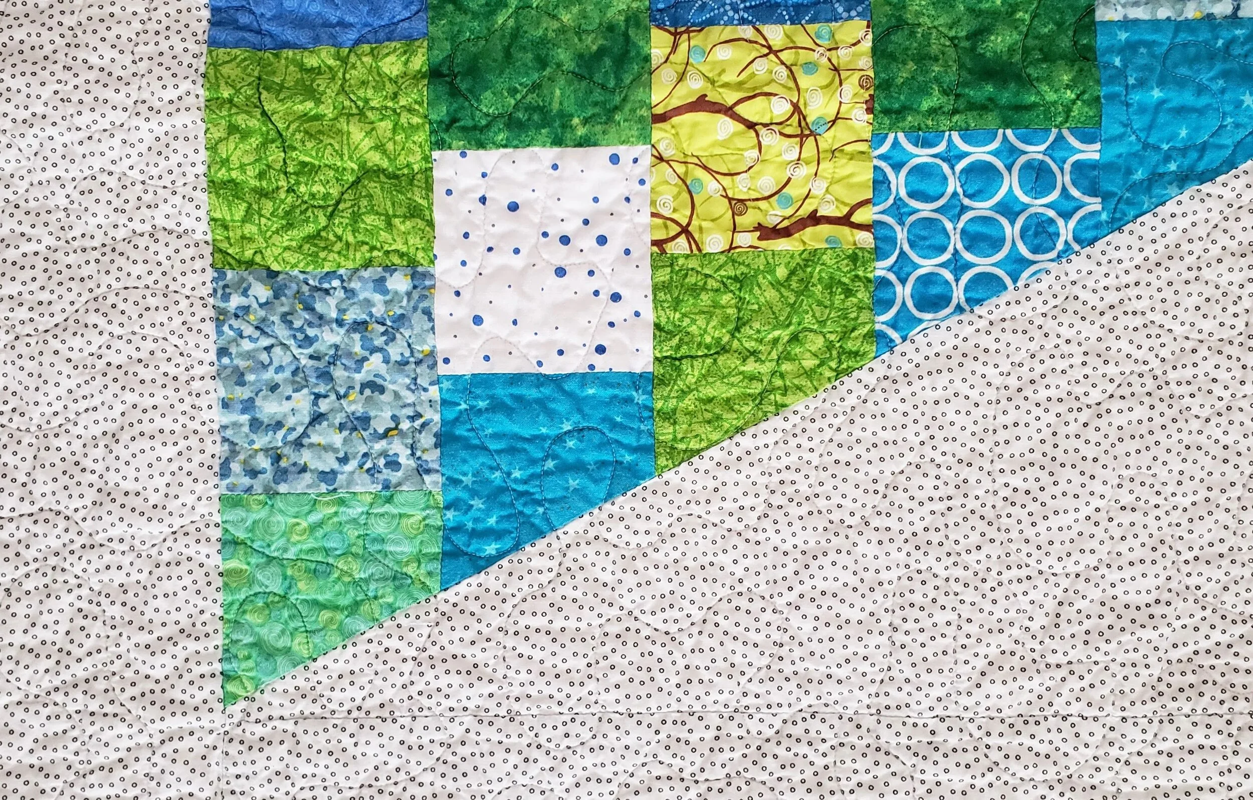
Texture is the look or density of the print. Is it a sparse, large scale print with negative space between design elements? Is is a dense text print with little space. Side by side, the dense print will look darker.
It isn’t that you have to pick prints where they are all the same density, but knowing that some will pop while others will recede allows you to balance their use across a quilt. And if you have one print that really seems to be taking over the background you can do two things: remove it, or add more similar prints, so nothing stands out on its own.
Compose Yourself from The Essential Guide to Modern Quiltmaking
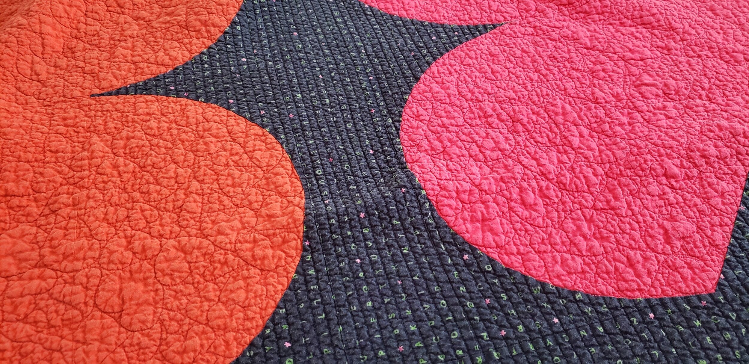
Colour can make a difference in backgrounds. Be willing to experiment with pale colours instead of white. Pick multi coloured low-volume prints instead of black and white. Mix grey with black and white. Or heck, make your main design elements a light colour and your background a delicious, dark print.
Have fun playing with prints. They are a pure delight. And we have such amazing fabric designers in the world providing us with endless inspiration.
Check out the first in the Quilt Bravely Series: Creatively Contrasting Binding.
For more details on using low volume prints as background make sure to check out my book, A Month of Sundays. It gives you all the lessons!