Euroa Quilt Update - Passed the Halfway Mark

Euroa quilt Cheryl Arkison

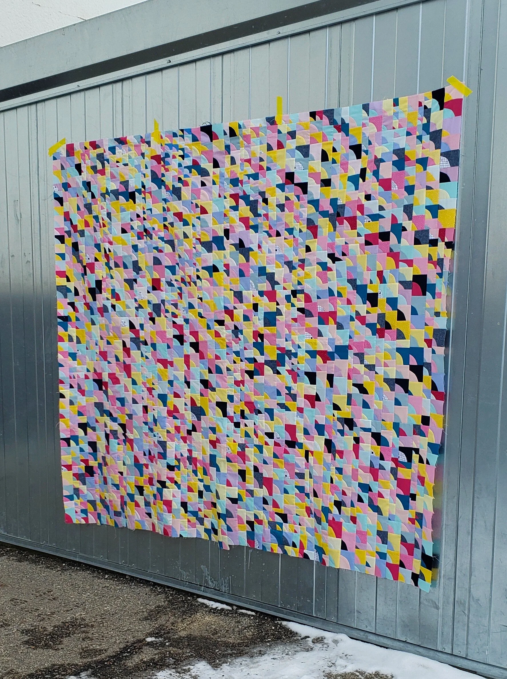
When I passed the halfway mark a few weeks ago I must admit that I had conflicting emotions. On the one hand, I was thrilled that I’d made it this far. On the other, I’d only made it this far?

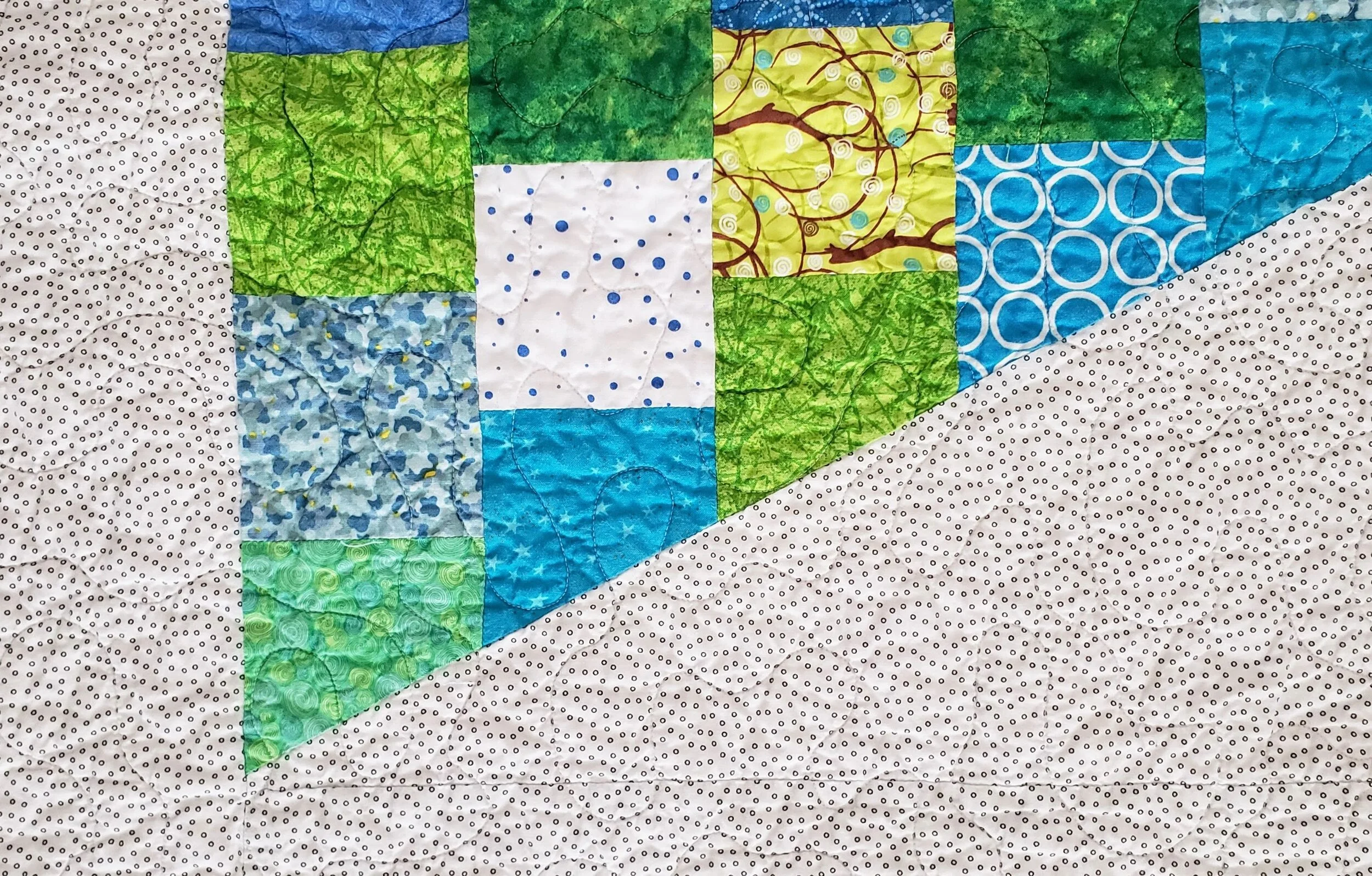
My trip to Australia was nearly 4 years ago, and that is where the original inspiration for this quilt came from. The threshold to a cafe in a little town called Euroa. Turns out that tile was pretty common in Australia as I’ve heard from many people since that they or their grandparents had it in their house. I made the first block… let me check now… in April of 2017.

It took me almost 3 years to get halfway.

I do recall not touching the blocks when I had a bout of tennis elbow. That was months and months of no hand stitching (completely solved by getting a new pillow, by the way). Some weeks and months the work is constant in any down the or pool deck or outside the dance studio time. Then I may not touch a block for a few weeks.

Euroa Quilt Modern English Paper Piecing Cheryl Arkison

So yeah, I may be a bit bummed that it’s taken almost 3 years to get this far, I can fully acknowledge and appreciate that life is life. Also, I am doing this entirely by hand. That’s a lot of work adding up to something glorious. Well, I think it’s glorious.

In the end, I have no doubt that this will be a special quilt. For the memories of the inspiration, gratefulness for the moments of making, gratitude for my hands and body being able to bring this together, and pure love for the beauty. If it takes me another 3 years to finish, then so be it.

All I know is that I wold love to go back to Euroa when it is done to take a picture in its inspirational namesake.

English Paper Piecing Cheryl Arkison

For those curious…

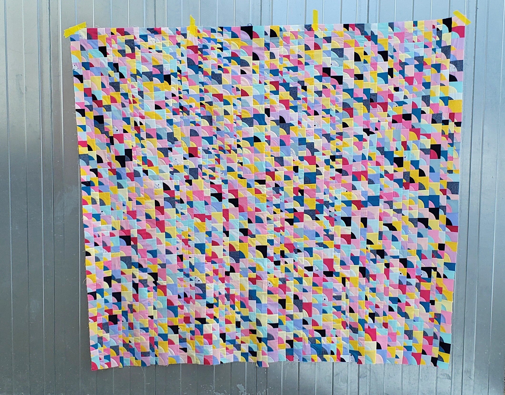
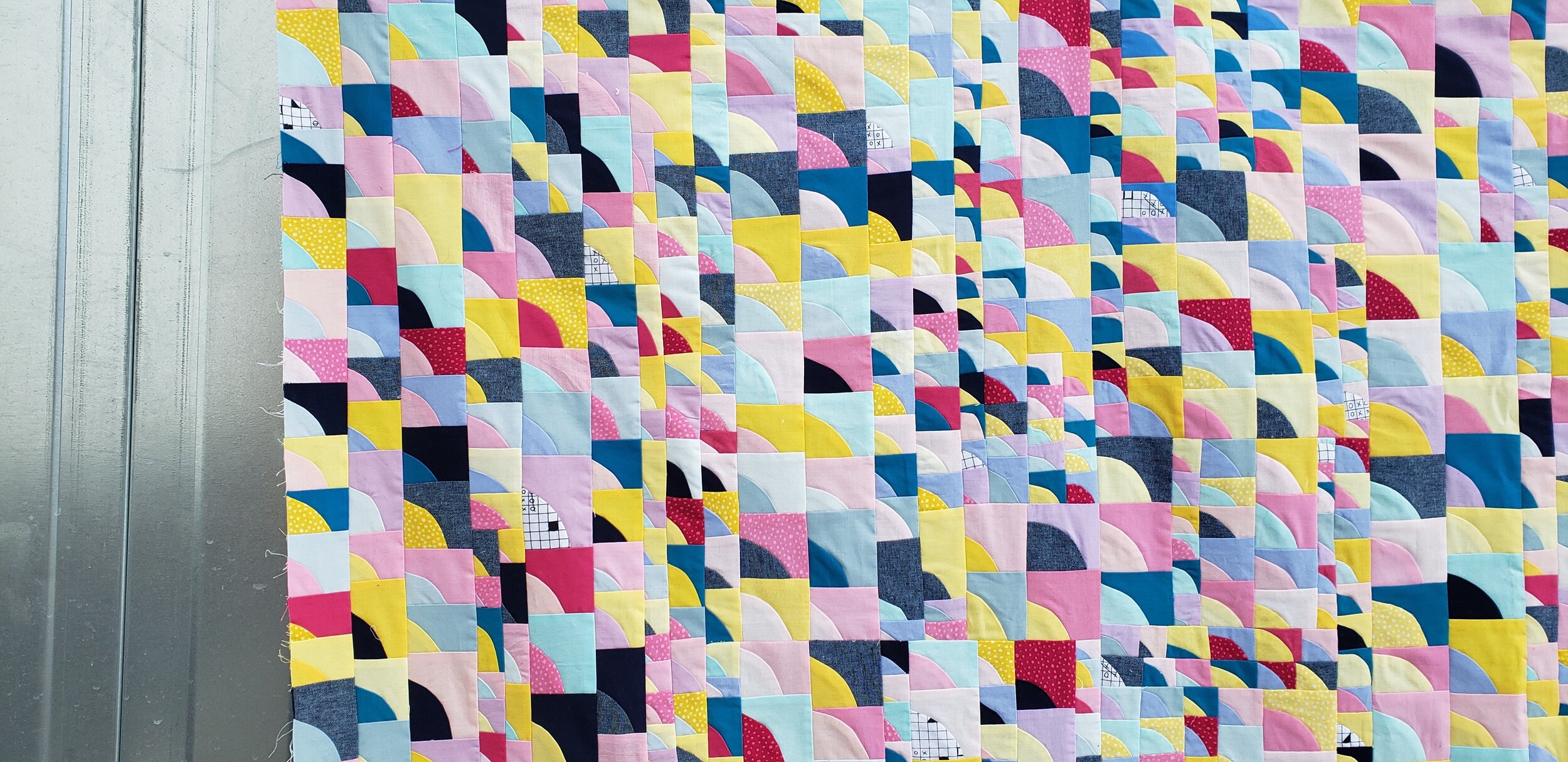
  • Each block contains 16 pieces. I can print the templates on a piece of card stock. Indeed, I designed the templates so that they could be printed easily, that’s why each block is 8’’ square.

  • I pick the fabric for each block in a way I would refer to as controlled random. I have a stack of fabric and try not to have the same fabric too close to itself. Otherwise, I am not too fussy about it.

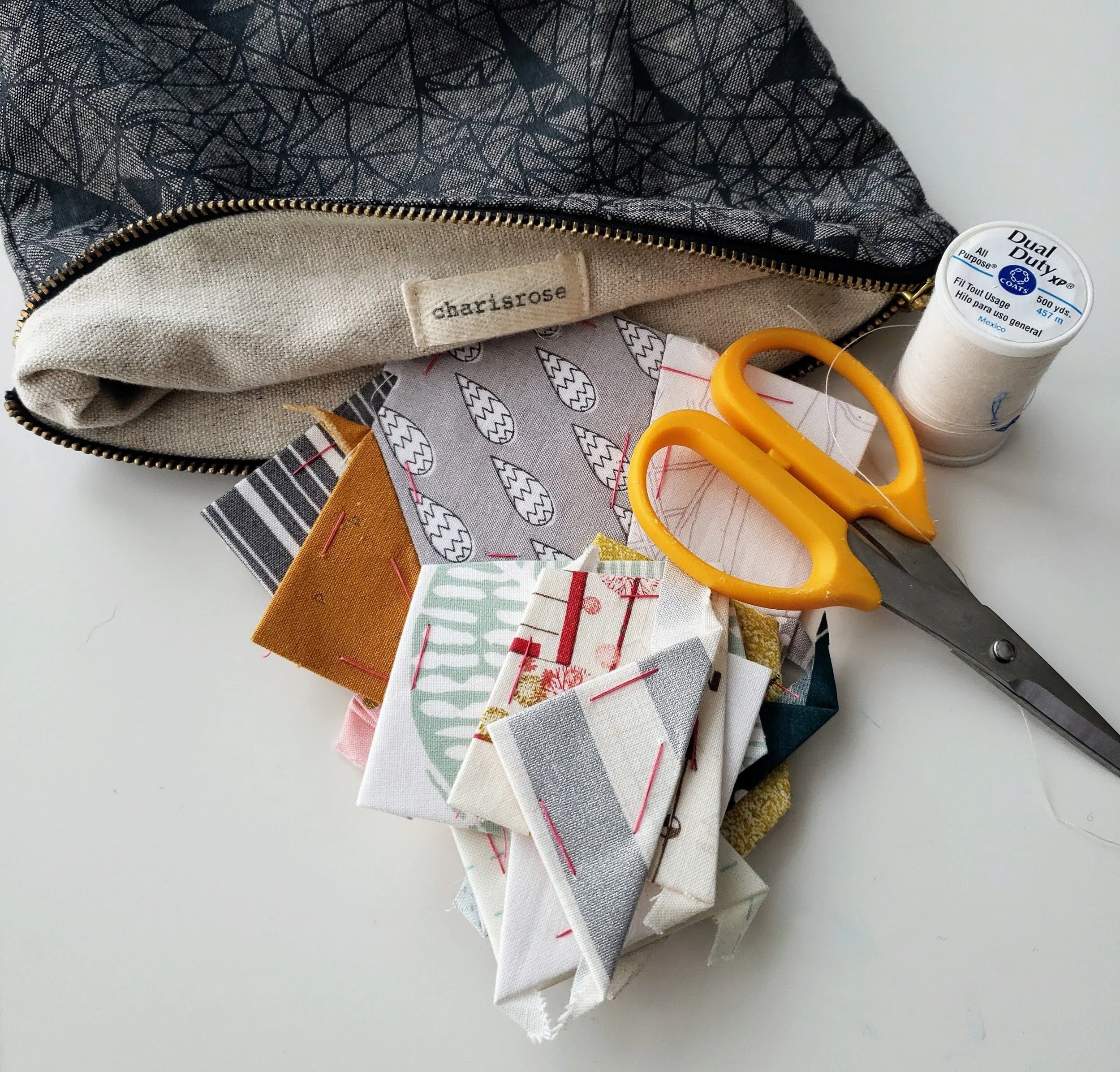
  • Each block gets prepped by cutting apart the template, picking the fabric, glueing the template to the fabric with a dab from a glue stick, then trimming excess fabric.

  • Thread basting works best for me. It is the most portable, a must have option for me. Also, it’s a great way to use the bit of thread left on a bobbin or spool that would otherwise be wasted.

  • Once I have all 16 pieces basted I stitch them together with a flat back stitch.

  • 4 blocks together become a mega block. 5 mega blocks become a column. There will be 5 columns in the finished quilt.

Quilt Bravely - Say Hello to Prints as Background

This is the second in a series of posts encouraging you to be different, quilt different, quilt bravely. To bend or even break some rules while pumping up your creative voice. You have the creative confidence, I’m just here to remind you of it.

Most of the first few quilts I ever made - some 2 decades ago - were pretty colours with a white background. For those first few years I couldn’t imagine how I would make a quilt any other way because it just looked so perfect to me. Well, I’m not sure what changed, but it’s been at least a decade since I made a quilt with a plain white background!

To be clear, I was almost never using plain white, a solid. No, I was using that lovely stuff called White on White, or what we used to refer to as WOW prints. A pretty shiny white ink on white fabric. Now, of course, the whites were never all the same and this row of fabrics in any quilt store will read from bright white to eggshell to cream.

Side note: if you ever find that white ink to be too bright, use the wrong side of the fabric. You get the idea of the print without the glaring brightness of the ink.

Then I discovered low volume prints. There weren’t as many then as there are now, but they definitely existed. More often than not that can still be located in the black and white section of the fabric store. Only now you can get a lot more choices of coloured ink.

I do find that people are afraid to use prints in a background, worried that they will overwhelm the design. Or, they are used and the design disappears. Here are two fundamental lessons to making sure neither thing happen.

Value Matters

Value is the relative light and dark of a fabric. The key word being relative. It is about what the fabrics look like next to each other. If you want your design to stand out, then you need good contrast between the main design components and the background. This matters especially so when all the fabrics are prints. It isn’t enough to just have colour contrast, or maybe you want a monochromatic look. Either way, making sure the value of the background prints contrast with the design elements is important.

You also want to make sure that your background prints are all of similar values. They don’t have to be match match perfect, but aim for similar. This leads to the next key lesson.

Sewing Machine Quilt, check out Pattern Drop

Sewing Machine Quilt, check out Pattern Drop

Texture Matters

Texture is the look or density of the print. Is it a sparse, large scale print with negative space between design elements? Is is a dense text print with little space. Side by side, the dense print will look darker.

It isn’t that you have to pick prints where they are all the same density, but knowing that some will pop while others will recede allows you to balance their use across a quilt. And if you have one print that really seems to be taking over the background you can do two things: remove it, or add more similar prints, so nothing stands out on its own.

Colour can make a difference in backgrounds. Be willing to experiment with pale colours instead of white. Pick multi coloured low-volume prints instead of black and white. Mix grey with black and white. Or heck, make your main design elements a light colour and your background a delicious, dark print.

Have fun playing with prints. They are a pure delight. And we have such amazing fabric designers in the world providing us with endless inspiration.

Check out the first in the Quilt Bravely Series: Creatively Contrasting Binding.

For more details on using low volume prints as background make sure to check out my book, A Month of Sundays. It gives you all the lessons!

Itty Bitty Improv Curves - A Quilt Top

Itty Bitty Curves 3 Cheryl Arkison

No one prepares you for the emotions of making a quilt. The thrill of picking fabric. The boredom of cutting fabric. The thrill of sewing. The boredom of pressing. The thrill of finishing a top. It’s a roller coaster journey for sure. And this is not counting the therapy contained within the emotional journey. Quilting can often have me working through some stuff, processing and feeling the feels while making a quilt, to have the release at the end.

Sometimes, though, the opposite happens. The quilt making gives you all the thrills and makes you smile with each stitch, no matter the work. Then you finish and there is a let down. There was so much joy in making that when you finish you are sad. I want to keep going! Don’t make me stop.

Alas, I’ve run out of fabric.

Itty Bitty Improv Curves Cheryl Arkison

I started this quilt with some scraps, a stack I grabbed for the initial class with the amazing Chawne Kimber at QuiltCon. Once I embraced the itty bitty curves I made in her class I eventually augmented the selection - more from the recesses of my stash and a trip to a local shop. I tried to match the colours of the vintage pieces (I think some of these purples came from my Baba’s house) and samples as best I could. With no real plan in mind other than to make blocks I made blocks until I more or less ran out of fabric.

Okay, there is a bit of fabric left, but not enough to make a random assortment of blocks. If I continued on I would have a big pink section somewhere. Yes, I could buy more, but I can’t replicate all the fabrics so, again, it would look less random. It pains me a little to not have this be a giant quilt, but so be it.

Itty Bitty Improv  Curves Cheryl Arkison

So with not enough fabric left to make it bigger I’ve stopped the sewing. It measures into a generous lap size (73’’ x 66’’). Considering the smallest blocks are finishing at 3/4’’ that amounts to a lot of piecing. Not once did that piecing feel like work or drudgery. It was addictive. Better than eating M&Ms, although the let down kind of feels like a sugar crash.

The whole quilt isn’t square and I’m not sure exactly how I will deal with that, but for now, let me wallow in it being done. And count the number of blocks. 1,2,3,4,…1000, 10001, 1002…

Chawne warned us about going small, that the high from it was glorious. That only means the low of finishing is that much so. That’s okay, I’m not done with itty bitty curves yet, even if this quilt top is finished.

Morning Make - January 2020

Learning poetry

Back in elementary

Haiku was the start

Cheryl Arkison Haiku

Do you remember back in school and the famous 5-7-5 syllable count of learning Haiku? We were taught it then because the perception is that they are easy, simple, elementary. And while you can write one following the count rule, that doesn’t mean they are any good!

Haiku is a form of poetry originating in Japan. Initially, they were written as objective, pictorial pieces. They usually described something in the natural world or made seasonal references. Quite often there are two subjects, contrasted through the visuals the words present. Haiku is subtle and can be both melancholy and beautiful.

For January I decided I would write one haiku each day. I threw out the subject conventions and mostly ignored the other rule about the subject contrast. At least, I didn't much care if that happened but tried to do it some times. Now, I am not a poet by any stretch of the imagination, but I do like words. I love the way we can express emotions and the sparseness of 17 maudlin syllables was inspiring. Most of the haiku reference what was going on in my life at the moment, so they serve as a diary too.

Here are some of my favourites from the month:

People I don’t like

Invading my dreams last night

Woke up feeling gross.

(January 10)

Lazy Sunday start

Because it’s damn cold outside

That hockey game though

(January 12)

Love overflows yet

It pools at my feet almost

Unconditional

(January 15)

Wrestling tournament

Time to display savagery

But nails must be cut short

(January 21)

Nocturnal living

Invited by pain that keeps

Sleep from persisting.

(January 25)

Seek joy. Take comfort.

Compassion for my body

My heart needs it too.

(January 27)

A daily habit

To jumpstart creative flow

And ease anxiety.

(January 29)

February is here and I’ve laid the pen down for a needle and embroidery floss. Follow along with my Morning Make on Instagram. Better yet, join in! #morningmake is the hashtag.