improv piecing

Much Needed Play with Ravel by e bond

Before there was such a thing as an influencer we had celebrity endorsements. When real people started to become more popular through blogs we simply called them bloggers. As a quilt blogger it was quite common to receive or at least be offered fabric. The catch being, of course, that you would make something to promote the fabric. Ideally, you would do that to coincide with either fabric purchasing for stores or the launch itself in stores.

Many times I was offered fabric. The first few times you get super excited and jump at the chance. Free fabric and exposure?! Sign me up. Then we realized that we were giving away free labour and not really getting paid by the fabric companies to use us as promotion. Not really a fair deal for the time invested. On top of that I was positively AWFUL at actually making something with all the shared fabric in a reasonable time frame. I was, frankly, a crappy promotional partner. So working with me to promote a fabric line was a bad deal for both parties.

On top of all that, I always found it very difficult to work with a single fabric collection. It felt stifling, creatively, and was always a challenge because of one common issue with fabric collections: the majority of the fabrics are the same value. This means it is hard to get contrast in your designs. As a result, many designs made with a single fabric collection, without the addition of other fabrics or neutrals, can fall flat.

So, no matter how much I’ve loved a collection, I rarely buy a single line of fabric. Instead, I pick favourites or the most interesting or simply what I need at the time.

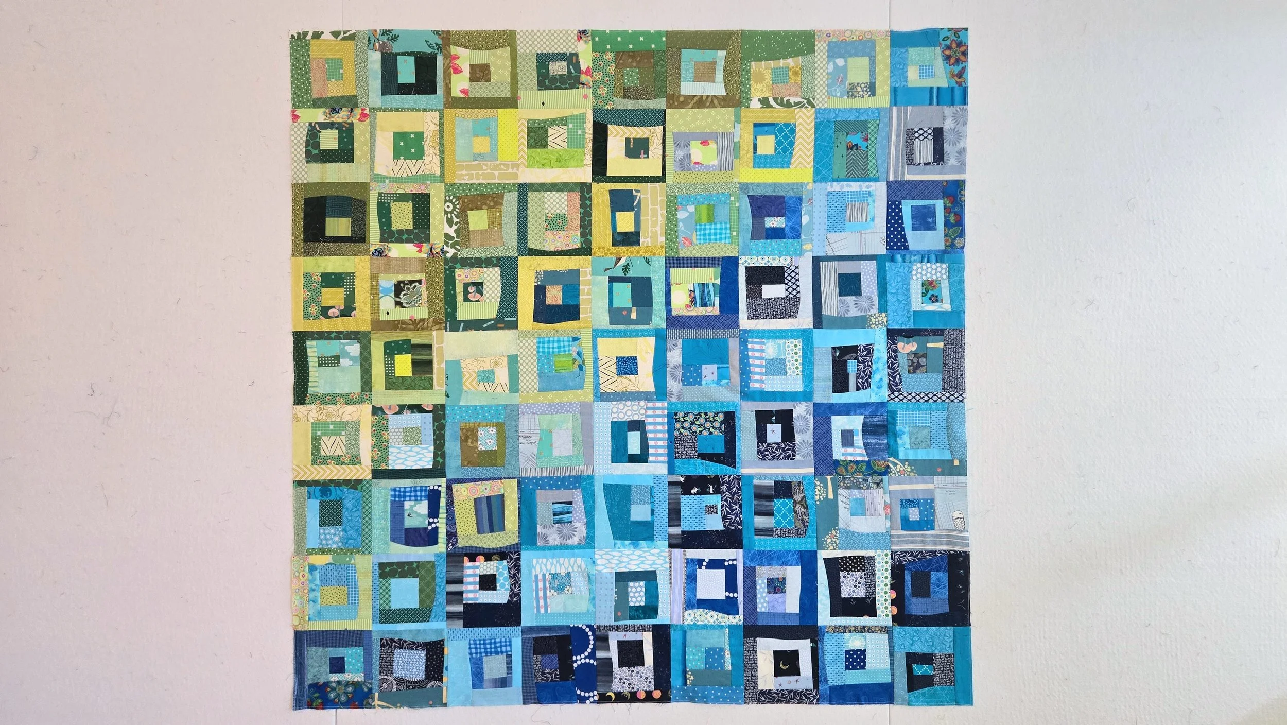
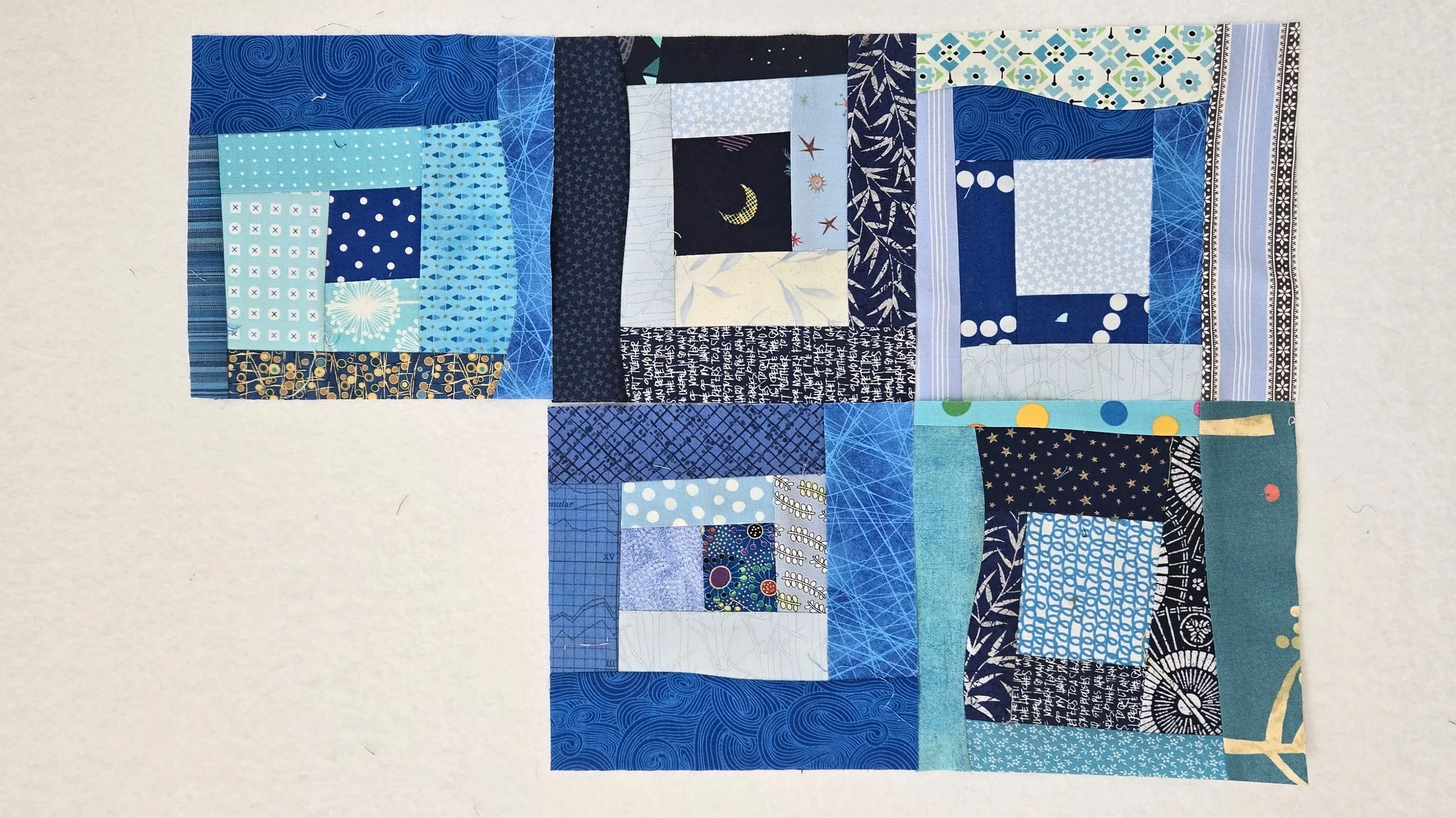
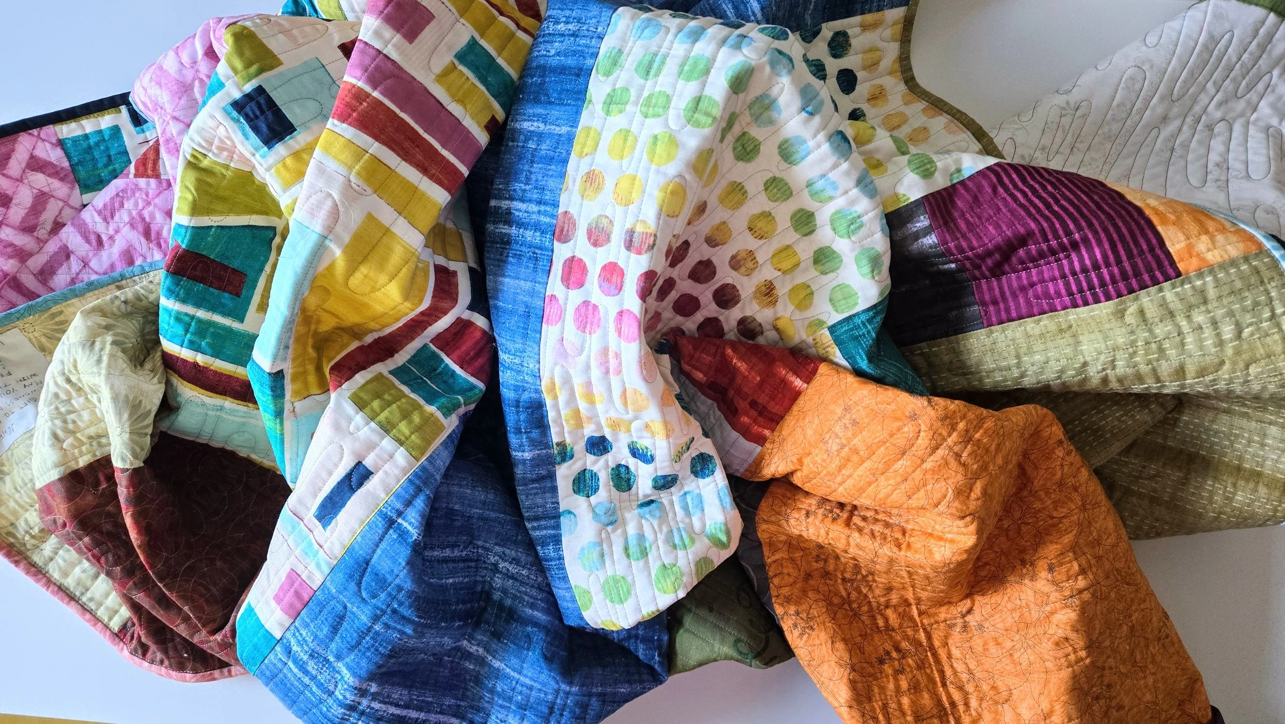
I could not resist, however, when I saw e bond’s Ravel collection. I love everything about it! The colour, the text, the graphic nature, the graffiti... and while I've never met e, her online presence is inspiring and real. I've had it for a couple of months and just started playing with it. Not only did I buy the whole collection, I'm using it all together. Who am I?

Yes, a good chunk of the fabric falls in the same value family, but there are enough contrasts with the lights and the darks as well as the texture of the prints that things seem to be working so far. I couldn’t resist though, I did add in a few solids for fun and respite.

I have no real plan for the quilt. I’m just playing. Life has been quite heavy of late and none of my current projects were giving me the joy I needed from my quilting. I’d sat with the fabrics and obsessed over coming up with something just right. That was taking all fun out of it so I decided to just grab some fabric and cut. I defaulted to my comfort of improv curves, primarily, but other things come up here and there and I let them happen.

Normally, when I make an improv quilt that is block based, I make all the blocks and then figure out a layout. This time around I am enjoying adding and subtracting and playing with composition as I go. Not so much planning each block as an individual unit, but seeing how a few blocks might talk to each other. A conversation. As it grows I am really embracing the chaos it brings. It’s a wild thing. In a way, it reminds me of a spot under a bridge with layers of graffiti marking the lives of people who’ve been there.

Wildfire Quilt

It’s scary to think that wildfire season started here in February. February, when it is supposed to be cold and dark and snowy. February, when we are cocooning and only dreaming of summer days and the dappled light of the forest. Not this year. Wildfire season already started and, indeed, zombies fires from last year still burning.

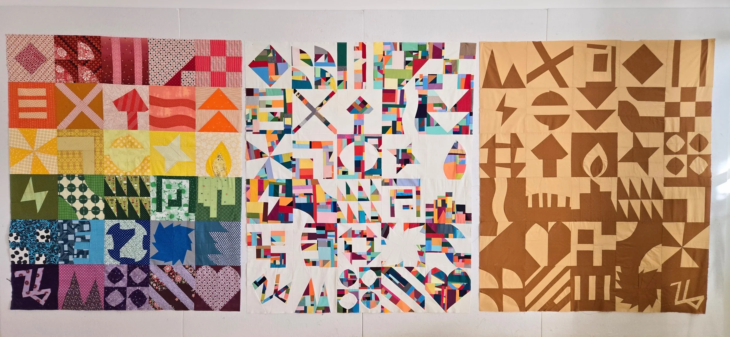
This quilt started life as a fun experiment and sample for a Cut, Sew, Repeat Playcation. I used it as a sample in the class then had fun continuing the play. The entire time I played and sewed I saw it vertically and just about the interactions of the colours. Then, the night I was basting it, I saw it horizontal and only saw the wildfire influence. Then I couldn’t unsee it. So I ran with it, adding quilting to accentuate that design aspect.

For the quilting I used a coordinating thread for each band of colour. It was a mix of Wonderfil and Aurifil 50 weight cotton threads - whatever colour I had around that worked well. In each section I changed my free motion design. The orange, obviously, had flames. The green was a triangle meander that I’ve used once before. I don’t know what you would call the blue section, it’s some kind of hatch but not really. The purple was a wavy meander for the sky/smoke. Breaking it down like this not only made it manageable from a working perspective, but really accentuated the overall design.

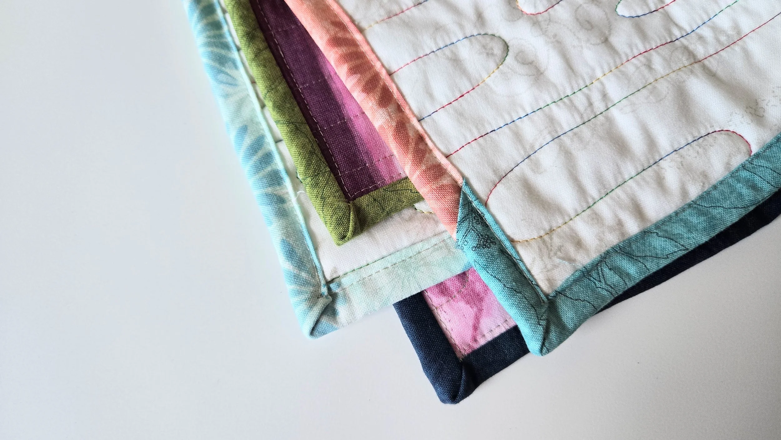
Binding the quilt was straightforward. My usual high contrast binding was not going to work here so I went with a charcoal grey. I want to say it is symbolic because of soot and ashes, but really it is about picking a neutral to frame but not take away from the quilt. Black was too dark, too sharp. The grey was perfect.

Most of us here are worried about what the coming months will bring for fires. We did not nearly have enough snow cover and cold temperatures to give our forests and grasslands a proper break. We can hope for a wet spring, but that brings its own challenges. With a kid with asthma that definitely gets triggered by poor air quality, wildfire season takes on another meaning too.

In my previous career I worked on the climate change file. I started there over 25 years ago, working to convince a lot of people that we needed to act, acting in industry where we caused a part of the problem. I had to leave because it got so disheartening, if I am being honest. While I am glad that I no longer have to define or explain climate change, if that had happened 25 years ago we might be in a different place.

Working Title for This Quilt: Happy Scraps

Barbie Pink became a trend right when I needed it. Hot pink is always a dopamine hit for me. I will seek out the colour on a down day, fixate on things in this delicious hue until I feel myself smile.

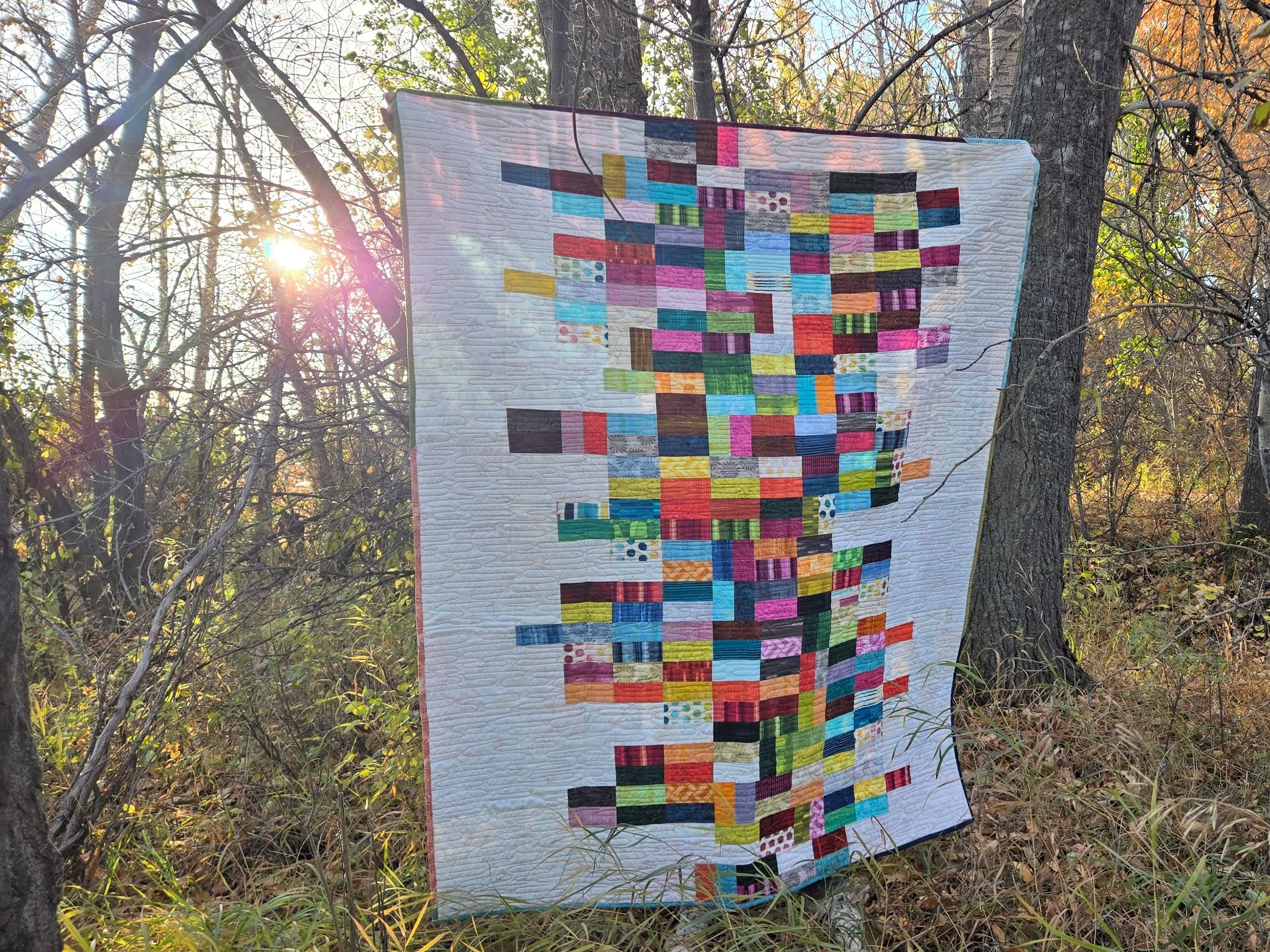
This particular quilt started as a mess on the flower. More than a decade ago my son was playing at my feet as I wrote. He pulled down the coloured scrap bins and had a grand time throwing fabric around. He was happy and I was sewing so it was a win win situation. When it was all over I had a mess of pink, orange, yellow, and a grey scraps all over the floor. Clean up got a lot more fun when I simply started sewing. That’s right, I grabbed two pieces from the floor, sewed them together, and repeat until all the pieces were picked up. A much more enjoyable way of cleaning up! A little while later I had a small quilt top.

Then it sat. And sat.

Last year, as I finally felt healthy after a years long depression, I embraced all the pink in the world. This quilt, then, came to mind. The top I made more than a decade ago was a small, awkward size. I generally don’t worry too much about size, but I wanted this joyous one to be big enough to snuggle with myself. Luckily, I never have a shortage of scraps. I simply sewed pieces together, making slabs to ‘border’ the original top. I assembled them log cabin style around the original in the hopes that it would blend more.

It gave me such joy to finish piecing her, to play with this colourful fabric. There are some treasures in here, some long time and recent favourites playing together. I will never not smile looking at this quilt top.

Kayleigh - My Version of a Fall Quilt

Kayleigh

70” x 70”

Along with her friends Ashley, Ashleigh, Brittany, and Angelica, Kayleigh loves her pumpkin spice, wide brim hats, and the stackers that the cooler weather brings. Or even just the hint of cooler weather. Time to put away the spaghetti straps and flip flops, bring on the boots and oversized turtleneck sweaters. She’s sweet but not all that smart. She’s kind but not all that generous. But she will always open the wine. And she always finishes the book for book club. Who wouldn’t when wool socks and warm quilts keep you company while you read? Kayleigh is fall.

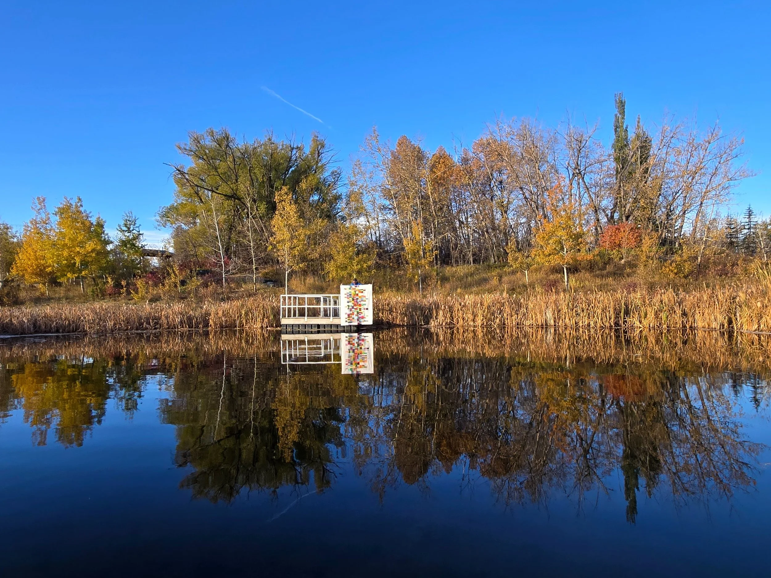
Okay, so my version of a fall quilt is a little less stereotypical than your basic girl hunting for pumpkins. It’s a function of where I am. Here in Calgary we don’t get a lot of the rich reds and oranges of your New England fall. We get gold, so much gold. We get blue skies in late September heat. My fall quilt reflects that.

I didn’t actually set out to make a fall quilt. The whole thing started with an experiment with a square in a square technique. You know, I had to see if it could be done improvisationally. Of course it can! I loved it so much I taught it as an online class - a Quilters’ Playcation Playdate last year. Then the colour combo of blue, yellow, and coral made me so happy I decided to just keep going! On a walk last fall I realized that these indeed were the colours of our fall.

I can hardly believe I actually finished the quilt already. My quilt tops tend to sit for years. Fall is here though. While pumpkin spice is not my thing - unless actually IN a pie - I do enjoy exploring nature as the season changes. So when I had a long arm appointment booked a few weeks ago I made sure to bring this quilt top and give her her due in the right season.

She is quilted with Wonderfil Tutti in a variegated yellow (TU01) with deco bob in the bobbin. I rented time at My Sewing Room on their Bernina long arm. In a little over 2 hours she was quilted! Nothing fancy, just an all over loop de loop design. There is no point going too fancy because you won’t see the stitching on such a busy quilt.

This is a great example of using prints and not being afraid of it! Most people call this look scrappy. It works because I paid attention to both colour and value as I made each set of squares. There are actually 5 of each fabric combination. I made five at a time simply so I could chain piece without getting confused. I would pick the four fabrics I wanted in the blocks, start with a centre square and build out. Each block wanted to finish around 7.5” so I decided to make 100 blocks in total. That meant I need 20 sets of blocks. To keep order with all these fabrics that meant I did 10 sets that went warm-cool-warm-cool, and 10 that went cool-warm-cool-warm. That way, when it came time to laying out the quilt top I could alternate the groupings for an effective layout. I think it worked well!

I also paid attention to value, although not as fastidiously. Some blocks have high value contrasts between each round, some are lower contrast. I like that mix of bold and soft. I did, however, pay more attention to value when laying out the blocks to make the quilt top. The really bold blocks and the really soft spots are spread throughout the quilt, so no one area commands all the attention. This is what I call managing the bossy blocks.

The back is pieced from things in my stash. Nothing fancy.

She is bound with a Heather Ross reprint. I tried a number of different colours and fabric and felt the white was a nice tough. As you probably know, I usually like a high contrast binding but it wasn’t right here. There is just a touch of pink in the print, though, that makes me smile.

Our days haven’t actually cooled off that much, even though the colours are changing. Which means there isn’t a huge need for a fall quilt just yet. She came in handy at a cross country race as a soft place to sit. And the evenings are getting longer and a bit colder. If I sit by the window I definitely need a quilt. Besides, pumpkin spice is already at the coffee shop so it definitely means fall.