colour

Morning Make - May 2020

Morning Make Hand Applique Cheryl Arkison

At the end of April my son decided to learn how to sew All. By. Himself. He made 2.5 quilt blocks, they were awesome. He told me he wanted making a quilt big enough to wrap around himself. He also said he wanted to start the day with sewing, like me. So rather than have any machine work on the go in the mornings I made May Morning Make about hand stitching so I could be available for him. And he hasn’t sewn a stitch since!

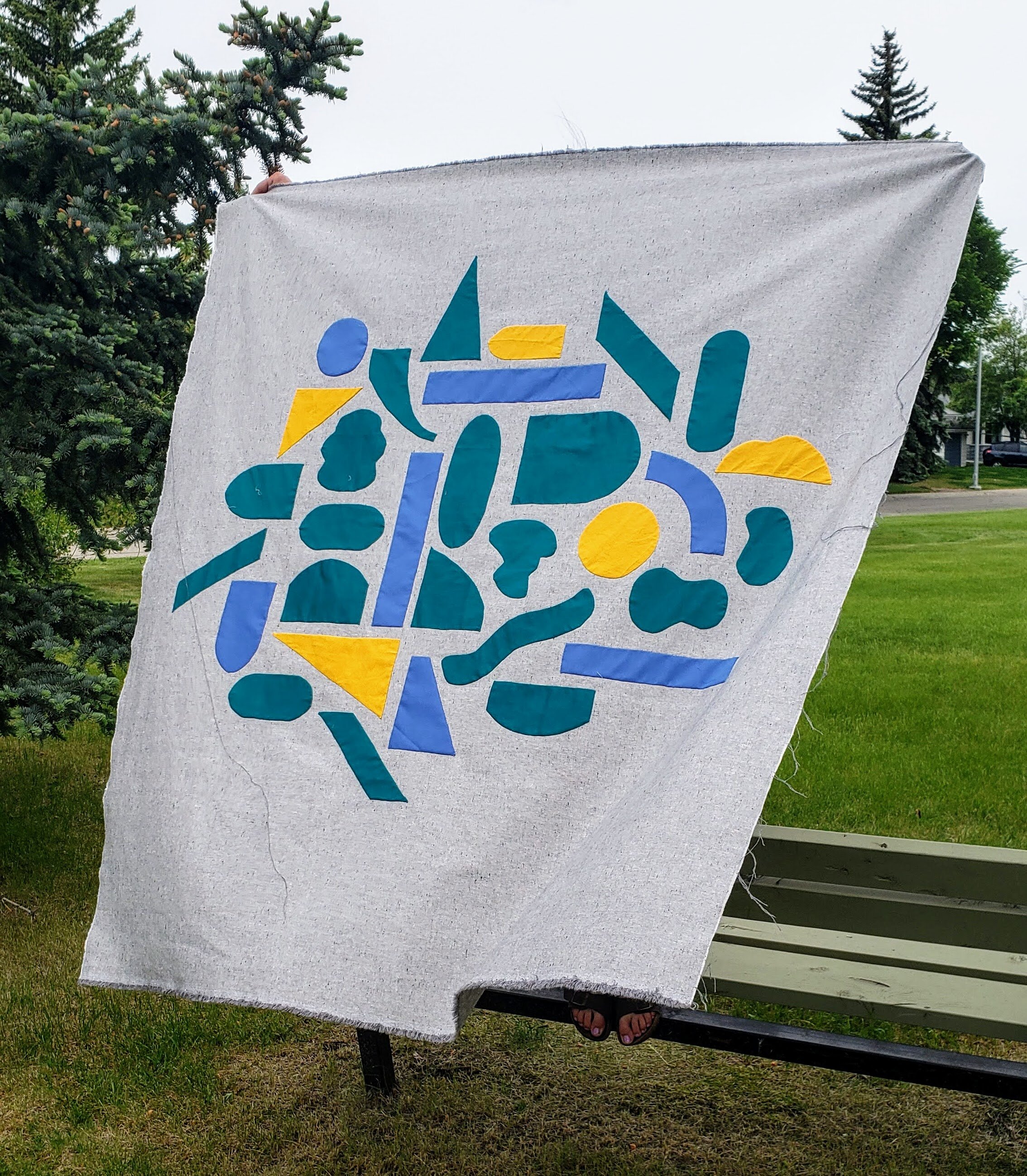
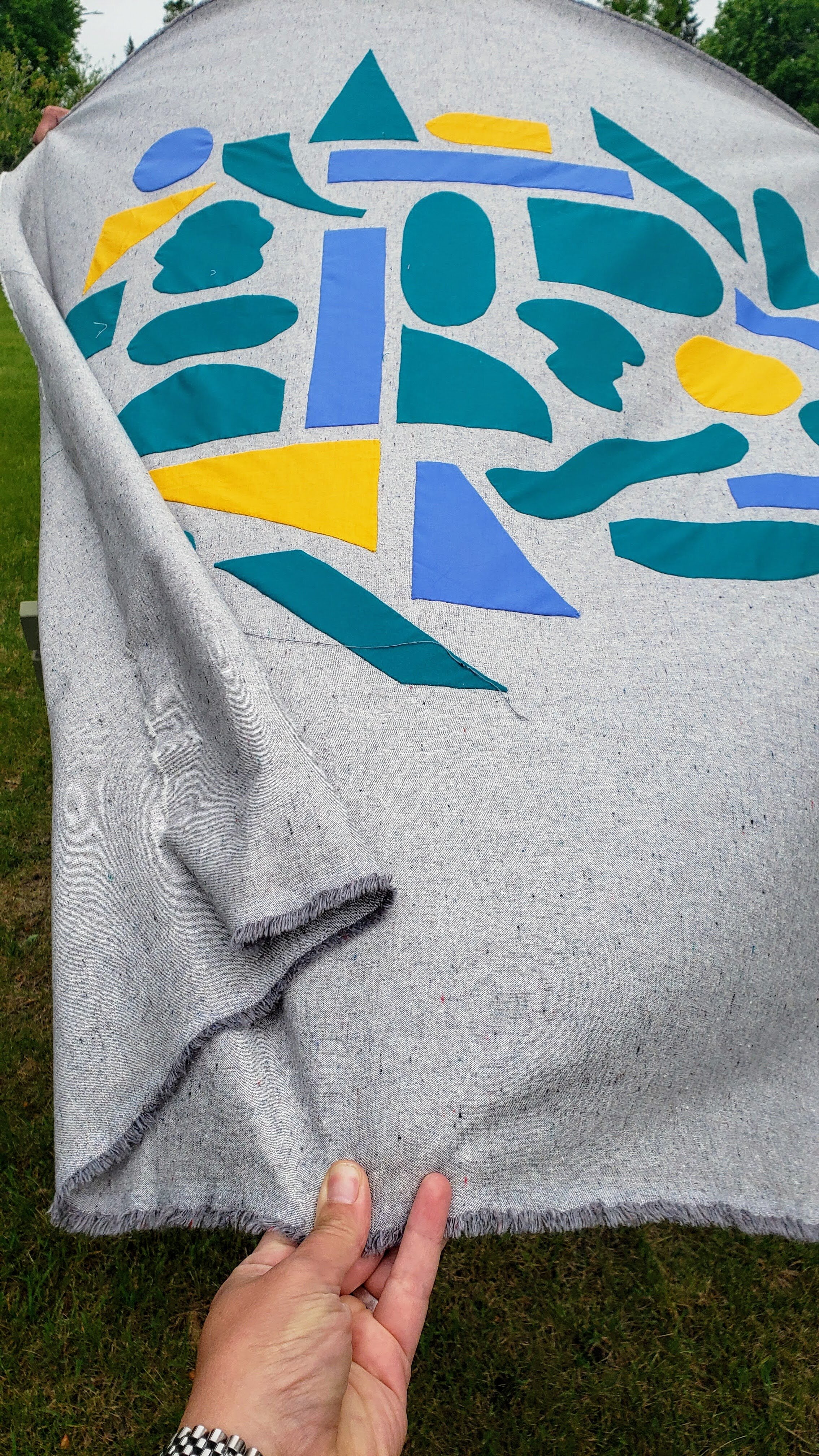
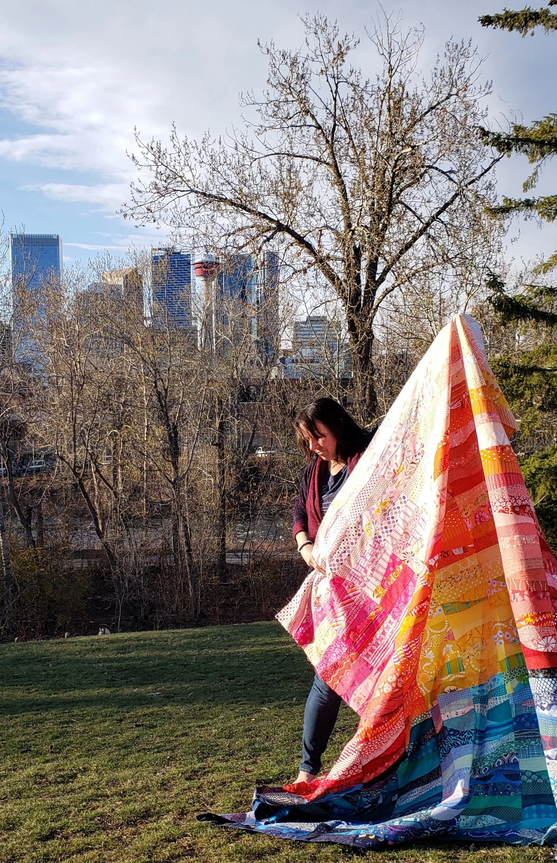
I, however, got a quilt top finished in May with that hand stitching. One applique shape at a time.

Aurifil 80 W thread

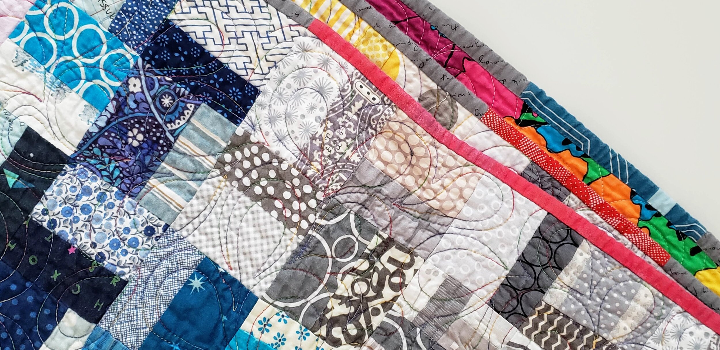
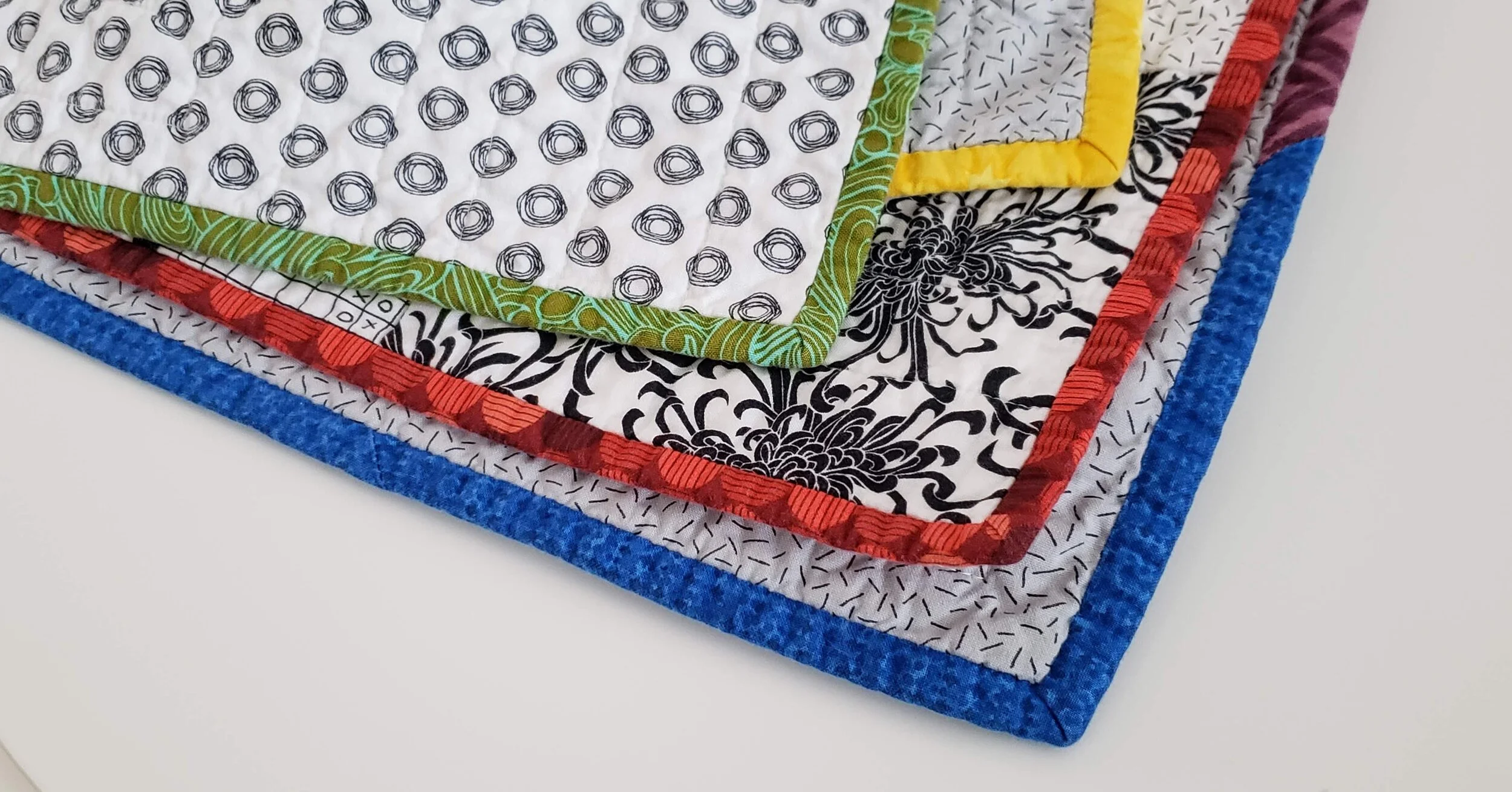
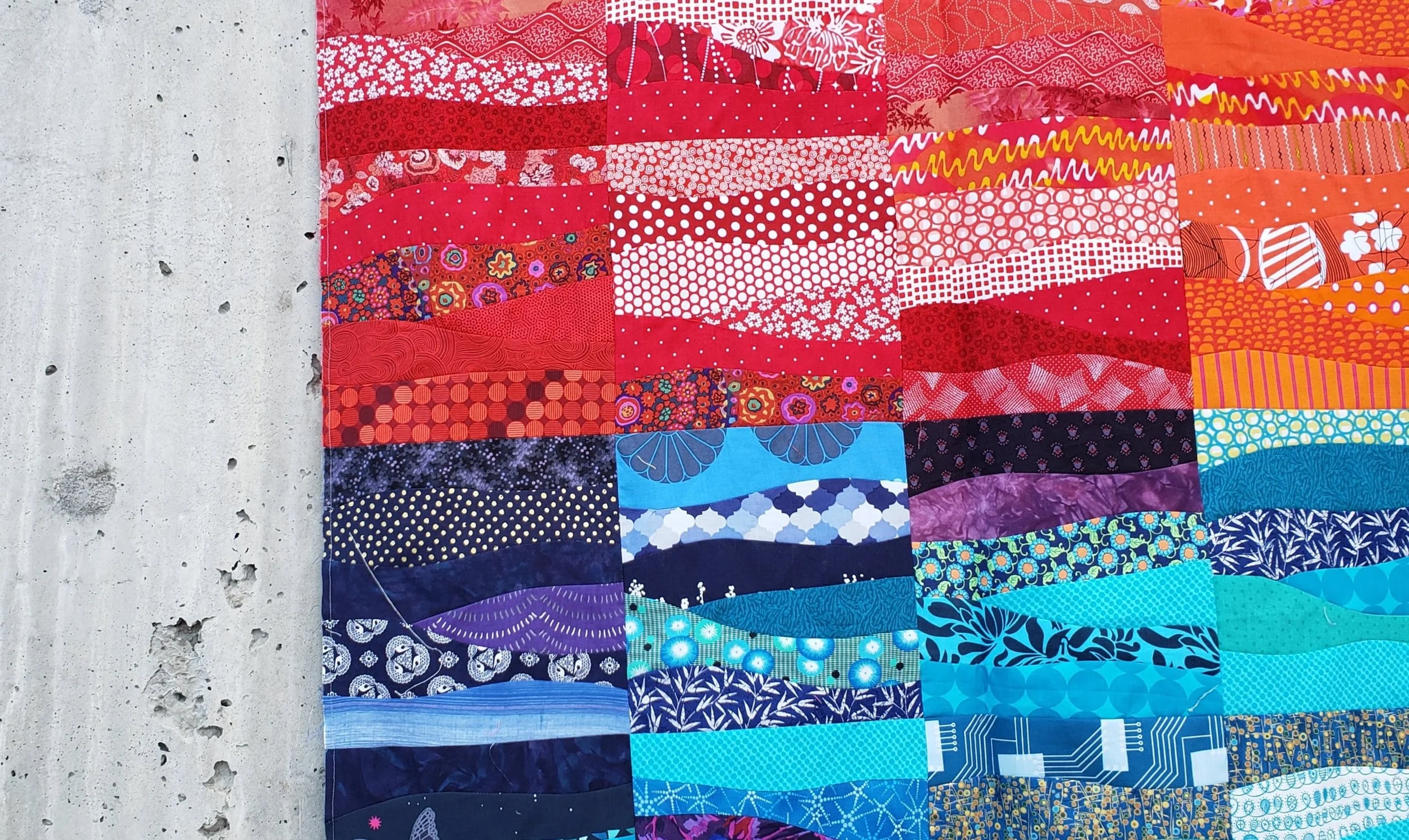
The background fabric was a single piece of linen I picked up in California years ago. It was intended for a different applique project, but things change! I liked that it was a single piece of fabric, as opposed to something I had to sew together. It also constrained the project in a good way. As for the other fabric choices, I simply went into my solids bin and picked mostly based on size. And ability to match with thread I already had in the house. The green and the periwinkle came first then I chose a yellow to have some pops.

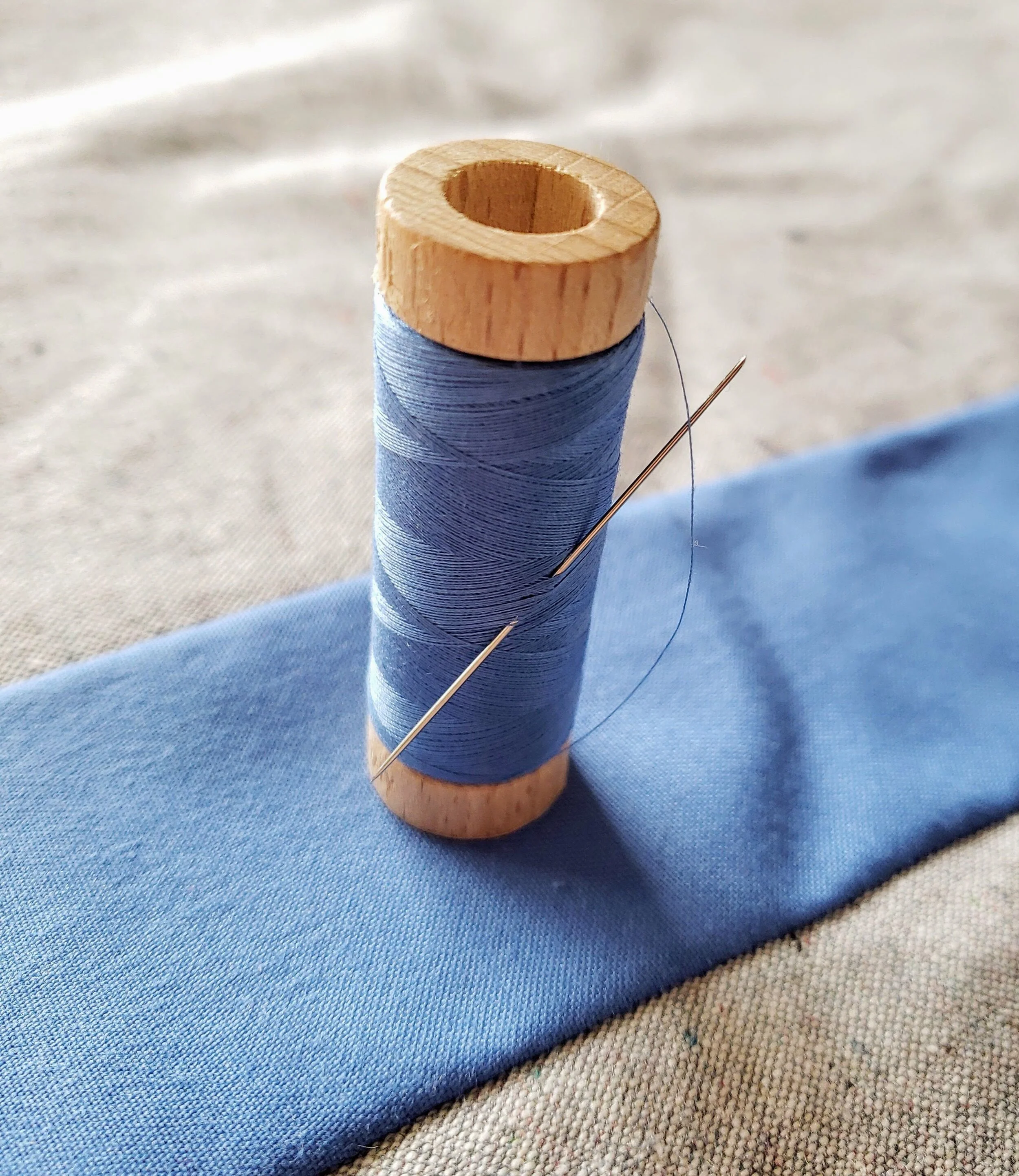
It was absolutely coincidence that I had the spool of Aurifil 80W that matched this vintage mystery fabric in periwinkle. But using it made me want this thread in ALL. THE. COLOURS. for any future applique work.

Improv Applique Cheryl Arkison Modern Quilts

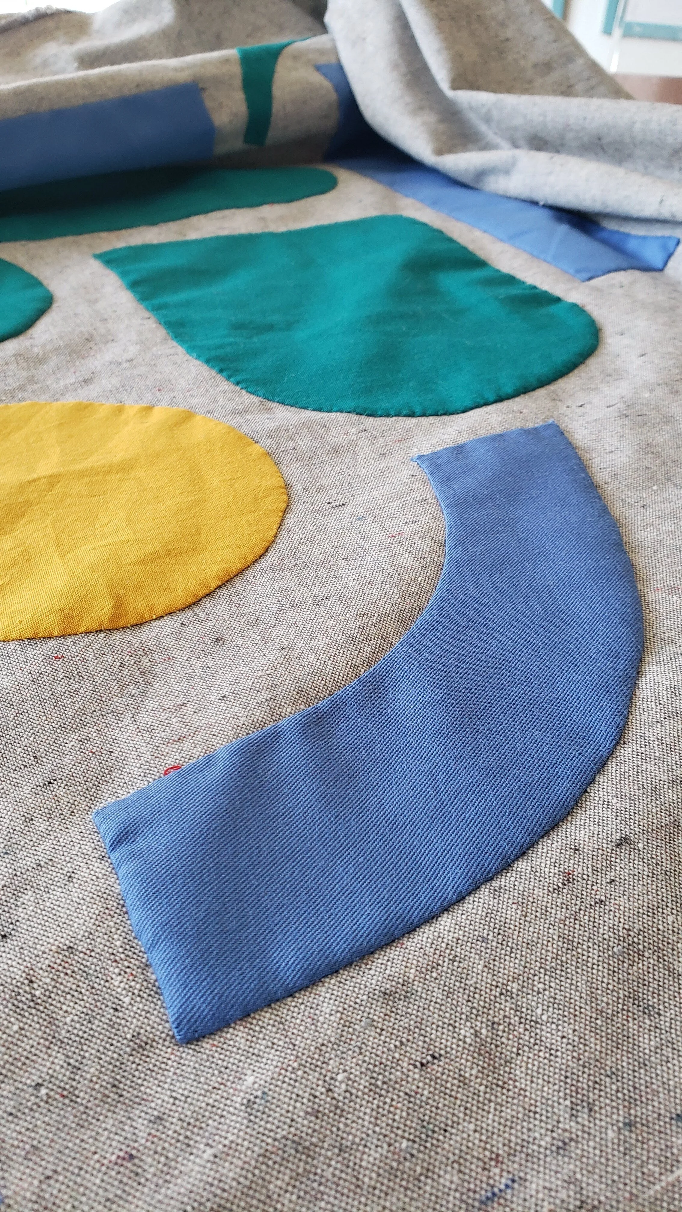
Other than having a general idea of a collage, I started and progressed with no real plan. It looked quite questionable at the beginning, I won’t lie. But halfway through the month I could see the vision come to life. Every couple of days I cut a few shapes out fabrics. Some general shapes are repeated, but never measured to be the same. By cutting a few at a time I could have a bit of control over the distribution of colour. Then each morning I would pick a shape that motivated me or looked good that day and stitch it on.

While it’s been a while since I did any applique, I stuck with my tried and true basting technique. I didn’t invent it, but I will certainly sing its worth.

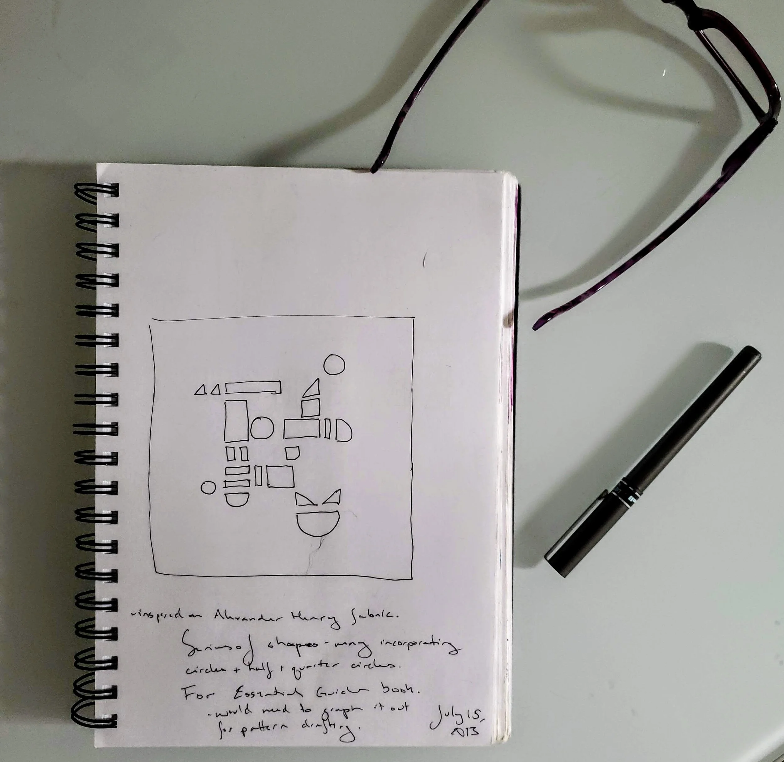
The original influence came from the collage and painting work of Lisa Congdon as well as the watercolour marks made through Lisa Solomon. That being said, when I was flipping through old sketchbooks I came across an image I made seven years ago that could definitely also be an influence.

Cheryl Arkison Sketchbook

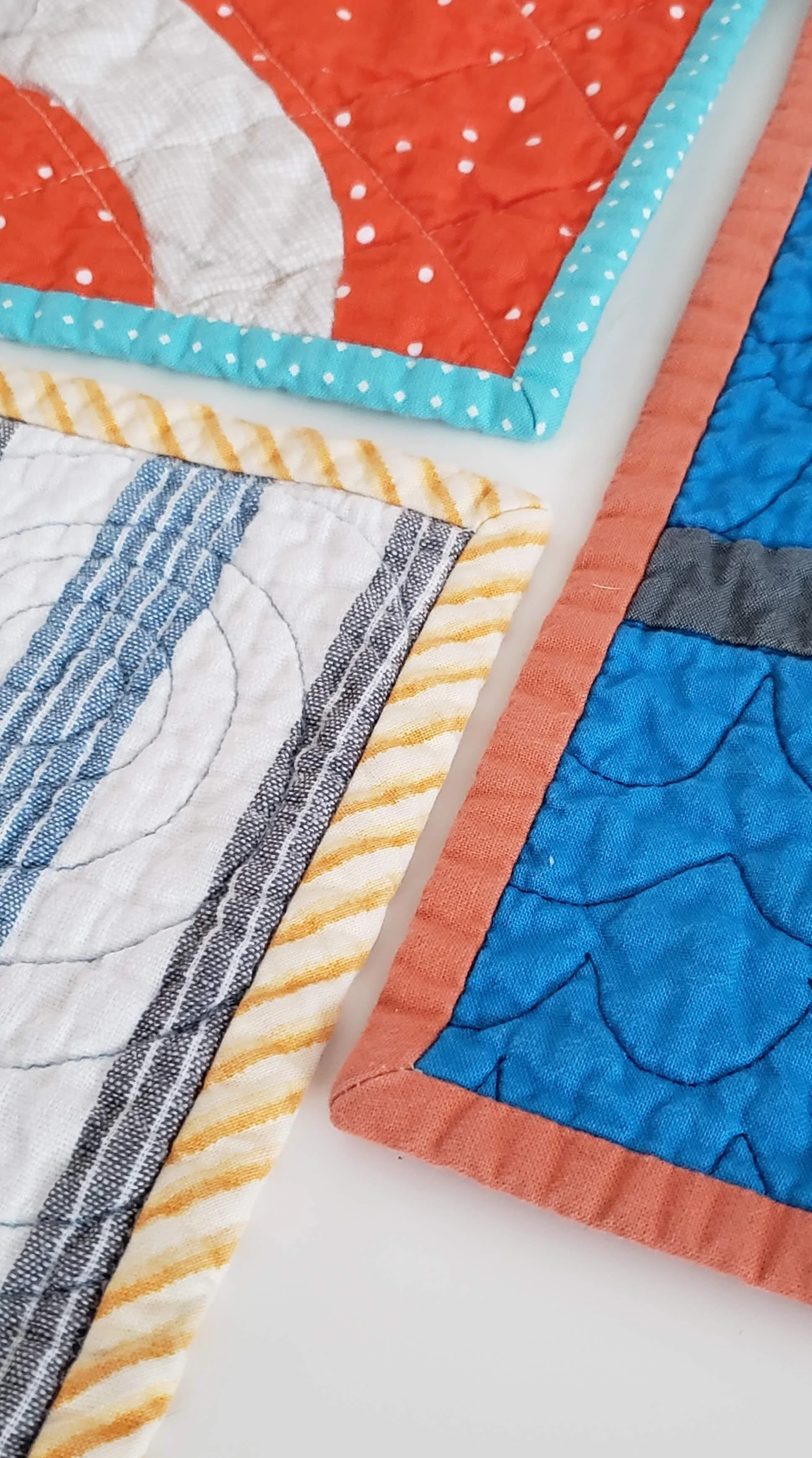
One of the most difficult parts of an applique project for me is then deciding how to quilt it. A part of me worries about ruining the applique with quilting. Or questions whether I should highlight the applique or ignore the specific construction. Needless to say, this quilt top will sit for a bit while I figure it out more.

We’re halfway through June and I decided to put the needles down entirely for Morning Make. And my son still hasn’t sewn anymore himself.

Improv Applique Cheryl Arkison

Quilt Bravely - Creatively Contrasting Binding

This is the first is a series of posts encouraging you to be different, quilt different, quilt bravely. To bend or even break some rules while pumping up your creative voice. You have the creative confidence, I’m just here to remind you of it.

So you need to bind a quilt? You might be one of those quilters who not only selected their binding fabric with the rest of the fabrics but also made your binding before needing it. That would be awesome! This post is for those of us looking to jazz up our quilts with binding, not just treating it as an afterthought.

Binding selection generally comes as the quilting winds down. Maybe even as the quilted quilt sits and marinates or you muster the energy to do it at all. You might have a default binding - black and white stripes, anyone? You might search for just the right shade of blue that coordinates with everything in the quilt and the quilt back. You might pick the stripe from the fabric collection that the quilt top is made from.

My challenge to you is to embrace a contrasting binding. Whether in colour, style, value, or design a contrasting binding might be exactly what your quilt needs for a stellar finish. If not contrasting, think creatively about what choice you can make. The unexpected one is often the exact right one. Here are some great ways to play with your binding selections.

Colour Wheel Contrast Binding Fabric

High Contrast

Use the colour wheel or simple preference as your guide. Pick a colour not even in the quilt top but that coordinates nicely. Using the colour on the opposite side of the colour wheel is an excellent way to do this. For example, orange and blue.

Shiver

Stripes

(yet to be shared)

Binding Fabric Selection

Highlight a Little Used Colour/Fabric

If you have just a little bit of a colour in the quilt top use the same colour binding fabric to wrap it all together. The examples above show me pulling out the green in the background print, even though there is no other green in the quilt top and using the same coral fabric that is only used sparingly in a quilt with 100 blocks.

Smooch

Lilla

Quilt Binding Options

Look to the Back

You may have picked a fabric that coordinates with the front but doesn’t necessarily use all the colours of the quilt top, go ahead and pick your binding from that fabric.

Lilla

Compose Yourself

Pale binding.jpg

Think White or Pale

Most of us shy away from a white binding, fearing a show of dirt. Let me tell you, that isn’t a fear worth having. It looks absolutely amazing on a quilt. Whether a print or a solid a light binding is an exciting frame to your work.

Morning Make I

Crossword

Pieced Bindings

Insert Highlights in Bindings

Add a pop of a different colour randomly or make intentional inserts to extend the design of your quilt top. This is the moment to really think of your binding as part of the quilt and not necessarily just the frame.

Plus Size

Pieced Bindings

Pieced Bindings

Okay, so all bindings on a not-mini quilt are technically pieced. Use different fabrics to accentuate the design of your quilt top. For example, I made a rainbow of binding to wrap around my Pride quilt. I’ve used leftover strips to create a scrappy binding. Play with it.

Pride Quilt

Binding a Scrap Quilt

Scrap Quilts Call for Anything and Everything

Probably the most commonly used binding for a scrap quilt is some form of black and white stripe. It’s nearly a cliche. Sure, it looks good, but think outside the box. Grey is a good option. As is using the scraps of binding you have stashed all pieced together. Multicolour prints also look great. Or pick one colour you feel is underrepresented in your quilt top and use that.

Values Plus

Wine Gums

Forgiveness

Funky Quilt Bindings

Embrace the Uneveness

One of the reasons people love a stripe on the bias is that there is no concern about it looking ‘off’. And when was the last time you used a plaid or check on a binding? Just run with it and let your eye move around and even be fooled. It’s quite a fun effect actually. Essentially, you are ignoring the pattern to embrace what the fabric can do on the small scale of a binding.

Sewing Machine Quilt

Pocket Squares

Make Waves Quilt Top and Vacation Dreams

make waves quilt top 1.jpg

My obsession with this quilt is strong. From a random suggestion in a phone call to a live online quilting class to this. If I had a long arm or a clean floor this one would already be in the quilting phase.

It started with the planning for The Thursday Club with Marisa Anne Cummings. I’ve known Marisa for years and we were chatting about the class I would teach with her. She said something about the water and I quickly sketched a block. When I went to test the design it worked exactly as I sketched. Well, after we filmed the class - which you can still catch - I became obsessed with making more an more blocks. For me, this is normal.

Make Waves Thursday Club by Marisa
Make Waves Quilt Thursday Club by Marisa

It made a dent in both my scraps and stash as I searched for all the colours of all the prints. I didn’t want too much repetition so it was a deep dive in to the fabric closet.

On a related note, I am thinking of a new class on using prints in your quilts. Thoughts?

It took me a bit to come to the final layout. You can read more about that design wall play. Some days I only moved two blocks. It had to be just right. And now it is. It makes me think of sunsets at the beach. Or sunrises. Take your pick. But it has me all dreamy for sand and the crash of the waves and a Tequila Sunrise. So basically, it is a vacation in a quilt.

Alas, it is heavy competition season for my girls and we are at the pool, not the beach. And I make them help me take quilt photos after practice.

Thursday Club Make Waves Quilt

And you can still catch the class if you want to make your own sunset or just like the block. It comes together quickly and by the end of one block you will be the master of improv curves! Catch it here.

CMYK - First Mighty Lucky Row Done

Mighty Lucky Quilting Club First Row

Paper piecing 12 blocks isn't so bad if you do them half a block at a time. 

That's what I kept telling myself, and it worked. Carolyn Friedlander's patterns are easy and graphic. Each one of these blocks is made in sections so I did a section at a time. Low stress. And sure enough, they add up. Sometimes it was Morning Make, sometimes I snuck in a bit of sewing in the sweet spot between when the kids go to bed and I crash. Seam by seam it gets done.

These are the first rows of the 2018 Mighty Lucky Quilting Club. Month one was about making a colour story. Mine was inspired by the CMYK issue of Uppercase Mag. It's been different for me to work in such saturated colours and just them. I quite like it. The key, I think, has been to vary the fabrics in print and texture. That's how you get distinctions, almost like value, when working monochromatically on blocks. Sometimes the distinctions are subtle, sometimes strong. Overall it works well.

Cheryl Arkison CMYK Mighty Lucky Quilting Club

And yes, my sandals match. True fact: I nearly entirely match the quilt. I have these sandals in turquoise, yellow, and red (not pink). But now that we are mentioning it...

On to the next round  - little improv crosses.

Check it out for more info on Mighty Lucky and to sign up for the entire Year of Colour.