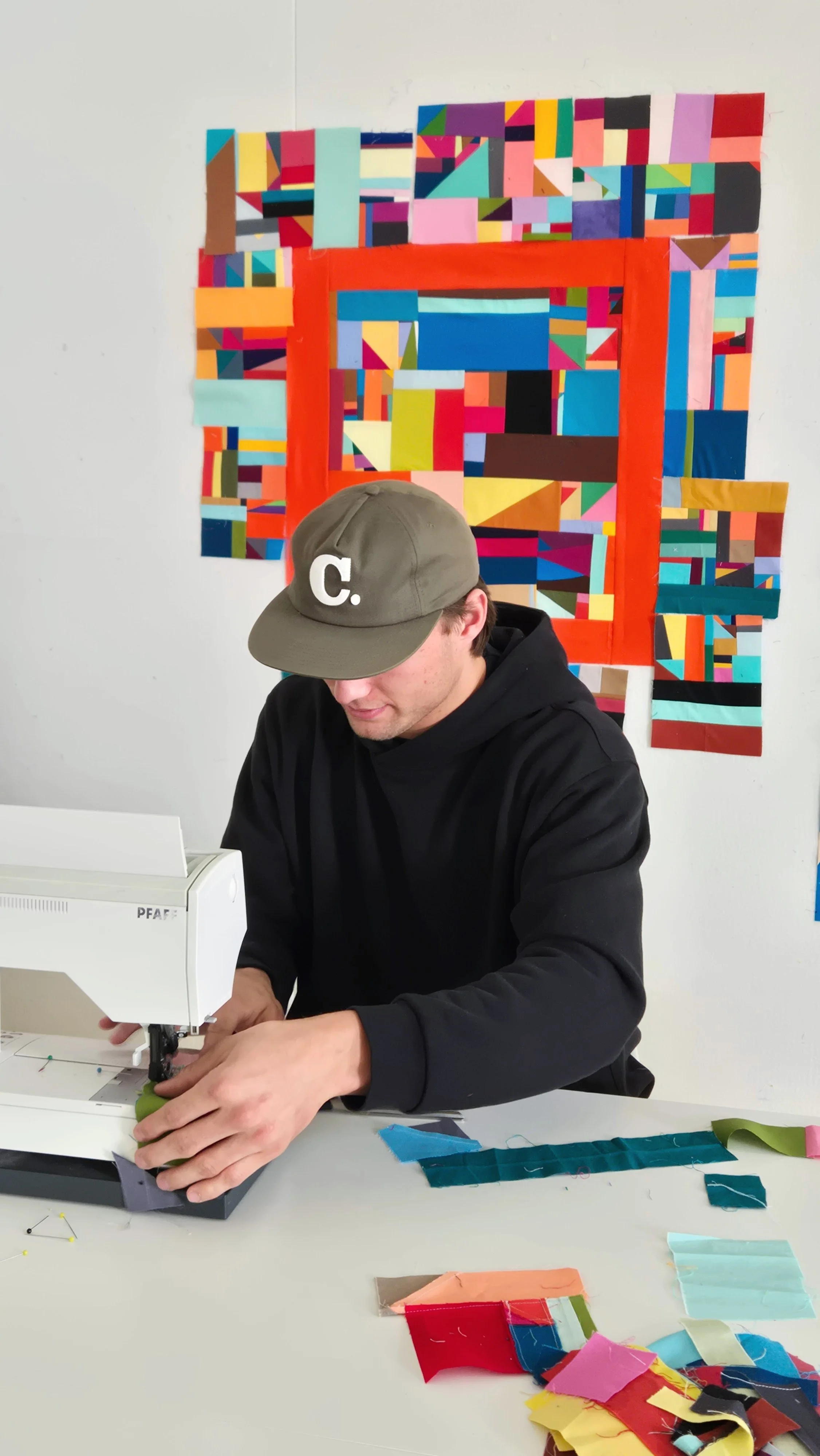
We wrapped up the Quilters’ Playcation Adventure Sewalong a few weeks ago. To be honest, it took me those weeks to both recover and finish the quilt tops. I knew I wanted to get the tops done quickly so that I didn’t lose any blocks or momentum. But let me tell you, I was tired! 30 days straight of live events is a lot. (How do streamers do it?)
Exhaustion aside, it was a truly fantastic month! I’m going to write more about it in the Quilters’ Playcation newsletter and I’m editing a longer video for You Tube. I just have to say, though, that it was such a heartwarming month full of connections and support. Whether folks were sewing along or just hanging out, it was a joy for all of us to be together. We shared the joys and sorrows of the world in the moment, the fun and challenges of making a new quilt block every day. Most importantly, we shared being together in play.
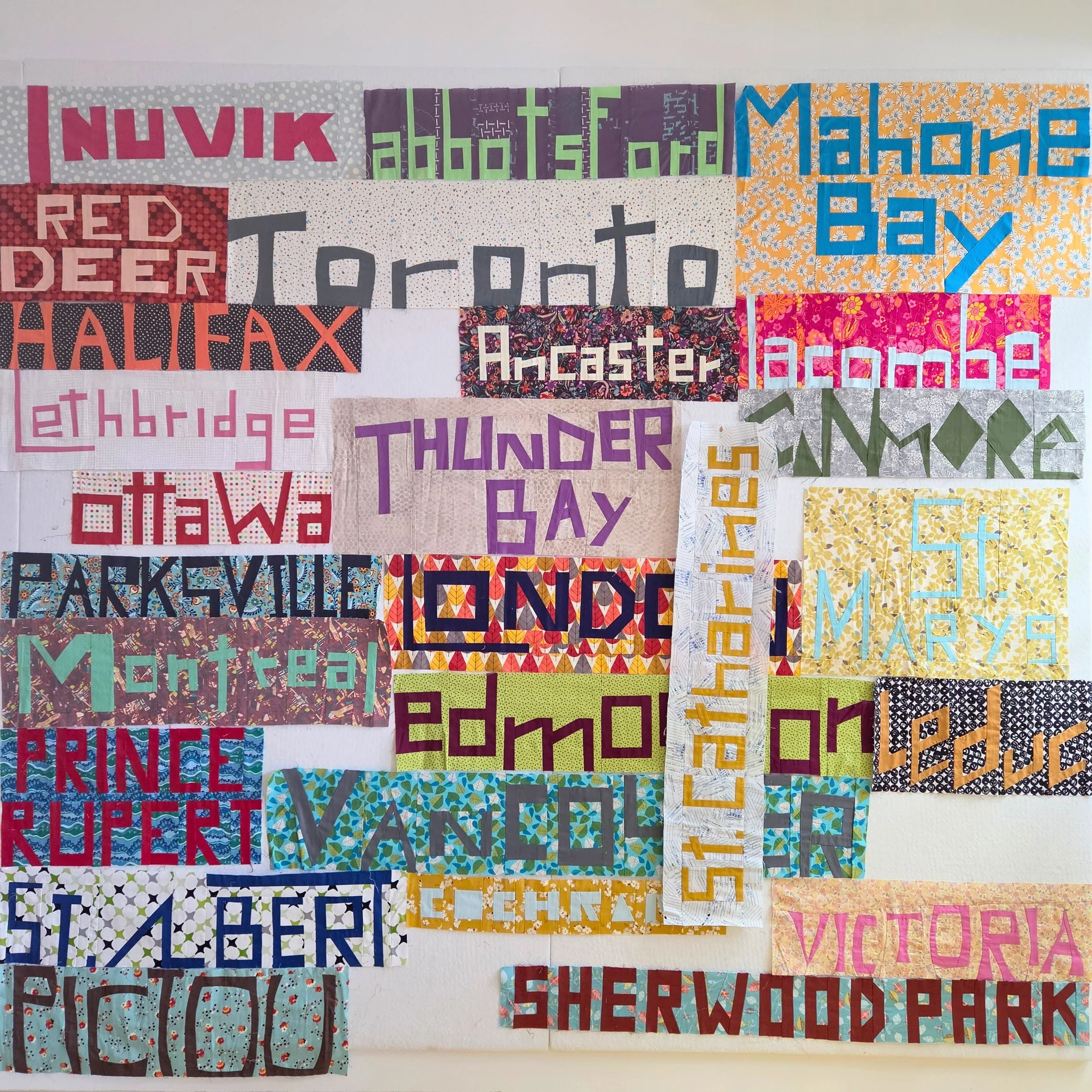
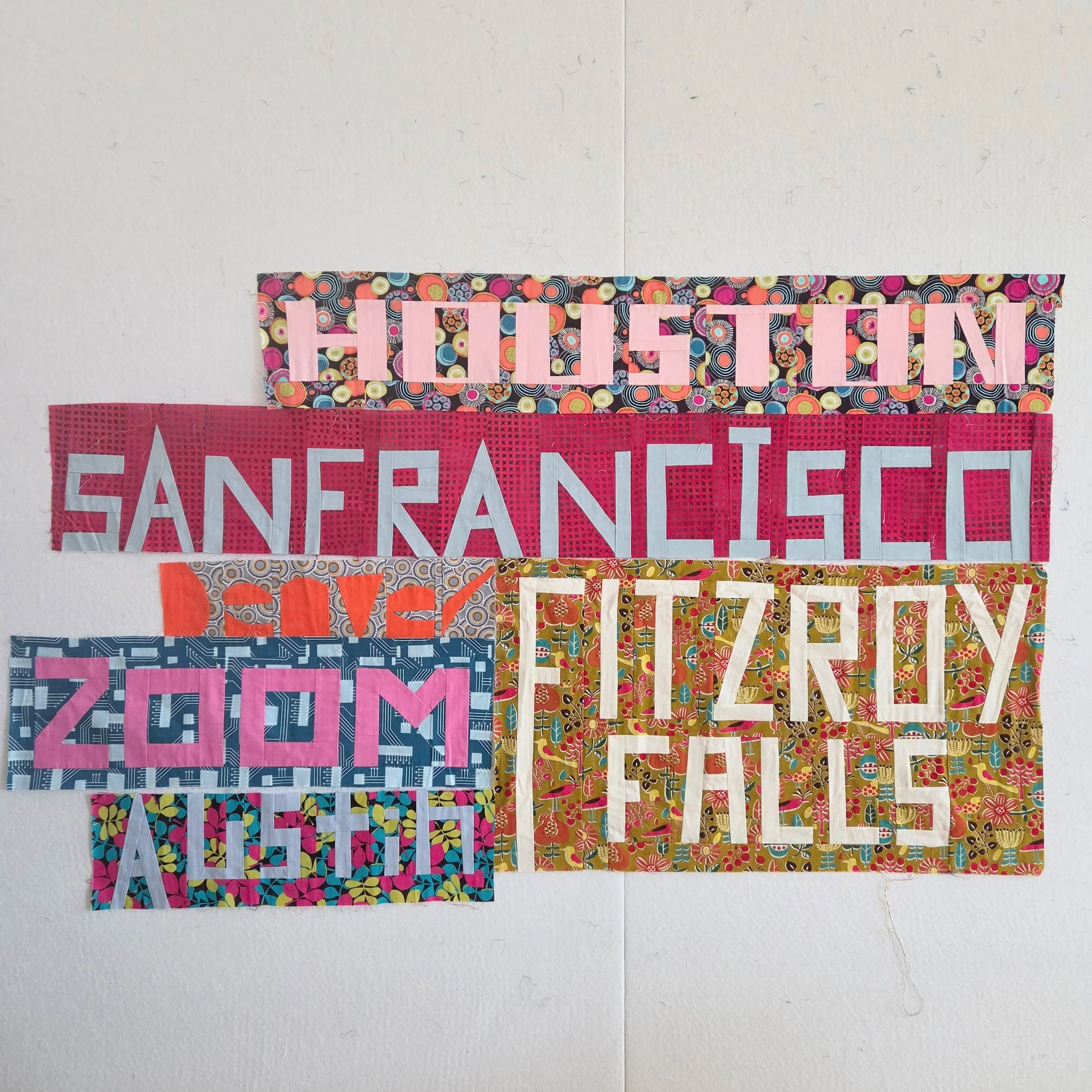
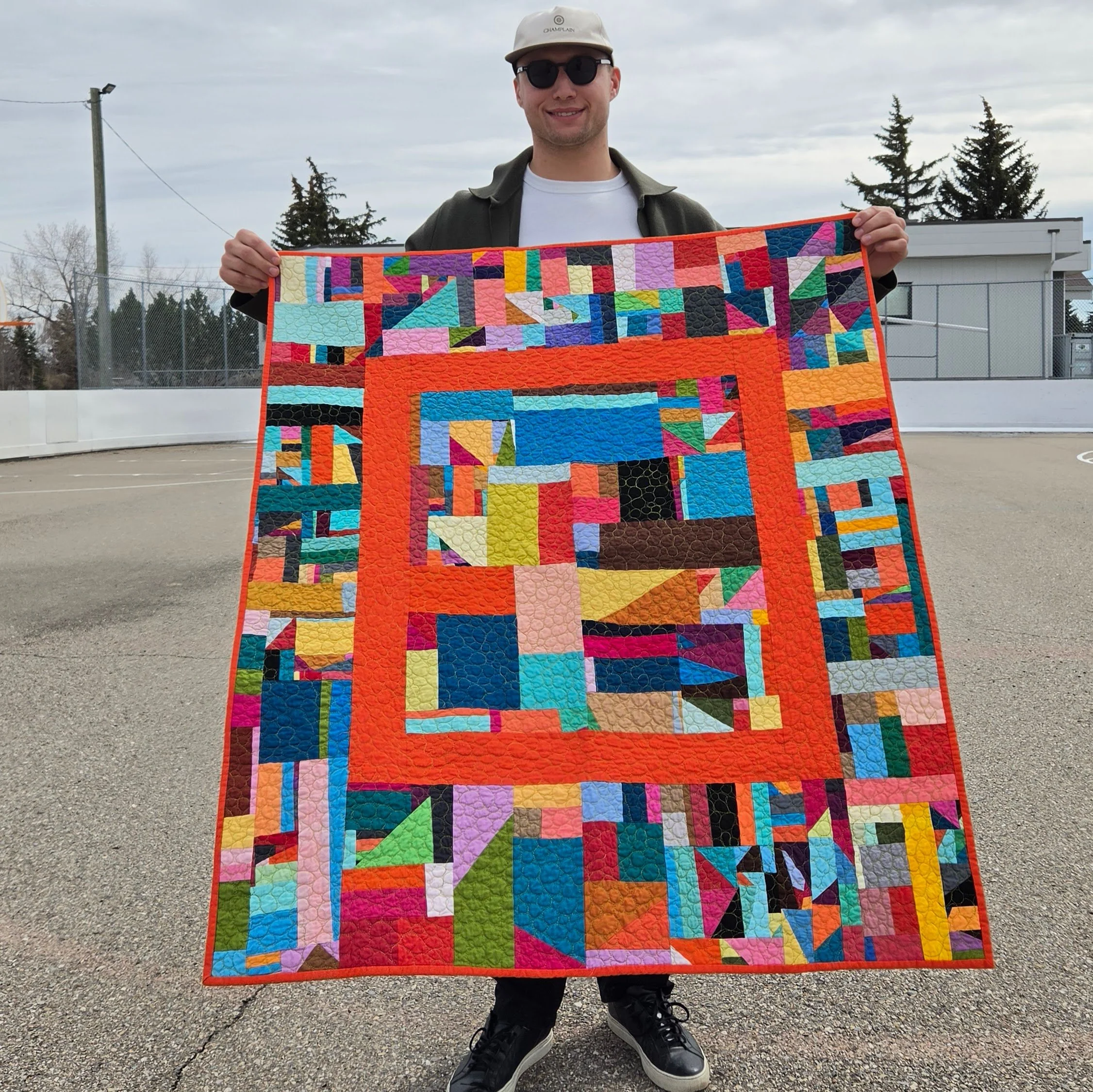
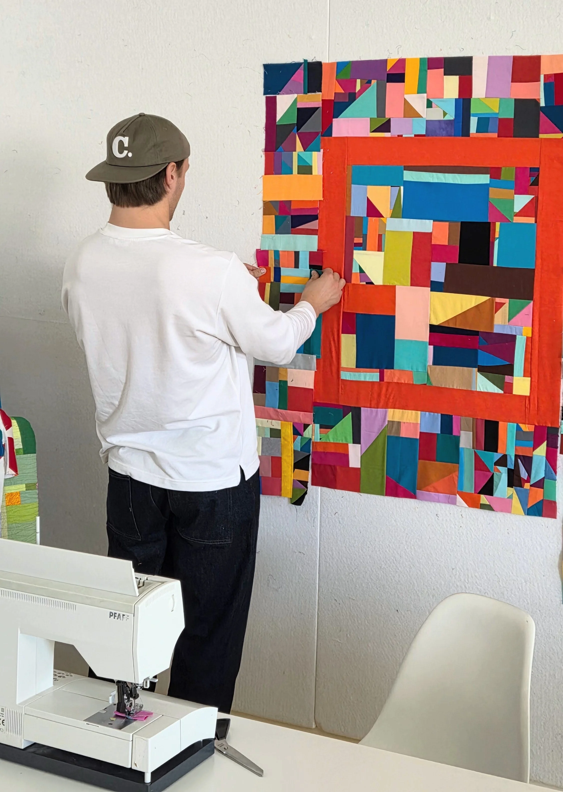
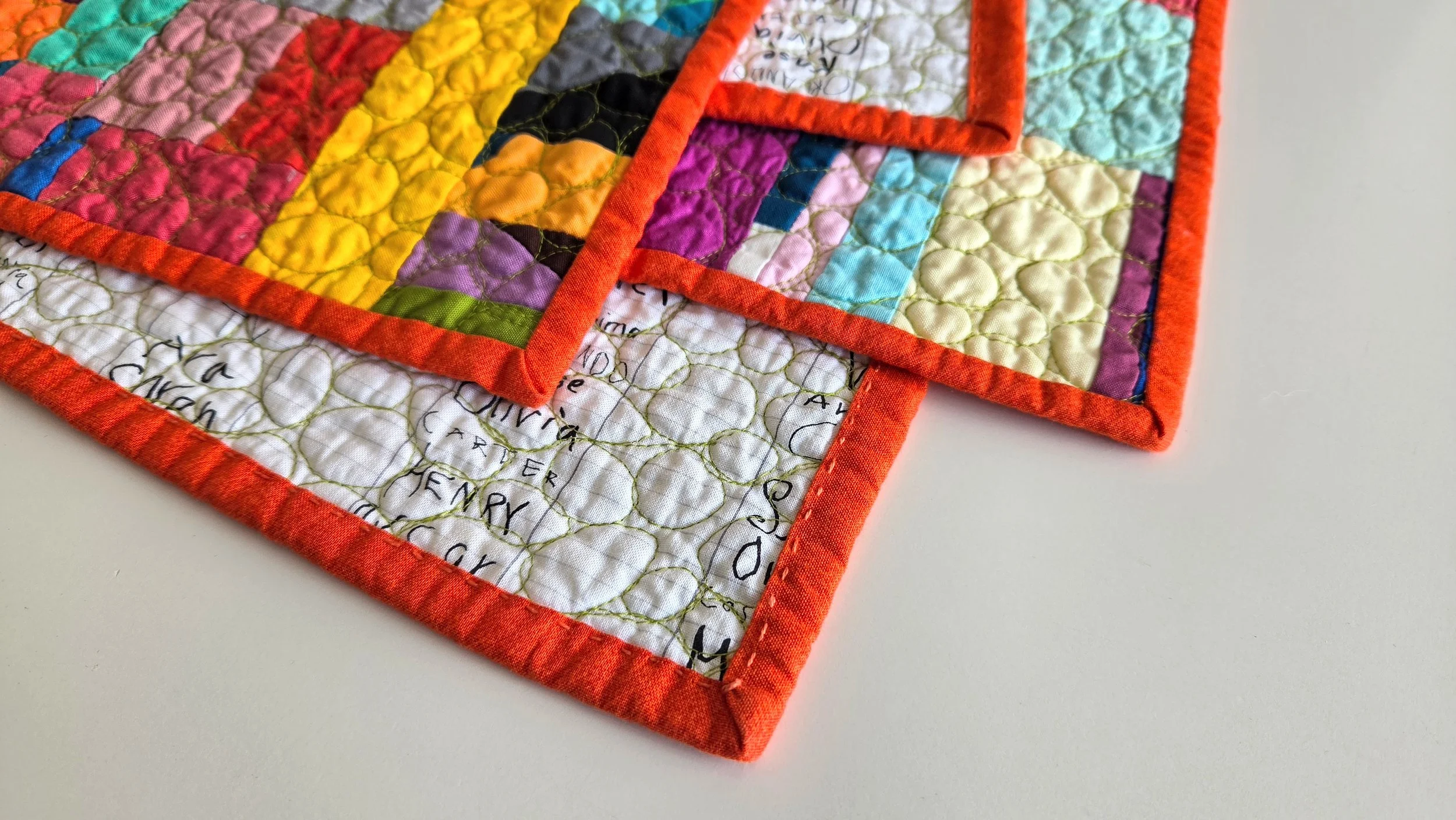
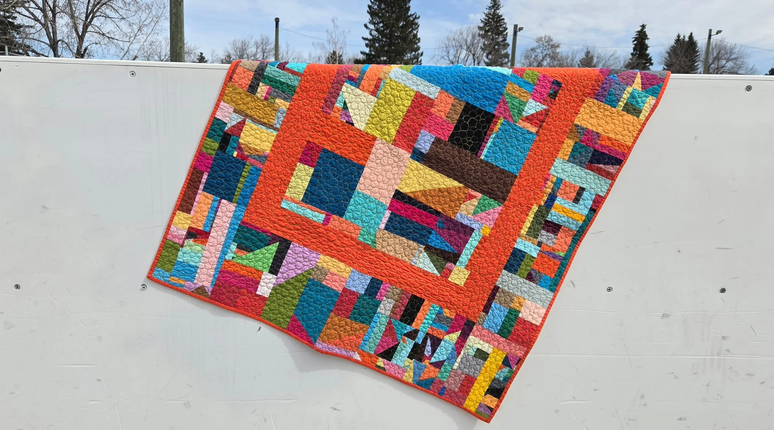
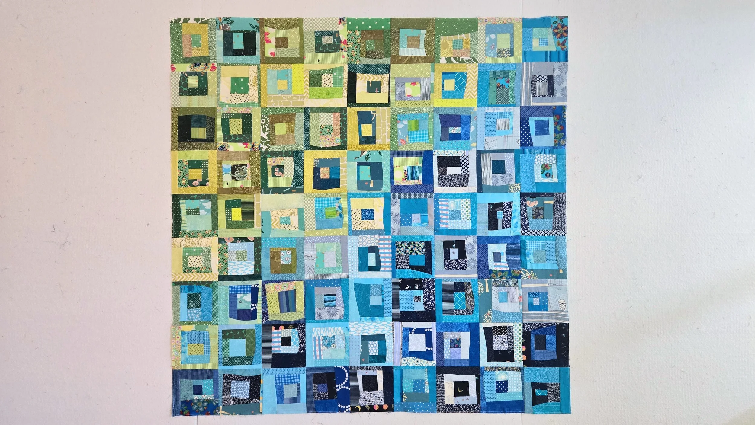
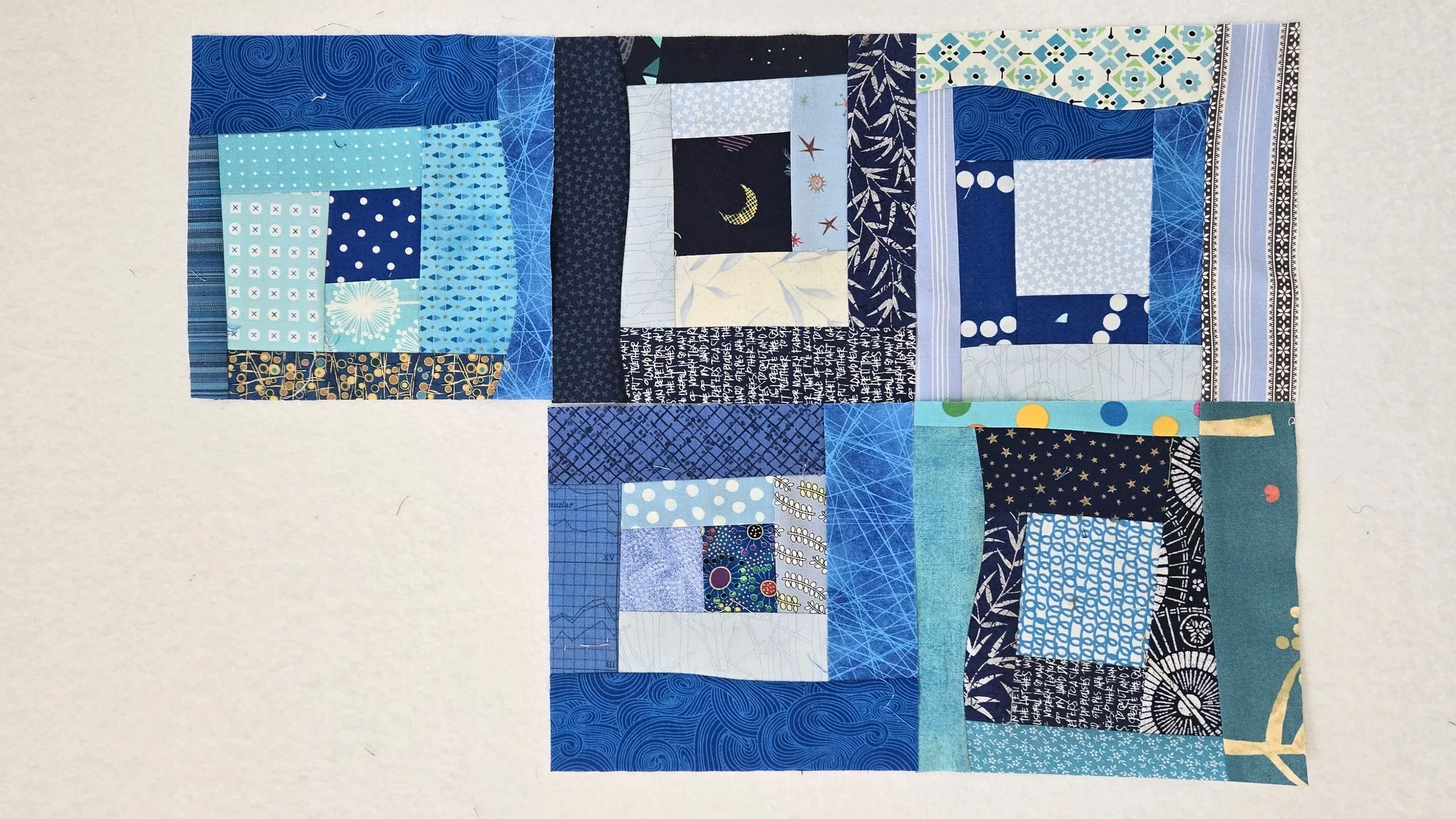
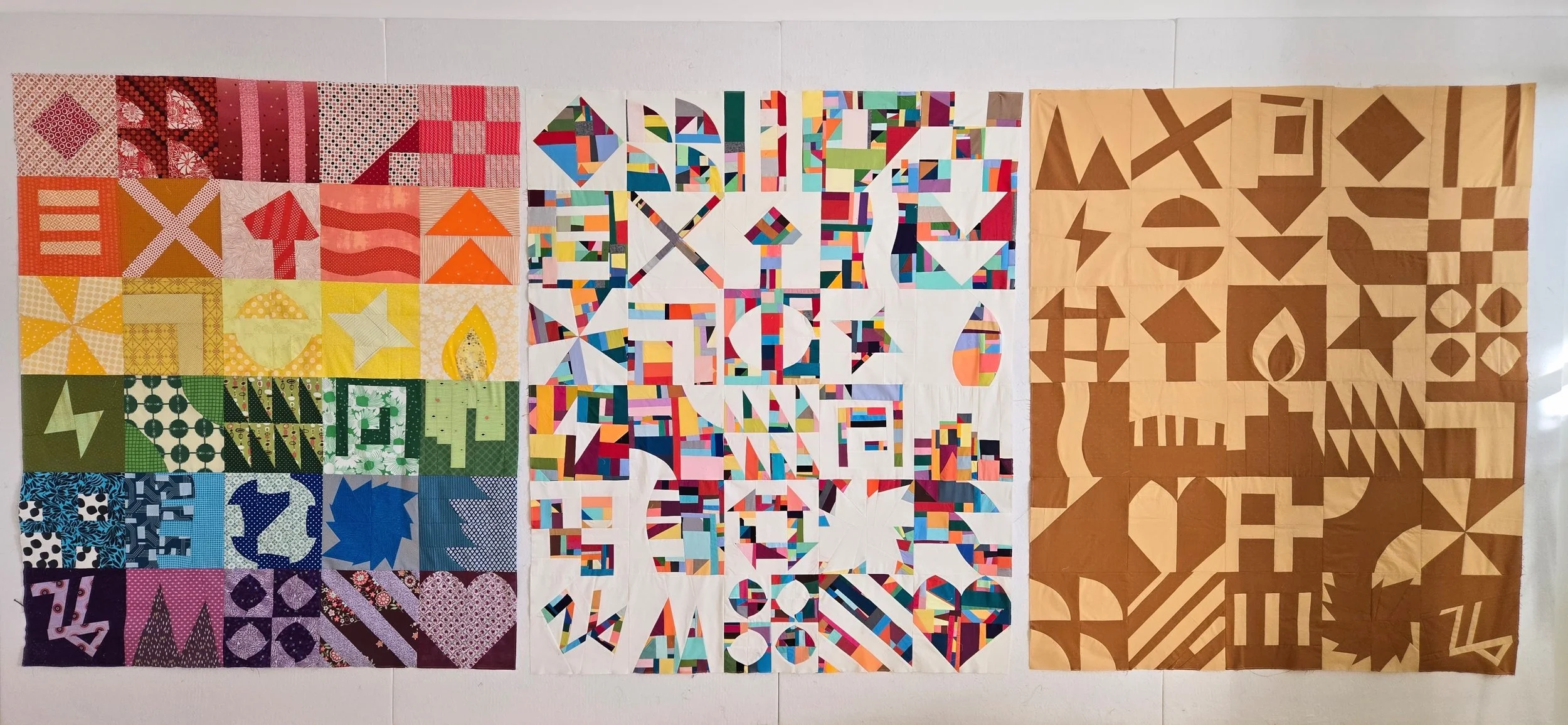
These are the three quilt tops I made throughout the month. Each of them have the same blocks, but showcase different fabric selections and layouts.
The rainbow version shows what happens when we pick a different combination of fabrics for each and every block. I chose a rainbow layout to keep it cohesive. All in all, it has both energy and order.
Using slabs I put together the centre version in the order the blocks were made. I loved the secondary patterns that developed as I went and wanted to keep that. Using the slabs was not difficult, as long as you pay attention when cutting and pressing. The result is absolutely worth it!
The 2-tone version was a definite challenge for me. To be so minimal AND in colours I am not generally drawn to. I kept wanting to throw in just a little bit of something. At the same time it was cool to see the graphic nature of the blocks really pop. I’m glad I stuck with my original intentions.
Now to get all these quilted!
Interested in making your own versions and missed the live events? Don’t worry, all the videos are saved on You Tube and available at any time.