
Faye
72” x 72”
Years in the making. Like her namesake. A fearless woman, tenacious, and patient. She knew her time would come. Moved to New York with a dream. Moved through New York with relentless energy. Meeting people, making herself just that much more, ignoring the naysayers. She persevered and found her beauty and her success.
Faye, the quilt, began life in the follow-up to making the Alturas quilt. Carolyn Friedlander’s book, Savor Each Stitch came out and I fell in love with the graphic pattern. She’d already got me hooked on needle turn appliqué so this seemed like a logical step. I started the first block back in the fall of 2014. This finish is indeed a long time coming.

One block led to two and then I might as well do four, right? The initial pattern in the book calls for one block and a great use of negative space. I never follow a pattern anyway. So over the course of a few years I worked on the blocks. Looking back, it took me about 6 hours to baste each block, then who knows how many to stitch. Appliqué is not for a quick finish. Then again, nothing is a quick finish for me.
The finish for Faye come very recently though. Our family wanted to gift a quilt to celebrate a wedding. The gift was long overdue and we decided that this quilt top matched the couple’s personality. I will admit, I had a moment of selfishness for her. Then I realized that my love for her came in the making more than anything. It was time to set her free and share that love.
I always have a hard time with quilting an appliqué project. It’s a battle between accentuating the appliqué and ease. At least, it feels like a battle. In the end I went for a straight line quilting pattern. For one, Carolyn has done this a lot in the past and it works. It provides texture and security without taking away from the graphic design. Secondly, I am hoping this will be a loved couch quilt so I wanted dense quilting to help keep her strong.
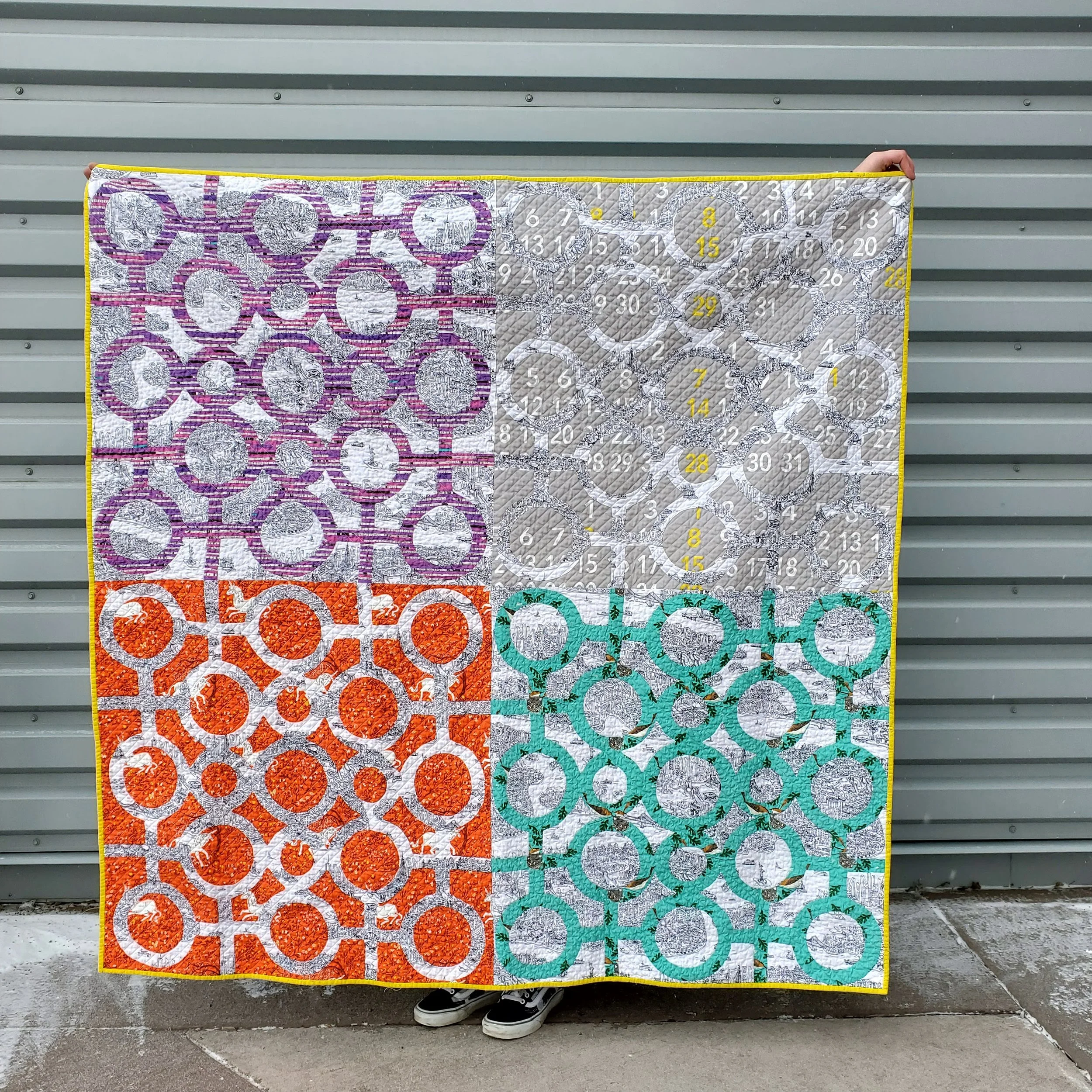
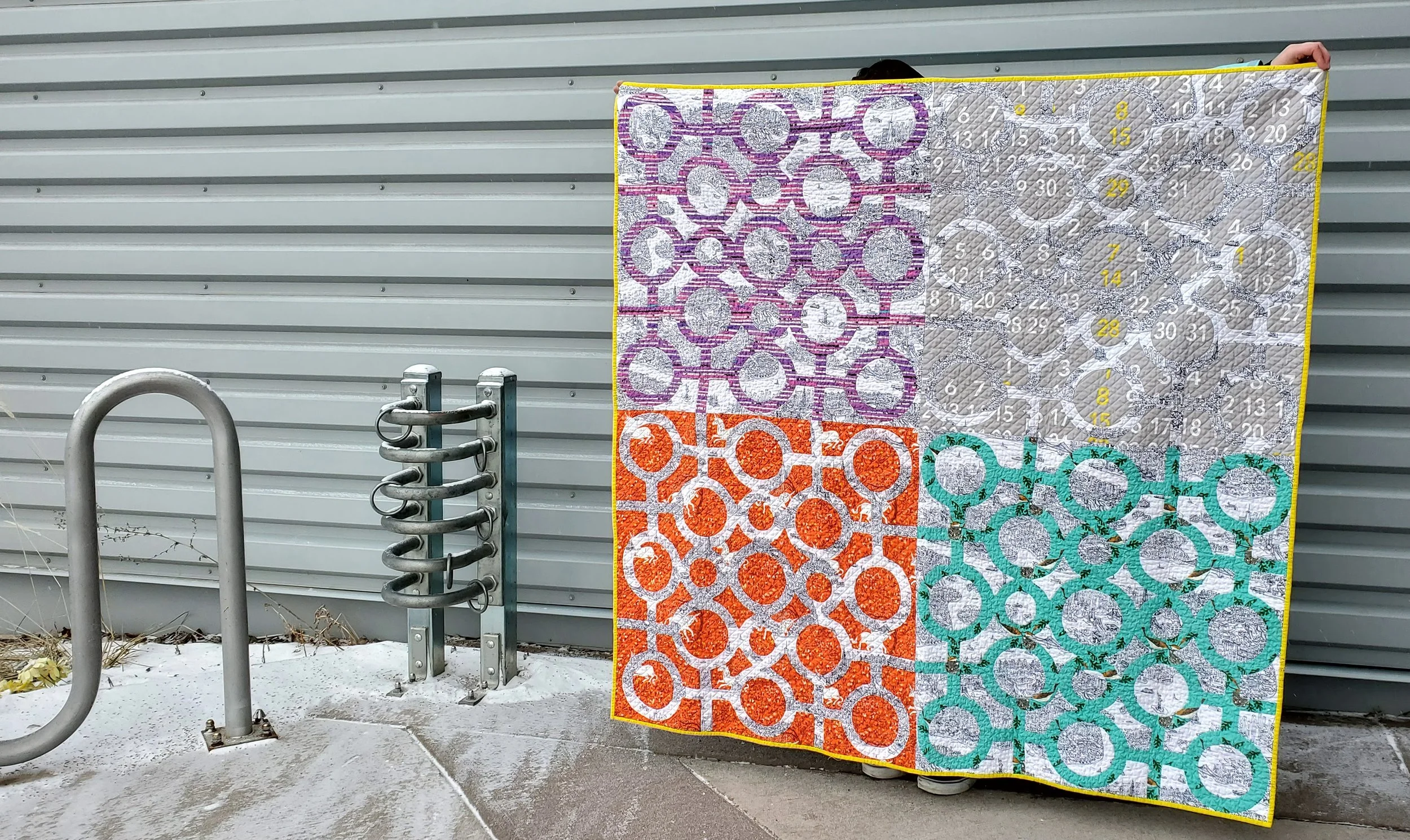
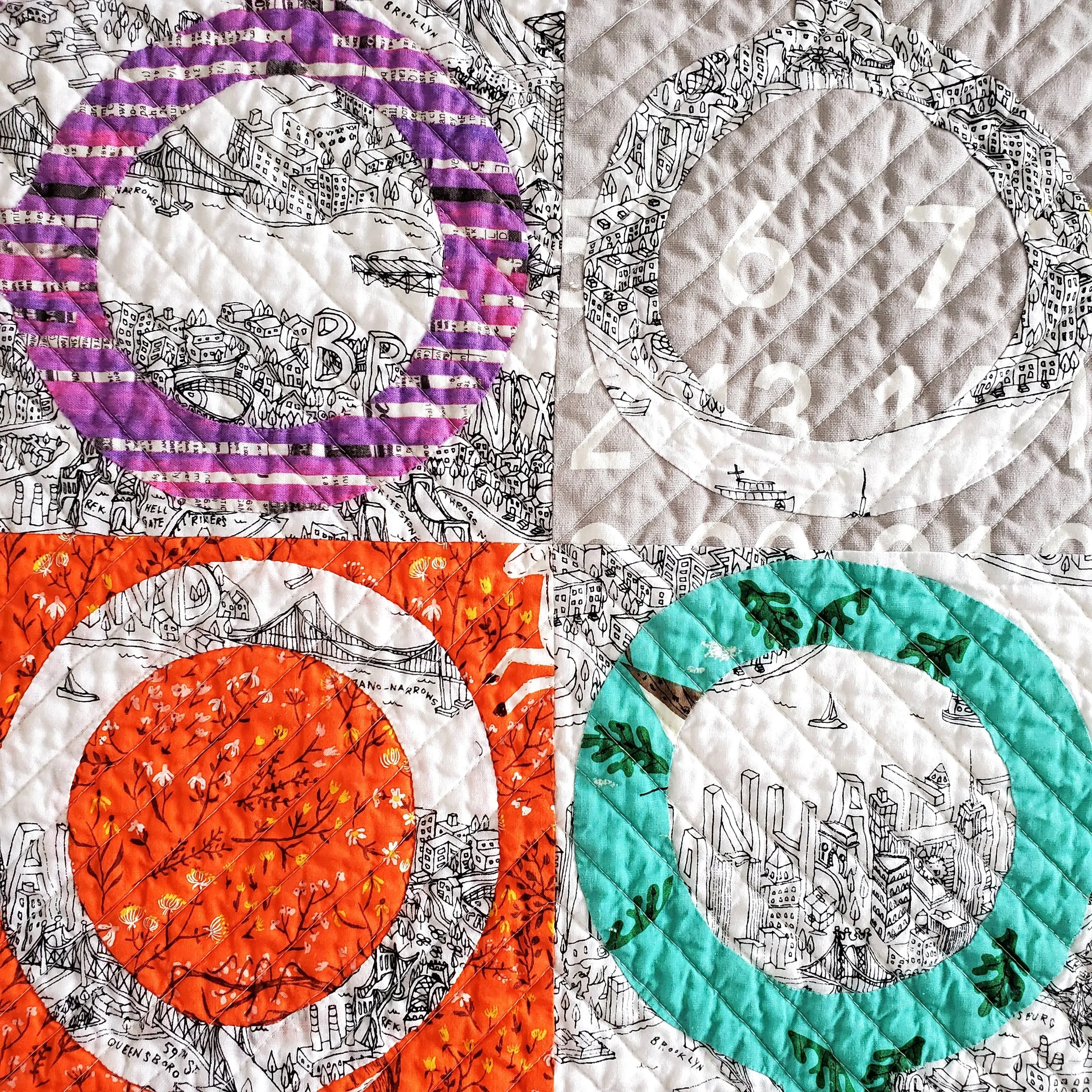
The whole quilt is divided into quarters with an X through the middle. Then I echoed that line between each triangle. I chose a pale yellow/cream Aurifil thread in 50W (2311). It isn’t harsh on the backing but disappears for the most part on the front. It might seem odd to use a creamy colour when there is so much bright white, but the reduction in contrast on the coloured fabrics makes it worthwhile and you don’t even notice it on the white.
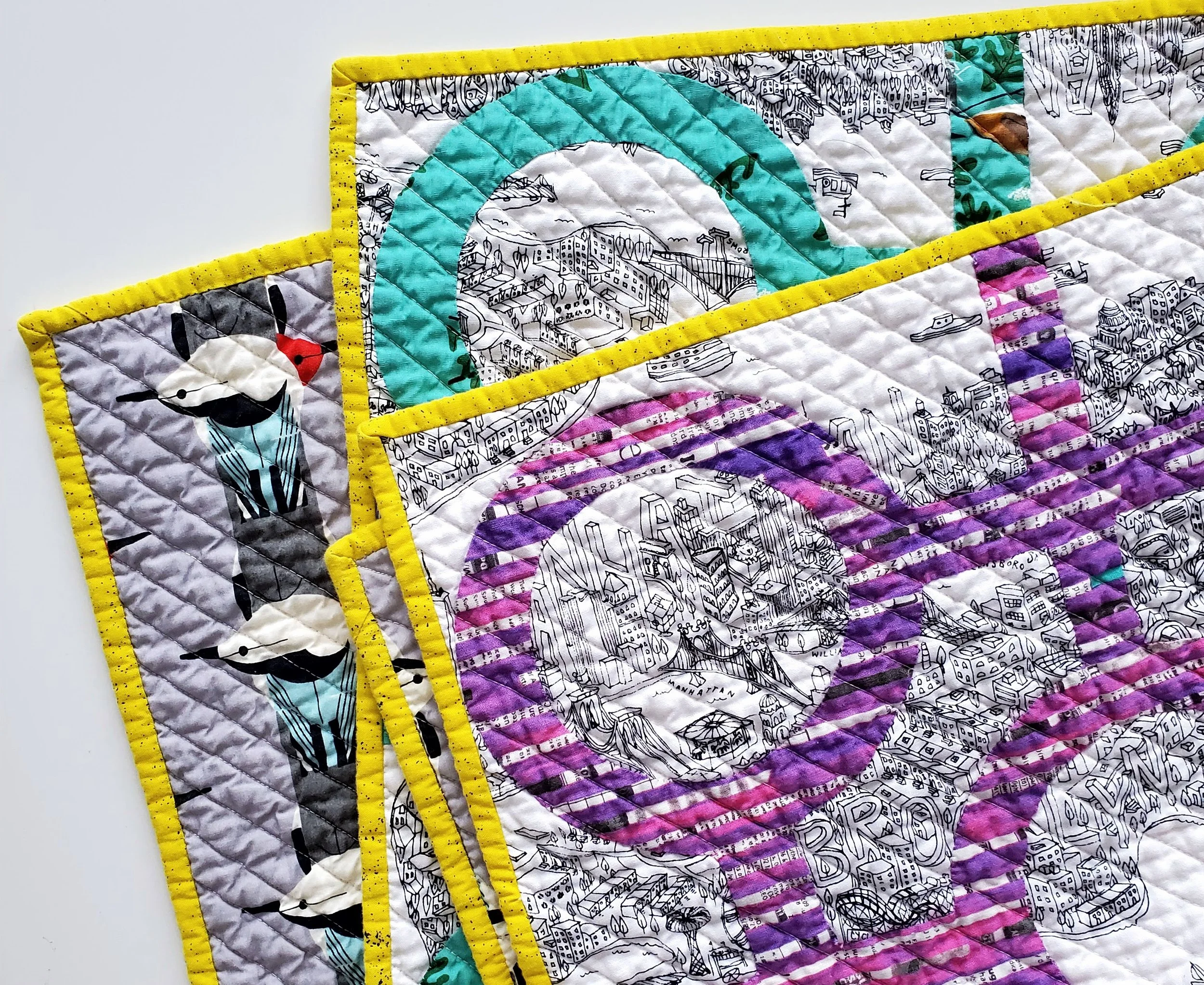
You know me and my love for a contrast binding. This bright yellow might seem like a funny choice, but almost all of the blocks have a bit of yellow in them. Black, my other thought, seemed too harsh. I had just purchased this yellow Spectrastic by Giucy Giuce from Keystone too. It was meant to be! Such a fun pop to finish this off.
The whole quilt really is a collection of some favourite and treasured fabrics. I started the whole thing with Samarra Khaja’s amazing New York illustrated fabric. Combined with a much loved Charlie Harper print that first block set the tone for the rest of the combinations. I stuck with the New York fabric when I realized I had enough of it, then paired it with some hoarded Heather Ross unicorns, the Stendig calendar print, and a gorgeous purple from Carrie Bloomston. On the back I shared another Charley Harper treasure.
Hopefully I will get to visit Faye in her new home.