
Pickets
Many of you know Uppercase Magazine. If you know the magazine you know by now that Janine Vangool, the editor and publisher has her first line of fabric coming out this spring, with Windham Fabrics. If you don't know Janine, the magazine, or the fabric I strongly suggest you seek them out. Creativity abounds, with no shortage of inspiration!
I am lucky enough that Janine is based here in Calgary. This means I can pop into her office with my son in tow. He can play trains while Janine and I can chat all matters writing, magazines, quilting, fabric, and more. Janine is a beautiful and hardworking woman. She is tremendously inspiring to me. So when Janine asked me to create a quilt with her upcoming fabrics I was thrilled to give back.
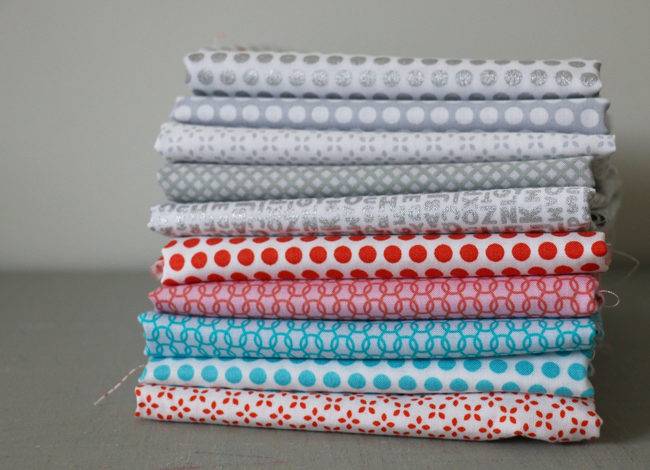
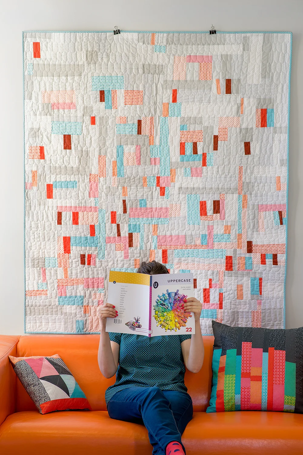
While the entire Uppercase line is full of bold colours (and prints pulled from the magazines spine designs) I went with the lighter prints for my quilt. Janine encouraged me to make something that was me, that was my style. So, of course, I was drawn to the more low volume prints and some improv work!
That alphabet print in metallic silver is destined to become an all-time favourite print of mine. And the oranges. Such perfect oranges. So perfect that I had to add them in to the stack for good measure.
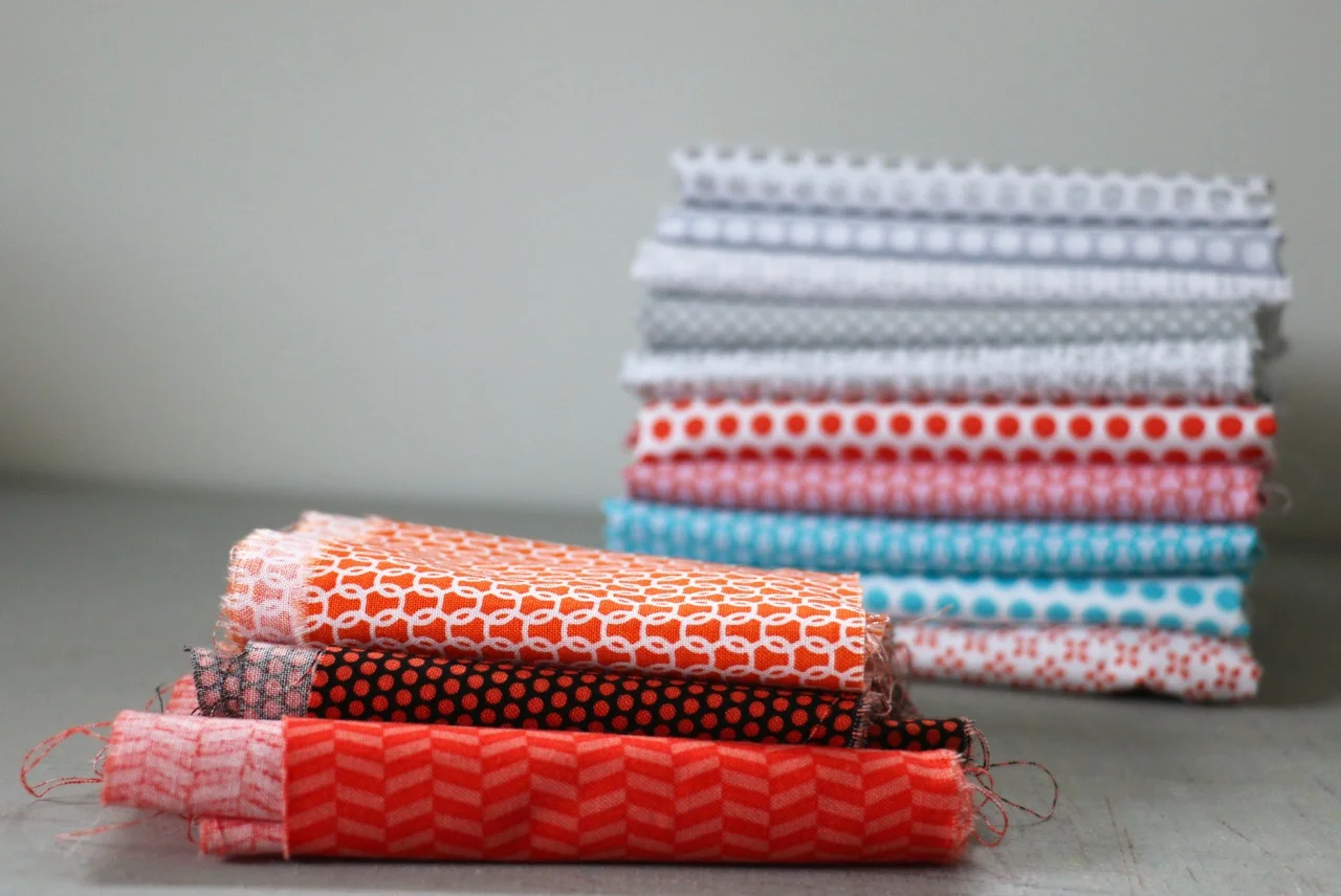
Then I did what I generally always do. Hacked apart the fabric and just started sewing. I wasn't sure what it would be and had little intention when I started. The only direction I gave myself was that the pieces of orange would be skinny bits. That's it. The rest of the fabric was cut into my usual small, medium, and large pieces. Then I put on some good music and got to sewing. Definitely my favourite part.
After awhile I stopped to evaluate where things went. I always do this. Start sewing then stop. Up on the design wall I get an indication of direction - what do the blocks want to be? It was at this point I made the decision to only place the orange strips vertically. First layout decision done, I made more blocks. The next evaluation had me seeing that some blocks had more dark orange than others. Rather than try to balance things out, I decided to concentrate these snippets. That meant now making blocks that had few or none of the orange pieces in them. After that it was a matter of making enough blocks to get to a decent size. Then puzzling the top together. (For an idea on how that process works check out my Creative Live class: Improv Quilting Basics.)
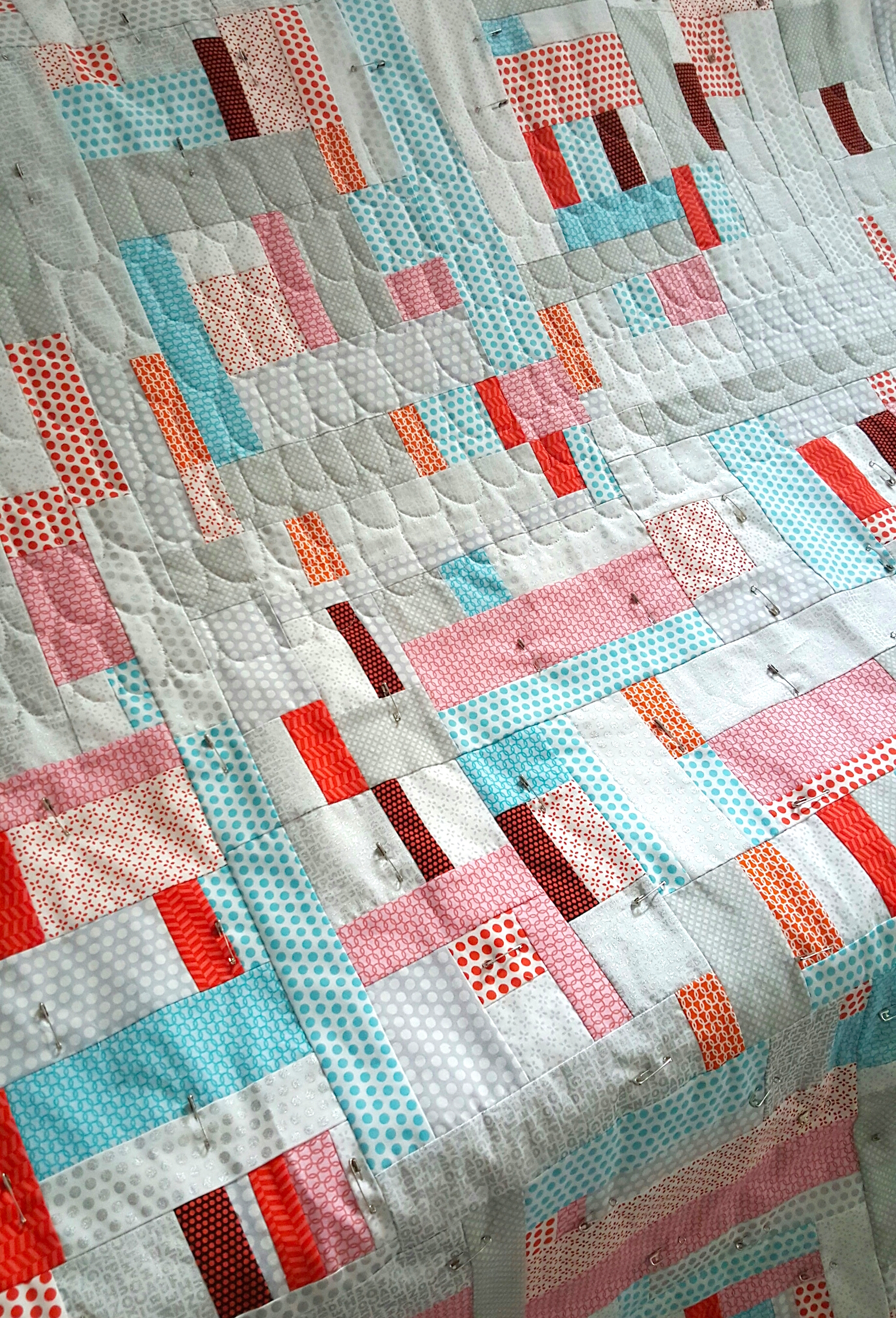
All over texture was the name of the game when it came to quilting. The most perfect grey thread - Aurifil 2600 - came into action. I chose to do a repeating free motion U motif in a nod to Uppercase itself. It was easy, quick, and effective.
At this point I was still unsure about including that pink fabric in the quilt. It initially seemed at odds with the silver, turquoise, and orange. But I pushed myself to go beyond that popular combination by adding the pink. It tripped me up a few times in the process, but something in me kept in in there. Once the quilt was finished I was happy I took the risk. Makes it just a bit different and a lot more dynamic.
When I finished the quilt Janine invited me to help her out with her look book photo shoot. Kirstie Tweed from Orange Girl did the photography for her. It was a wildly busy and creative day. Janine did so much work, so much sewing herself, to showcase the potential of the fabric. All day we played and styled and shot. Heck, the shoot was so successful that Kirstie went out and bought a sewing machine within a week and taught herself how to sew!
That's just how inspiring Janine and Uppercase are - it gets us to action, to creative delight. Check out the website for more on the Uppercase Fabric, to see the look book itself, and go behind the scenes with Janine.