June Morning Make 2022

Blue and Beige woven raffia basket next to a rock and a blown blue glass vase with native grasses in it

June was a bit of a weird month. I did not set out with a specific Morning Make in mind because I knew I was having surgery in the early part of the month and my recovery time would keep me from making. At first, I just continued with the watercolour paintings of the previous month. Then, post recovery, I grabbed a woven basket kit from Flax and Twine to play with.

The Calliope Basket is one of the raffia basket weaving kits from Anne that I purchased after my previous basket making endeavours. I was curious to try a different material and process. As I expected, it was relaxing and meditative to do this.

Ten rounds of raffia basket making - the beginnings of a blue and beige woven basket

The kit is well stocked with more raffia than you will need, a strong needle, snips, and both paper instructions and access to a video. I had enough raffia to make two baskets (that ended up nesting, but that was purely by accident) with some leftover for another. I’m sure that if I had been able to keep my weaving more flat, more platelike as per the instructions, I would have gone through a different amount and only made one. To be honest, I’m not sure what exactly I did to make it more round than flat, but I am not complaining. If I had asked Anne at Flax and Twine she probably would have sorted me out.

Calliope Basket kit from Flax and Twine

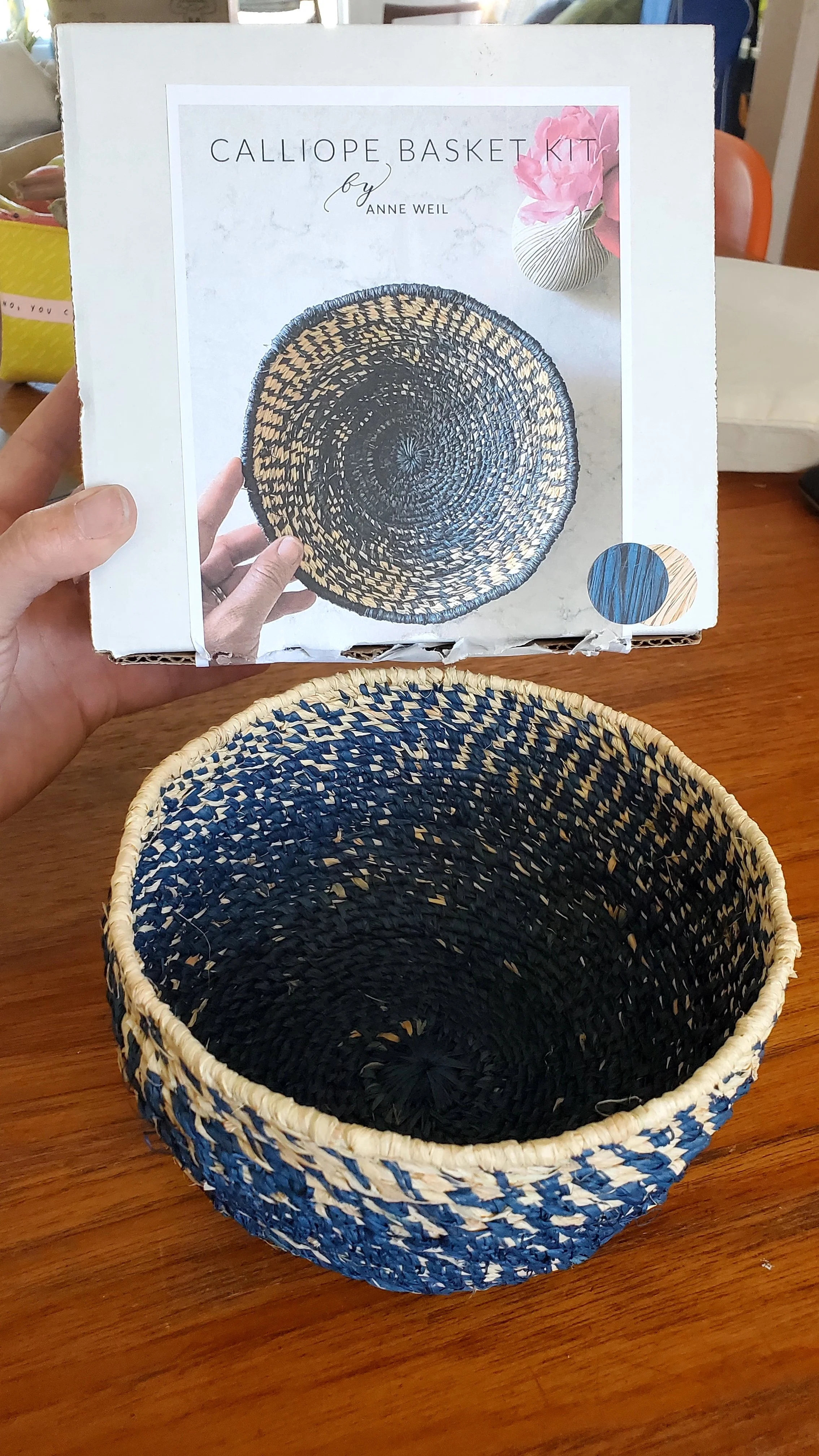
The kit comes with a choice of colours in your raffia so you can coordinate with your decor, if you like. We like blue in this house so I chose this deep indigo.

I won’t lie, I want to learn all the basket weaving. There are so many designs, techniques, and styles from around the world. I am definitely not done exploring. The kits from Flax and Twine have definitely opened up a world of suggestions.

May Morning Make 2022

Seven mediocre watercolour paintings of traditional quilts

While May was a busy month for a family it was a relaxing month for Morning Make. Indeed, starting my day with Morning Make meant that I was in a good frame of mind for the rest of a chaos.

These watercolour sketches of quilts are not a new to me effort. I’ve made a few in the past. For me, it’s a great, relaxing activity. Plus, I get to explore traditional quilts without having to sew them. All that precision piecing!

The Encyclopedia of Pieced Quilt Patterns by Barbara Brackman

While there are a million resources for quilt blocks in both print and online I turned to this beauty of a book for picking out my patterns: The Encyclopedia of Pieced Quilt Patterns by Barbara Brackman. It’s an absolute classic and was recently reprinted. It pairs, if you like, with the Electric Quilt products, but you can buy the stand alone book. I picked mine up through Quilt Folk, but check your local quilt stores (or ask them to order it for you) or through the big A. Note, the book only contains drawings of the patterns, there are no measurements, piecing instructions, or templates. You need the Block Base software for that.

It was an absolute treat to flip through the book. As you can imagine, it was hard to narrow down a block choice each time! I ended up picking blocks I either always wanted to try or love but will likely never piece myself.

Pencil sketch of a quilt, ready for painting.

Each painting started with a pencil sketch. Using a good old ruler, a sharp pencil, and with an eraser nearby I translated the single block drawing into a quilt sketch. Sometimes I played with layout, sometimes it was straight grid.

Green paint, looking like palm fronds, at the beginning of a watercolour quilt painting.

Once the pencil sketch was done I started painting. These are the basic watercolour sets I bought just before the pandemic started. I tried to stick with the colours of the palette itself, so that I wasn’t trying to match colours day over day. I also stuck with 2-3 colours only. This was to force myself to concentrate on the design of the block, not try to create a watercolour quilt like I would sew one. Simplicity is sometimes a challenge for me so this was good practice.

Orange and blue watercolour painting of a traditional quilt made from squares and triangles.

On the first painting of the month I outlined the ‘seam lines’ of the quilt with a black pen. I really thought I would do this to all of them, but ended up not liking the look. I’d done it previously but something about it didn’t feel right this time. I suppose I just wanted a softer look.

Gold and grey watercolour painting of a quilt made from curves and triangles.

It might be a little less ‘finished’? I’m not sure, but I still prefer it with the outline.

My watercolour skills are still very basic - this is essentially just colouring. But there is something about the movement of watercolour that is different than anything else. I am still smitten after my first forays into it over 2 years ago now. Loads to explore!

Label Your Quilts!

The corners of three quilts, from the back, with hand written labels

Everyone has a different approach to labelling a quilt. Some don’t do it at all, others design and make embroidered labels. Some simply sign it with a marker, others screen print fabric and make it part of the back. Some just add a ‘signature’ bit of piecing or binding, others have custom labels made and sew them in. Truth be told, there is no right or wrong way to do it. What is most important is that you put your name to the work.

For one, be proud of the work you did. You made that! Put your name to it, on it, in it.

Secondly, give your quilt the history to live beyond you.

There are various schools of thought about what should be included on a quilt label. Here is what I think should be on it:

  • Your name

  • Date the quilt was made/finished

  • Material make up

Anything else is just gravy. And gravy is good, so I include other things. I like to name my quilts so that is always there. If there is a specific inspiration or starting point, then that gets included. If I used a pattern I acknowledge it. If it is a gift, I like to put the recipients name on there too (and wedding/birth date if it is for that.)

Your name and the date is important. This is the history part. Should your quilt live beyond you or be separated from you (by choice or not) there is a record of the maker. If your grandchildren uncover the quilt one day they will want to know! So will the historian, the neighbour, the treasure hunter, the buyer.

Material make-up is very useful information for care instructions. I work almost always with cotton, including cotton batting and thread, so this helps any recipients present and future know how to wash it and care for it. If I use something different, then I include that. You could get super detailed here and list the thread used, batting chosen, and even fabric lines. The level of detail here is personal, but at least include material make up.

I know that labelling is a pain. We are so excited to finish the quilt, to wash it, to cuddle with it that we very often skip this system. Including myself in that majority. But I always label a quilt before gifting it. And lately I’ve been feeling the guilt of not having all my quilts lately. Might be the Covid stress and fear of the unknown - what quilts will outlive me? The solo show I had recently forced me to label a bunch of quilts as I did not want them going out into the world with no record.

As for ways to make labels, there are as many ways as there are quilts. I’ve seen people screen print fabric and sew it into the back of the quilt, embroider and stitch on a label, write right on the back of the quilt, sign the front, get custom labels printed, and appliqué something. Myself, I’ve done fancy ones where I’ve used leftover fabric for framing before stitching it onto the back, printed ones with special papers, intricate traced designs, and plain writing on white fabric. The last one has been my go-to of late. I use scraps of white fabric and a Micron pen to write it. Every now and then I might decorate the label with fabric markers. Nothing fancy, easy, and gets the job done. Unobtrusive too. Most importantly, it is there.

One last thing, a little tip I learned years ago. If you are gifting a quilt that will be used in a public setting like a dorm or care home, undo the binding and write some info on the inside of the binding before stitching it back up. Labels that are stitched on can be removed if someone really wants to claim the quilt as their own. But having a signature hidden in the binding then ownership can always be proven.

April Morning Make 2022

Stack of papers coloured blue with cyanotype

April was an exploration of light, more than anything. Indeed, I’ve never paid this much attention to light, shadow, and sunshine before. It was an excellent practice in paying attention, in noticing.

Cyanotype is a form of light exposure, like photo developing. You use chemicals on paper, fabric, or anything that can be coated (I saw someone do rocks and I want to try that!) It requires the interaction of the two chemicals: potassium ferricyanide and ferric ammonium citrate. You only really need to know that you need equal parts of each and to mix them together right before using. I picked up the set from my local art supply store.

Bottles of chemicals for making cyanotype prints

For the first half of the month I mixed the chemicals at night, painted the paper, and let them dry in a dark bathroom. Light exposure starts the process of creating the print, hence the windowless bathroom. For the second half of the month I played with wet exposure, meaning you paint the paper with the just mixed chemicals and go straight to the creation of the print. In the end, I couldn’t really tell the difference from the results.

To create the print you place an object on the treated paper and let light do its thing. Where the object is placed and in its shadow the outline remains while the rest of the paper gets exposed. Essentially, you are creating a negative image.

The beginnings of a cyanotype print with fabric trimmings and a mesh onion bag

Where things get both exciting and frustrating is with the shadows. Not that sunny? An object with diffuse edges? You get a ‘blurrier’ print. Very sunny? You get shadows. Depending on the time of day and the level of sunniness, you can get very sharp images or long shadows. I found the exploration of these differences fascinating and learned to exploit them to create different things. Seeing as this is morning make and it was April in a northern location, I had a lot of shadows to play with and sometimes not a lot of light. It means I will probably play a bit more in the peak of a summer’s day.

Bouquet of dried plants and grasses again the Calgary skyline

The other act of noticing this month was in looking for things to use to create the print. You see a lot of cyanotype prints exploring shape through living objects like plants and flowers. It was April in Calgary, not a lot of greenery! But weeds, grasses, and last year’s living plants provided fascinating textures to use. Going for walks I found myself nothing plants and sticks in new ways, or even discovering new to me plants. I never picked anything living and cut dead things, leaving roots in tact in case it was a perennial. I also explored the house for objects, using kitchen tools, jewelry, games, even garbage. If it can create a shadow it can create an exposure.

Four different cyanotype prints created from natural and household objects

Each day I made 2 prints, so ended up the month with a lot of prints, some definitely better than others. Here are four of my favourites. From top left, in clockwise order. A necklace from Elinor Stenroos on dry. Shadows from slurpee cup and jar lids on dry. Cheerios on wet. Thistle on wet.

Some days I got the real dark, indigo blue colour typically associated with cyanotype, others it was quite pale. To be honest, I never really figured out what created the difference. it always felt like I was putting the same amount of the chemicals on the sheet. I suspect my proportions of the two agents varied, but I don’t really know. Length of exposure varied too, depending on the light conditions that day. I don’t think that effects the colour though, as I exposed almost all to the same colour before washing. (The chemicals look pale green when they go on then change colour as the exposure happens, usually showing done when a bronze or dark green.)

Yes, you can do this on fabric and that probably made a lot of sense for me, a quilter. However, I wanted to try the paper and besides, it’s not like I needed more fabric! That being said, I also don’t need 60, mostly mediocre, cyanotype prints. So I got a notion for a secondary art project.

Cyanotype prints cut apart and arranged in a churn dash quilt block

I need to test my assembly idea for these but if it works, I think it could be pretty cool. And it just might get by the ‘no quilts on the wall’ rule in the house!

At the end of the month I have to say this was a lovely exploration. I admit to being intimidated by the chemicals and the idea of it at the beginning. What foolishness! It is actually really easy, I felt totally safe mixing the agents together, and it was an adventure to see what could happen. Sure, things didn’t always work and I’m still on the low end of the learning curve but it was a low stress experiment. The anticipation each morning of what could happen was a great way to start the day. Pure creative optimism.

PS. I saved a highlight of the process - start to finish - on Instagram.