"colour"

Oh Canada


Oh Canada
72" by 48"


The Maple Leaf quilt is finally done! (Sorry, it's been done for months but it took me forever to get photos I liked.)

Made in complete proportion to the real Maple Leaf Canadian flag. All the coloured sections are made from slabs - scraps pieced together to make fabric. The technique is in our book, Sunday Morning Quilts. I wanted to show that the slabs can be used for more than straight blocks. I also wanted to share a little patriotism to show the Brits that the Union Jack isn't the only flag worth making into a quilt.


How awesomely Canadian of me to snap the photos on Lake Louise as we skated on a snowy days. Hockey skates, fires, mountain, snow... Damn, I love where I live!

Seriously, I do love where I live. Even when I have to pay my taxes and deal with dumb politicians (but those are everywhere, right?). I love our spaces, our vistas, our social leanings, our multi-culturalism, our healthcare (even when flawed), our cities, our variety in everything. I even love my accent. And that's PROgress if you know me.


For the quilting on this I used a combination of Aurifil 50w in white - to densely quilt the white sections with a lot of texture - and Presencia in coordinating colours for each flag section. There were a lot of threads to bury at the end, but it was so worth it.


I will be developing this into a pattern, I promise. Hopefully before Canada Day. I'll keep you posted.
Wine Gums


Winegums
40'' by 55''

Look, I finished something!

This is my version of Amanda's quilt from our book, Sunday Morning Quilts. Such a fun piece. Little scraps, some raw edge appliqué, and really casual quilting. And look at that Washi fabric from Rashida on the back! Because of that I went with a grey and white dotty binding, instead of a harsher contrast with black and white.


I started this quilt off on the wrong foot, when I didn't read Amanda's actual pattern in the book. That left me to come up with a different way to stabilize my little pieces. It wasn't a big deal and I'd happily use glue again. But I did follow her directions for quilting the piece. One straight stitch underneath each row to keep it all in place and make the rest of the quilting easier. Then free motion stitching following each arc - over, back, and over again. If you don't love little frayed edges after washing then this might be a challenge to your sensibilities, but it is worth it. Think of it as another layer of texture.


Pre-washing above, post-washing below.


There is a part of me that wishes I had made it bigger, like my original plan. That will just have to be another quilt. I'm sure I'll have scraps enough!

Considering that I never made my son a baby quilt I think he may lay claim on this one, if he ever stops his commando crawl long enough to savour it.


(PS Sorry about those top two photos, they get all blurry when I put them here... working on it.)

Had To


It had been weeks since I sewed. All invigorated from vacation and bursting with inspiration and one of those pesky ideas that just won't go away I had to get in my sewing room and sew. With just a cutting table and a couch I piled, cut, and started sewing. A few days later I had a sewing table and a design wall and three helpers constantly underfoot.

More on the sewing room next time.

For now, let's focus on my current obsession. An obsession it is. A million WIPS to finish, looming deadlines for articles, quilts, and more, and a house that still hasn't fully recovered from the holiday season. All of it thrown aside to work on this quilt.


It started with the Architextures line, a wonderful fat quarter bundle that Carolyn Friedlander herself sent me herself (she is such an awesome friend!) I had a concept in my head for some text letters too. Instead of using the whole line I decided to focus on a few specific colours: pink, navy, and orange.

A note on the colour focus. It wasn't until I was putting away our vacation laundry that I realized why I focused on these colours. Those were the colours I also packed for the trip. Seriously, all my clothes were navy, pink, or coral with neutrals thrown in. Funny.


So I shopped my stash for more low volume prints and a few darks. Then the rotary cutter came out and I started to hack it all up. This is both the terrifying and exciting part. I LOVE this line of fabric and it would be easy to hoard it. But I was giddy with my idea and wanted to get going.

And go I did. In between school pick-ups, swim lessons, play dates, construction, and interruptions I managed to get some letters pieced. And then some!

Capturing Inspiration


Just because I was on vacation, it doesn't mean I wasn't thinking about quilts. 

Confession: I brought some hand sewing with me, but it never left the bag.

When you are open to it, inspiration is everywhere. Even my daughters were getting in on it. They pointed out textures and colours that would make a good quilt. 

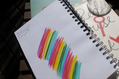
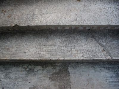
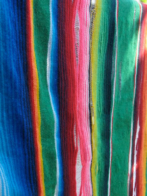
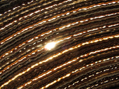
I try to capture all inspiration one way or another when I see something interesting. Sometimes I sketch it out. Just a rough doodle and a few notes. I put date and location on the sketch that act as a trigger for my memory. Quite often I take a picture. It doesn't have to be a perfect picture, if the colour is what matters then who cares if the focus isn't perfect. My cell phone - which does not have a good camera on it - is filled with images that serve as inspiration scrap book.

It is pretty much impossible that I will make all the quilts that these inspiration images conjure, but it is nice to have a bank of concepts. You never know when the right fabric will appear for one idea, or you need a quick quilt and can't decide what to make. Then there are the times where you just HAVE to make something because the inspiration is too strong. I don't know anything about that...

Here are the images from my trip that may or may not get translated into a quilt one day.


Texture, all about texture.


Colour and stripes! Plus that age and fraying.


Light and texture. This is the sun through my hat.


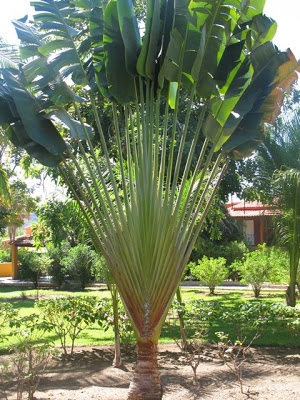
My daughter loved the woven effect of this palm. Me too.


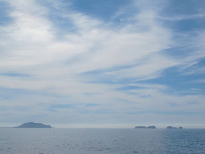
Blue.


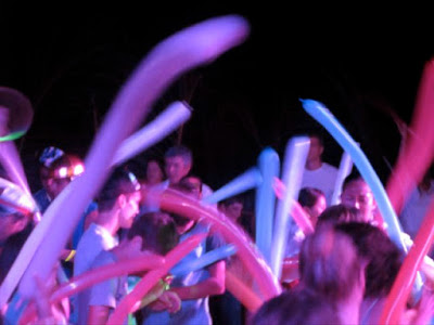
Energy and colour contrasts.


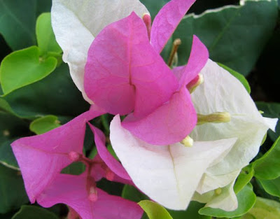
This may be the start of a mild pink and white colour obsession.


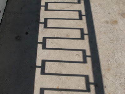
Shape and line.


Curves. Simplicity.