"art"

For Sarah Golden

Sarah Gold Mini

16” x 20”

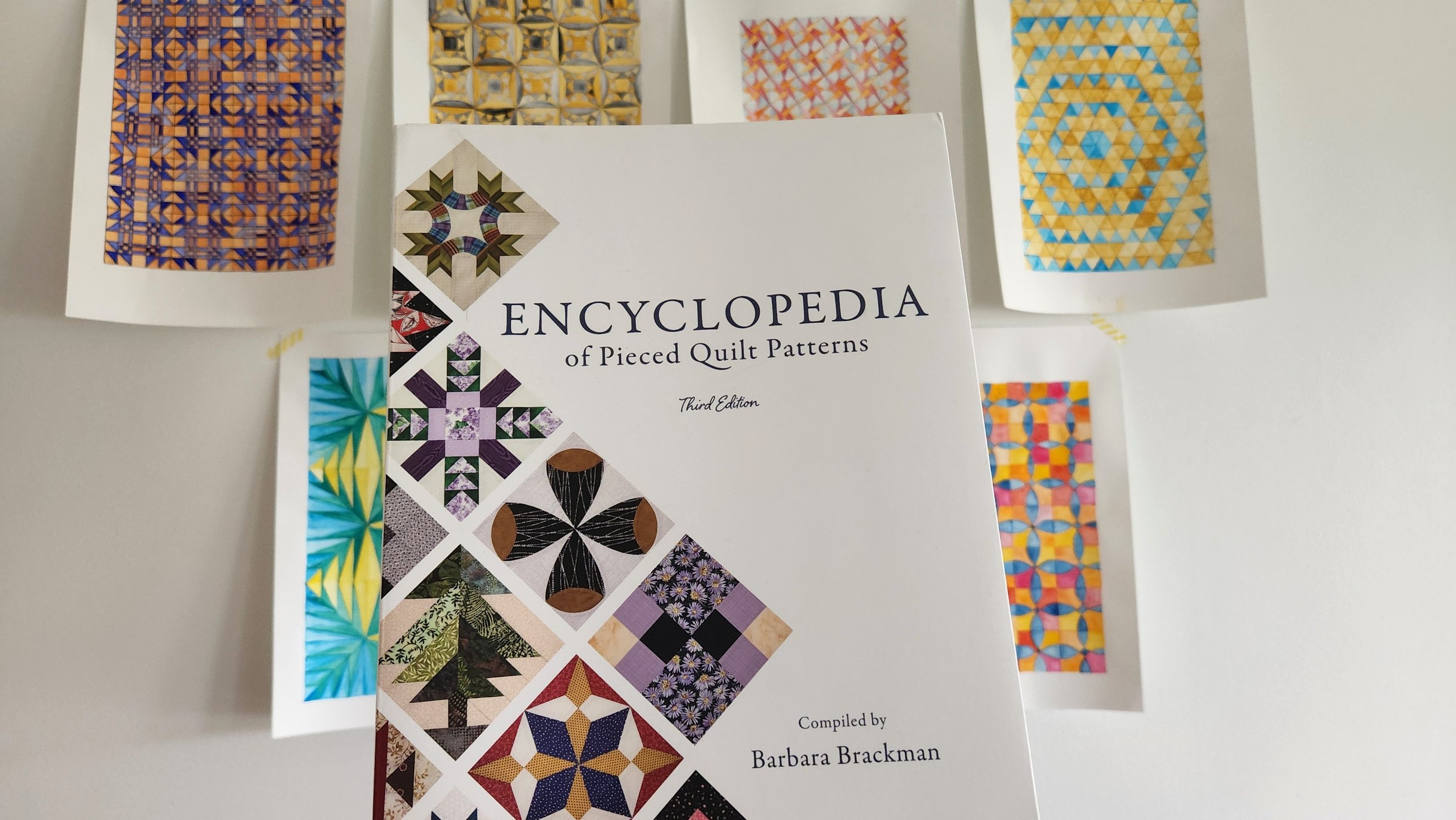
It was a few years ago, in the middle of another lockdown, that I became truly entranced with the work of Sarah Golden. Something about her shapes and colour use, not to mention that we are birthday twins, just got to me. One day she posted some paper collages she was making. It was instant inspiration and I wanted to turn it into a quilt. With her permission I explored the handmade and the shapes of her work but in fabric and thread.

Here is the inspiration image:

Sarah Golden paper and painting collage

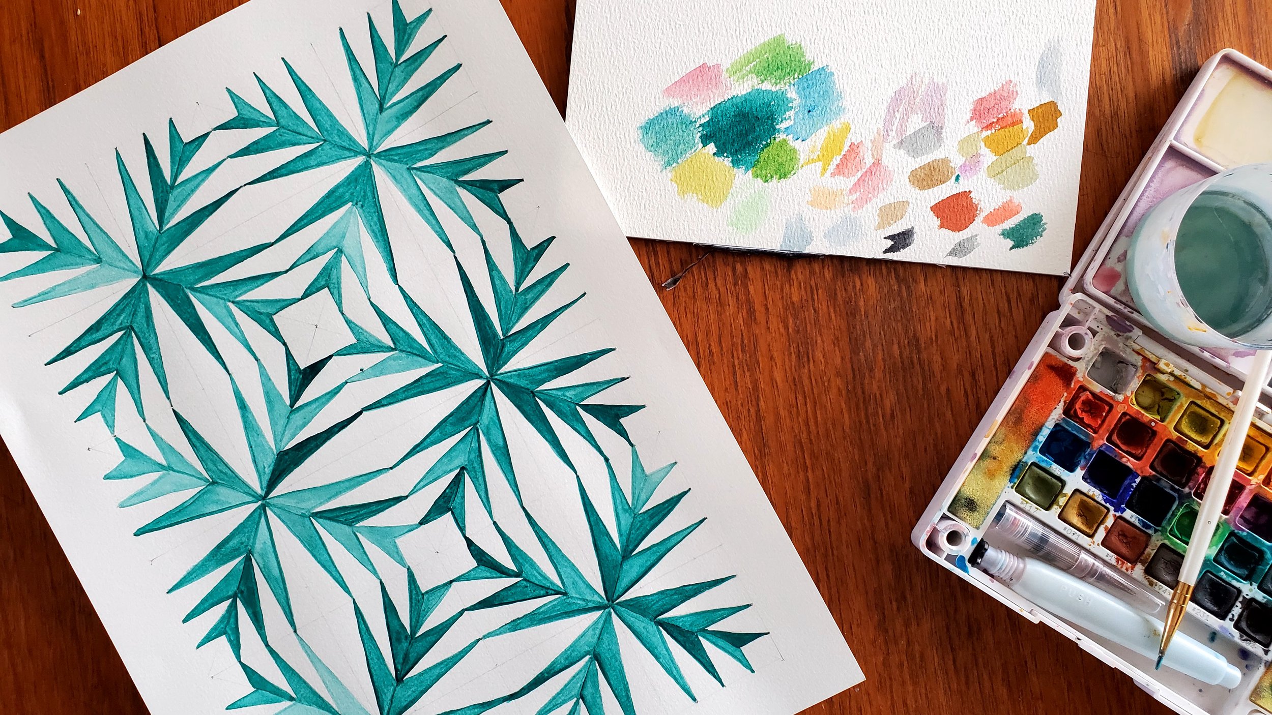
To make the mini I dug through my stash for the right colours to reference her original piece. Some of my finds meant that I did not have to piece all the sections, but let the fabric talk. In the end, the components of my quilt collage were a combination of improv piecing, appliqué, and single fabrics. Then I used embroidery and hand quilting for additional details. I even matted my details like she did, with a ground of white.

Hand embroidery and quilting details on a gold, black, and blue improv quilt
Details of a gold, black, and blue improv quilt

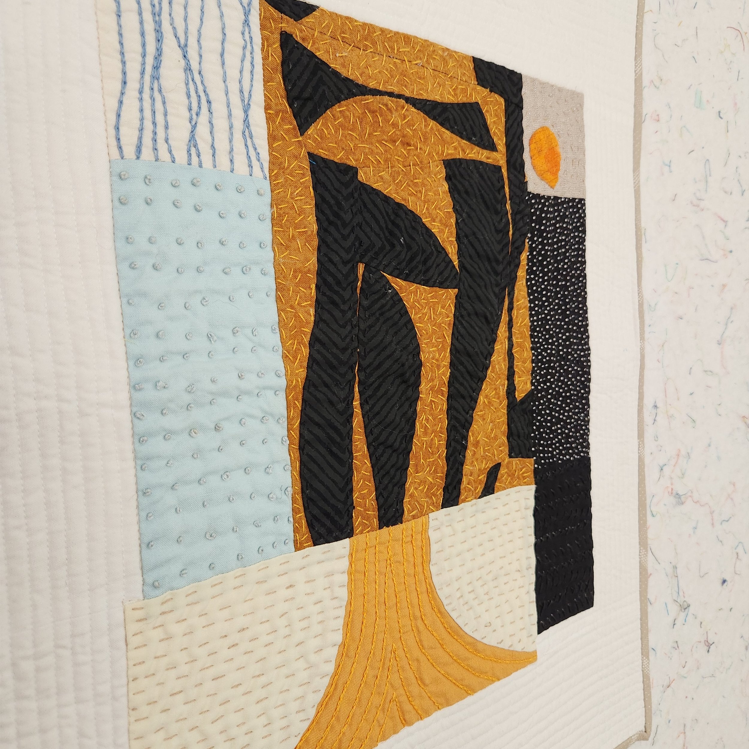
Not entirely sure why it took me so long to finish this quilt. It’s just a mini! Yes, there is a lot of work in this small space, but that isn’t it. I just went in fits and starts on it. But it is finished now. Bound in a fabric to look like a wood frame. Sent to Sarah as a thank you for the inspiration.

August Morning Make 2022

Whenever people tell me that can’t sketch out quilts because they can’t draw I like to pull out my own sketchbook. Chicken scratch, random lines, and quite often things that only make sense in my head. You don’t NEED to draw to quilt. As long as you can think about where your seam lines go you are good. That being said, I always want to draw better.

I’ve done drawing for Morning Make before. Quick little still life sketches of things around me. It was a good exercise but building a skill isn’t a one and done thing. So in August I decided to set myself a drawing challenge again. This time, however, I explored a technique called contour drawing.

In contour drawing - at least the way I did it - your pen isn’t supposed to leave the paper. You are doing one continuous long line. Some people do it blind, as in they look at their subject and never the paper. I was not ready for that. But in slowing down to look at my starting image and translating it through a single line I was able to focus on shape and composition. You can’t draw everything in the picture. Well, you probably could, but I didn’t. Depending on the source image (pictures from my phone) I narrowed the focus to only certain elements. Sometimes background were completely eliminated, sometimes just enough to give context. It was an exercise in looking just as much as drawing.

I’ll be honest, I think some, if not all, are quite bad. That is, if you compare to people for whom drawing is a livelihood or serious endeavour. There was improvement, for sure. Some are even better than I would have expected. All were, at least, recognizable. Regardless of the results it was an enjoyable exercise.

May Morning Make 2022

Seven mediocre watercolour paintings of traditional quilts

While May was a busy month for a family it was a relaxing month for Morning Make. Indeed, starting my day with Morning Make meant that I was in a good frame of mind for the rest of a chaos.

These watercolour sketches of quilts are not a new to me effort. I’ve made a few in the past. For me, it’s a great, relaxing activity. Plus, I get to explore traditional quilts without having to sew them. All that precision piecing!

The Encyclopedia of Pieced Quilt Patterns by Barbara Brackman

While there are a million resources for quilt blocks in both print and online I turned to this beauty of a book for picking out my patterns: The Encyclopedia of Pieced Quilt Patterns by Barbara Brackman. It’s an absolute classic and was recently reprinted. It pairs, if you like, with the Electric Quilt products, but you can buy the stand alone book. I picked mine up through Quilt Folk, but check your local quilt stores (or ask them to order it for you) or through the big A. Note, the book only contains drawings of the patterns, there are no measurements, piecing instructions, or templates. You need the Block Base software for that.

It was an absolute treat to flip through the book. As you can imagine, it was hard to narrow down a block choice each time! I ended up picking blocks I either always wanted to try or love but will likely never piece myself.

Pencil sketch of a quilt, ready for painting.

Each painting started with a pencil sketch. Using a good old ruler, a sharp pencil, and with an eraser nearby I translated the single block drawing into a quilt sketch. Sometimes I played with layout, sometimes it was straight grid.

Green paint, looking like palm fronds, at the beginning of a watercolour quilt painting.

Once the pencil sketch was done I started painting. These are the basic watercolour sets I bought just before the pandemic started. I tried to stick with the colours of the palette itself, so that I wasn’t trying to match colours day over day. I also stuck with 2-3 colours only. This was to force myself to concentrate on the design of the block, not try to create a watercolour quilt like I would sew one. Simplicity is sometimes a challenge for me so this was good practice.

Orange and blue watercolour painting of a traditional quilt made from squares and triangles.

On the first painting of the month I outlined the ‘seam lines’ of the quilt with a black pen. I really thought I would do this to all of them, but ended up not liking the look. I’d done it previously but something about it didn’t feel right this time. I suppose I just wanted a softer look.

Gold and grey watercolour painting of a quilt made from curves and triangles.

It might be a little less ‘finished’? I’m not sure, but I still prefer it with the outline.

My watercolour skills are still very basic - this is essentially just colouring. But there is something about the movement of watercolour that is different than anything else. I am still smitten after my first forays into it over 2 years ago now. Loads to explore!

April Morning Make 2022

Stack of papers coloured blue with cyanotype

April was an exploration of light, more than anything. Indeed, I’ve never paid this much attention to light, shadow, and sunshine before. It was an excellent practice in paying attention, in noticing.

Cyanotype is a form of light exposure, like photo developing. You use chemicals on paper, fabric, or anything that can be coated (I saw someone do rocks and I want to try that!) It requires the interaction of the two chemicals: potassium ferricyanide and ferric ammonium citrate. You only really need to know that you need equal parts of each and to mix them together right before using. I picked up the set from my local art supply store.

Bottles of chemicals for making cyanotype prints

For the first half of the month I mixed the chemicals at night, painted the paper, and let them dry in a dark bathroom. Light exposure starts the process of creating the print, hence the windowless bathroom. For the second half of the month I played with wet exposure, meaning you paint the paper with the just mixed chemicals and go straight to the creation of the print. In the end, I couldn’t really tell the difference from the results.

To create the print you place an object on the treated paper and let light do its thing. Where the object is placed and in its shadow the outline remains while the rest of the paper gets exposed. Essentially, you are creating a negative image.

The beginnings of a cyanotype print with fabric trimmings and a mesh onion bag

Where things get both exciting and frustrating is with the shadows. Not that sunny? An object with diffuse edges? You get a ‘blurrier’ print. Very sunny? You get shadows. Depending on the time of day and the level of sunniness, you can get very sharp images or long shadows. I found the exploration of these differences fascinating and learned to exploit them to create different things. Seeing as this is morning make and it was April in a northern location, I had a lot of shadows to play with and sometimes not a lot of light. It means I will probably play a bit more in the peak of a summer’s day.

Bouquet of dried plants and grasses again the Calgary skyline

The other act of noticing this month was in looking for things to use to create the print. You see a lot of cyanotype prints exploring shape through living objects like plants and flowers. It was April in Calgary, not a lot of greenery! But weeds, grasses, and last year’s living plants provided fascinating textures to use. Going for walks I found myself nothing plants and sticks in new ways, or even discovering new to me plants. I never picked anything living and cut dead things, leaving roots in tact in case it was a perennial. I also explored the house for objects, using kitchen tools, jewelry, games, even garbage. If it can create a shadow it can create an exposure.

Four different cyanotype prints created from natural and household objects

Each day I made 2 prints, so ended up the month with a lot of prints, some definitely better than others. Here are four of my favourites. From top left, in clockwise order. A necklace from Elinor Stenroos on dry. Shadows from slurpee cup and jar lids on dry. Cheerios on wet. Thistle on wet.

Some days I got the real dark, indigo blue colour typically associated with cyanotype, others it was quite pale. To be honest, I never really figured out what created the difference. it always felt like I was putting the same amount of the chemicals on the sheet. I suspect my proportions of the two agents varied, but I don’t really know. Length of exposure varied too, depending on the light conditions that day. I don’t think that effects the colour though, as I exposed almost all to the same colour before washing. (The chemicals look pale green when they go on then change colour as the exposure happens, usually showing done when a bronze or dark green.)

Yes, you can do this on fabric and that probably made a lot of sense for me, a quilter. However, I wanted to try the paper and besides, it’s not like I needed more fabric! That being said, I also don’t need 60, mostly mediocre, cyanotype prints. So I got a notion for a secondary art project.

Cyanotype prints cut apart and arranged in a churn dash quilt block

I need to test my assembly idea for these but if it works, I think it could be pretty cool. And it just might get by the ‘no quilts on the wall’ rule in the house!

At the end of the month I have to say this was a lovely exploration. I admit to being intimidated by the chemicals and the idea of it at the beginning. What foolishness! It is actually really easy, I felt totally safe mixing the agents together, and it was an adventure to see what could happen. Sure, things didn’t always work and I’m still on the low end of the learning curve but it was a low stress experiment. The anticipation each morning of what could happen was a great way to start the day. Pure creative optimism.

PS. I saved a highlight of the process - start to finish - on Instagram.