
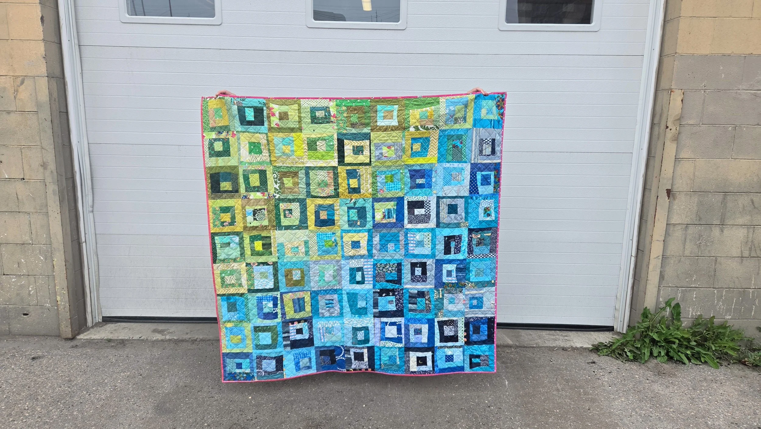
Nahla
59” x 59”
Water is life. A fact, but also a cliche. Me? I am a water person through and through. The sports I did involved water, I am most comfortable in it. I crave it. Whether it be a bath, an ocean view, a dip in a lake. A drink of water can cure a lot. An immersion, even more. Nahla is the first drink of water and she gives me life.
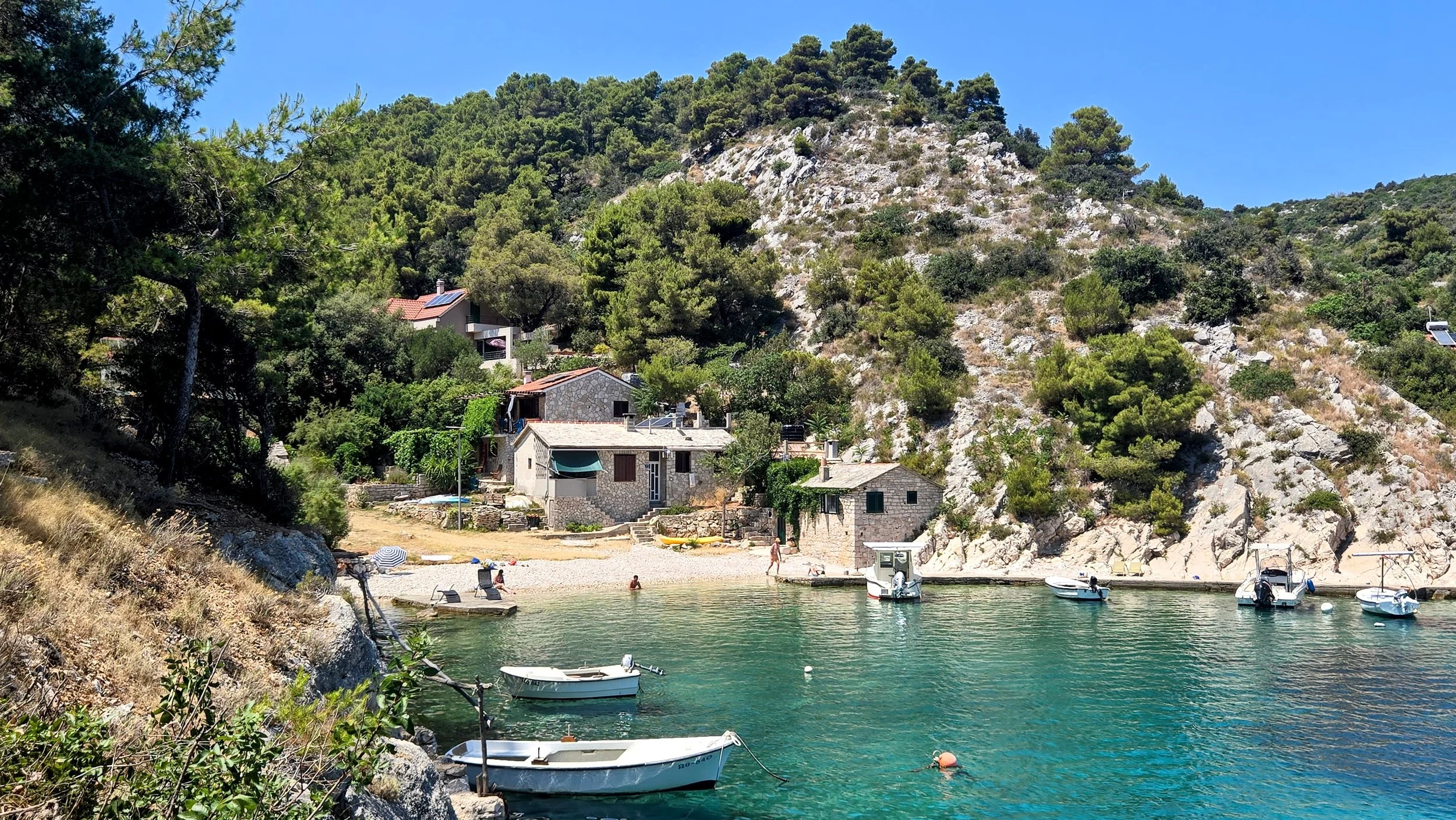
Although this quilt was never started as an homage to this life force, she clearly evolved into it. I can’t help but look at her and see a mountain lake or the Adriatic Sea. (Croatia is still clearly on my brain.)
See what I mean?
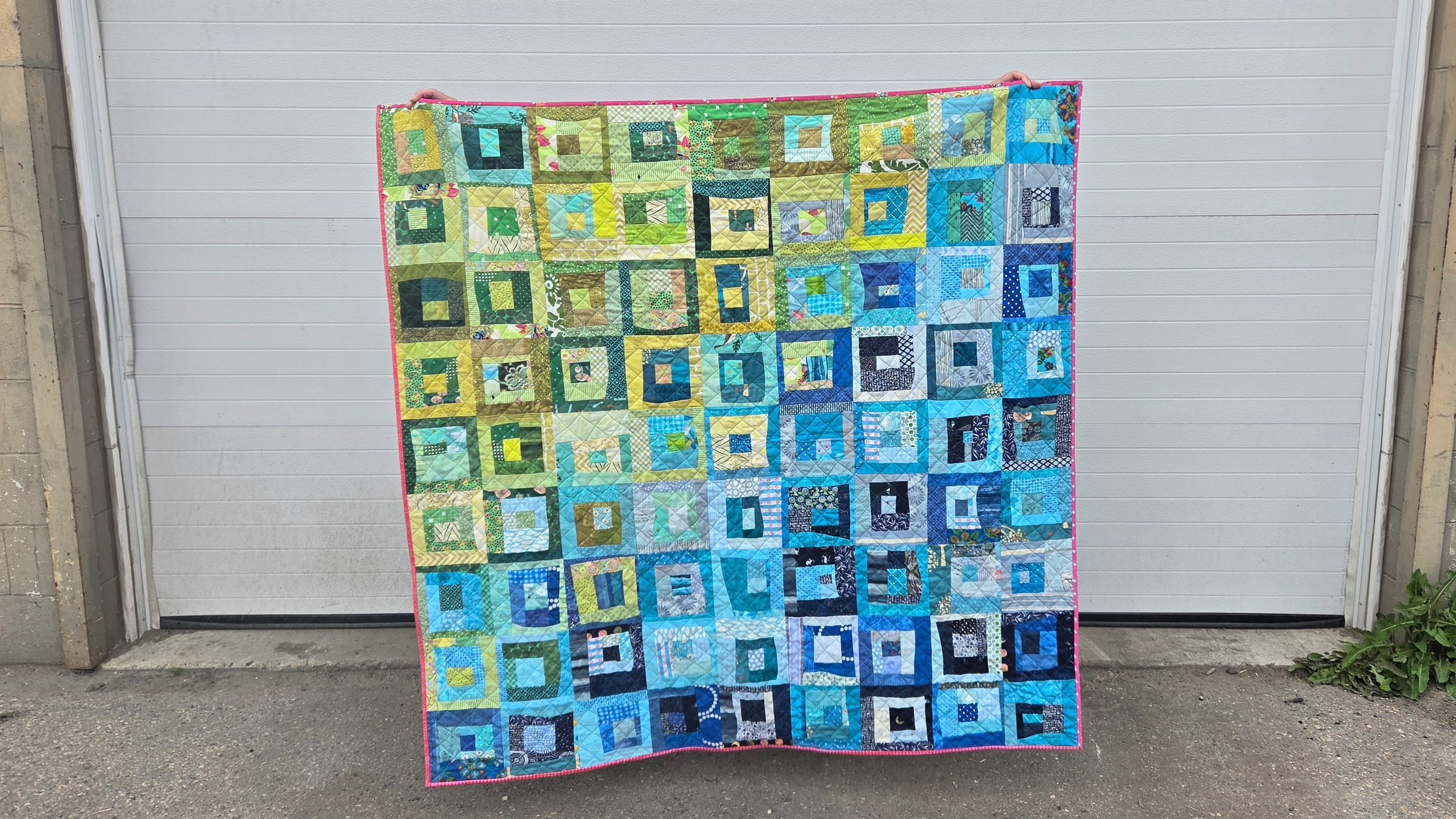
She is purely a scrap quilt. The top is made of 99.5% scraps. When I needed just a little bit I did raid the stash, but fabric is fabric! When you look close at the blocks, you can see I really paid attention to both colour and value. Within green there is forest green, emerald, Kelly, lime, olive, sage, and even mint. All green, but all a bit different. Same for blue: navy, royal, teal, turquoise, pale.. Each block is two colours/values. Then one curved seam thrown in there for fun. Each fabric is only used once in a block (but many times over in the quilt).
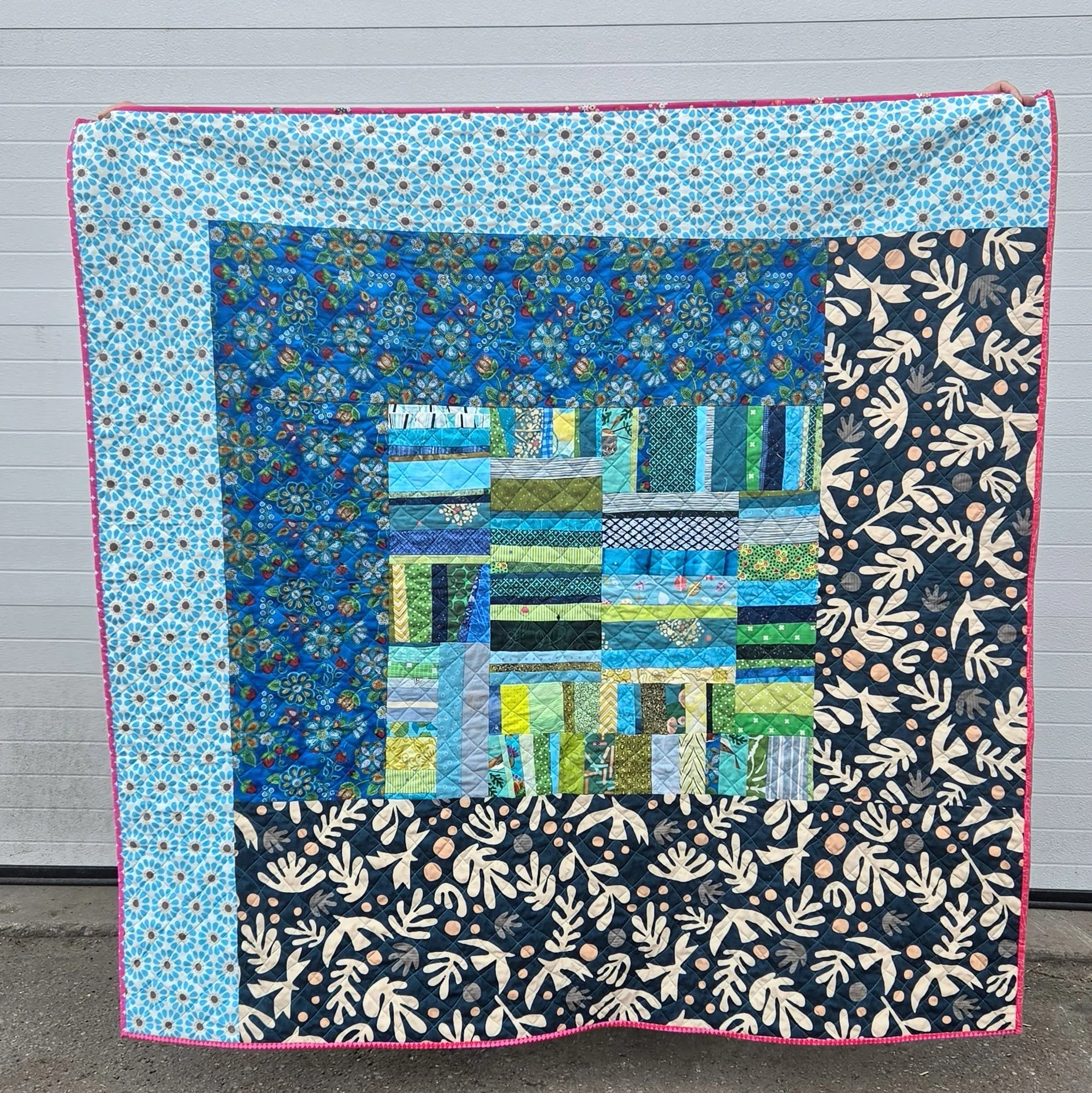
The back is made from the leftovers from the front framed with big pieces left from other quilt backs. The batting is frankbatting, two odd sized pieces joined together. And the binding is made from 4 different pinks, leftover from another project. Even the thread for quilting was in the stash, a teal to bridge the transition between blue and green. So, nothing new to see here!
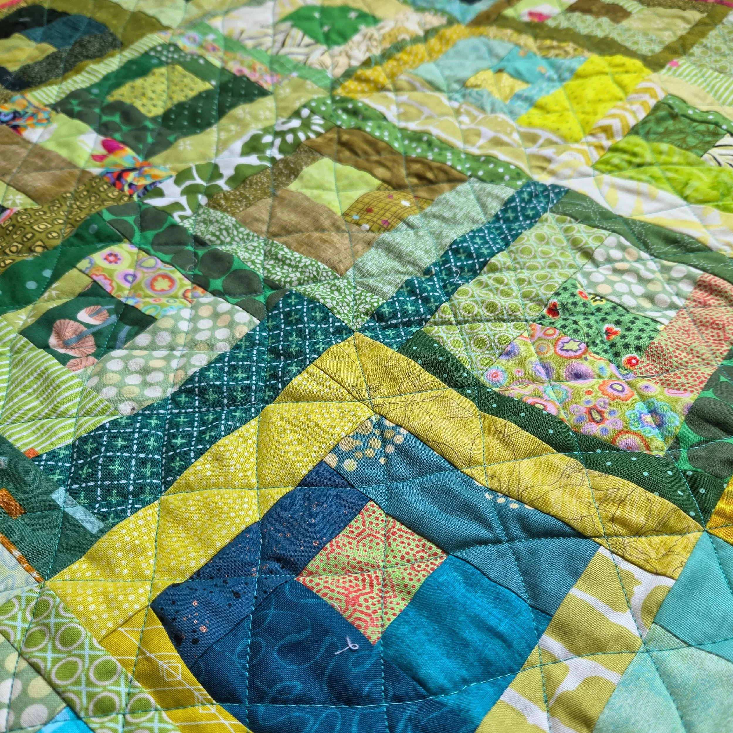
For quilting I went with a wavy grid on the diagonal. I didn't want any fancy quilting on this one. And getting in there to truly accentuate each block was not the effort I was interested in doing right now. That being said, I am finding myself distracted by this wavy diagonal grid. It might just be the light these days (June is always our rainiest month) or I am just being picky? Don't get me wrong, I don't think it looks bad, it just isn't feeling right. Am I going to unpick it? Absolutely not! Will I change anything? Nope. Just observing, that's all.
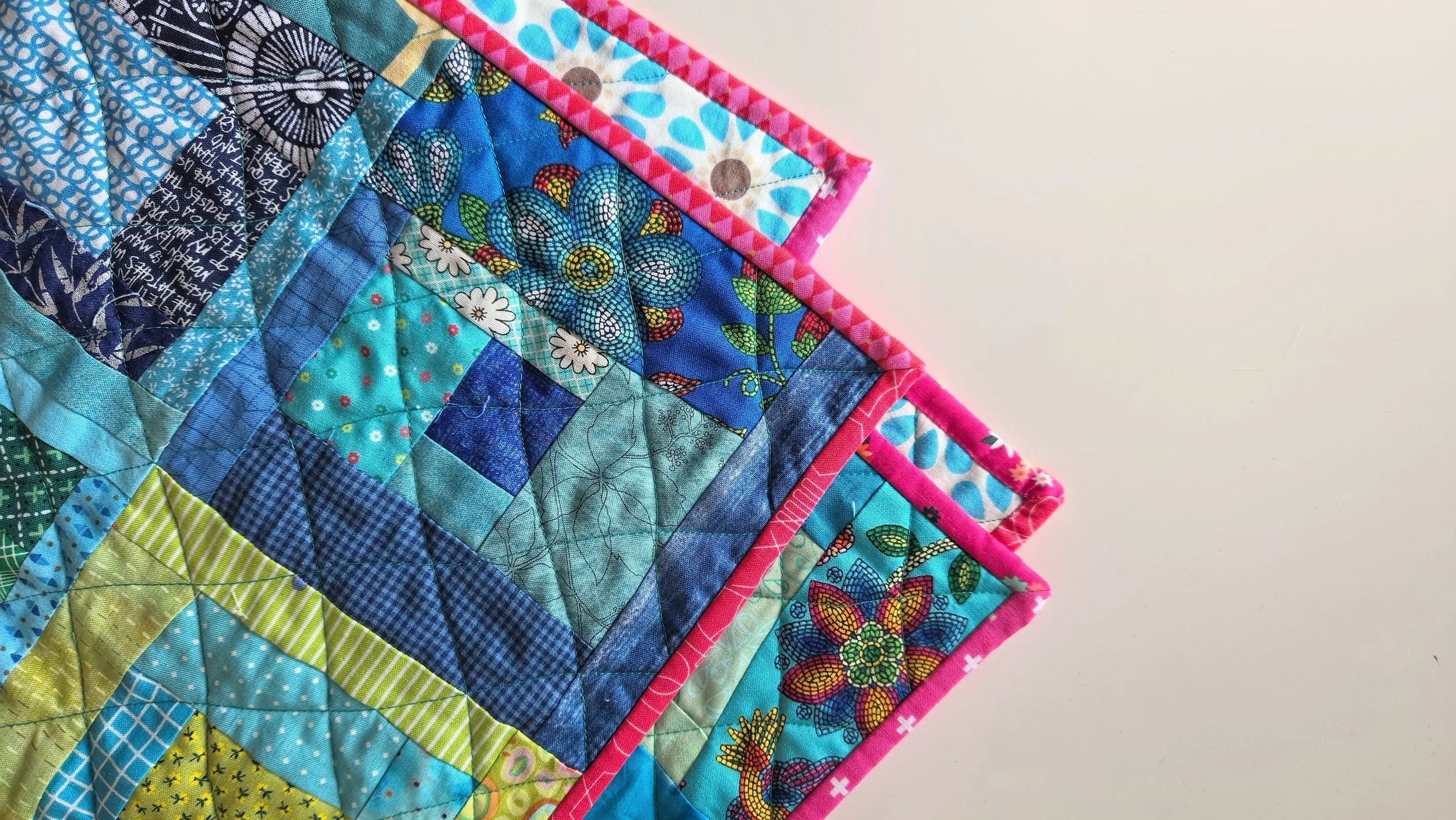
Binding was a bit of a challenge for me. Initially, I thought I would do two sides blue and two green, to reflect the design. Then I debated a neutral. something in grey/beige to reflect that Croatia influence. Purple was another option, but pink won. In case you’ve never noticed, I do love a high contrast binding! To link back to the blocks I did each side in a different fabric. Just like the logs of the blocks. It was the perfect choice, in the end.
To see a few more details on the quilt you can check the video on basting that I recently posted on You Tube.